I. Overview编辑
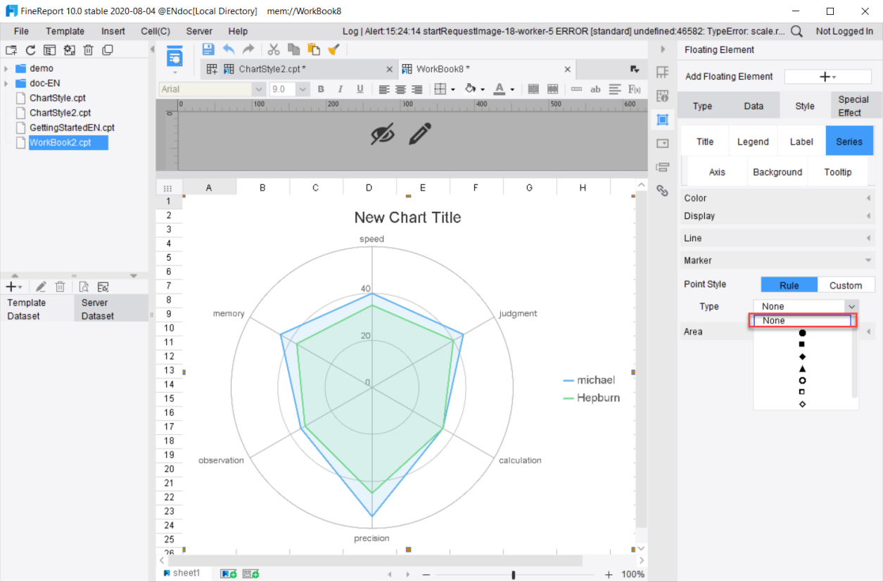
1) The Chart Series is a setting under the Chart Style attribute, which is used to modify the layout and style of series, as shown in the following diagram:
2) This document describes common series settings. For charts with special series settings, please refer to their own documentation for specific descriptions.
3) Suggested Reading: 图表数据, 图表样式.
| You will learn |
|---|
|
II. Insert a Simple Chart编辑
Those already familiar with inserting charts may skip this section.
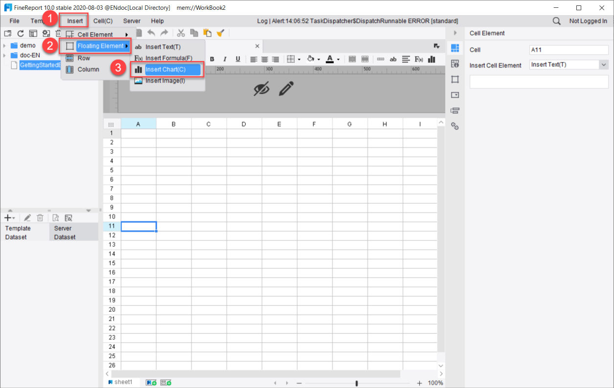
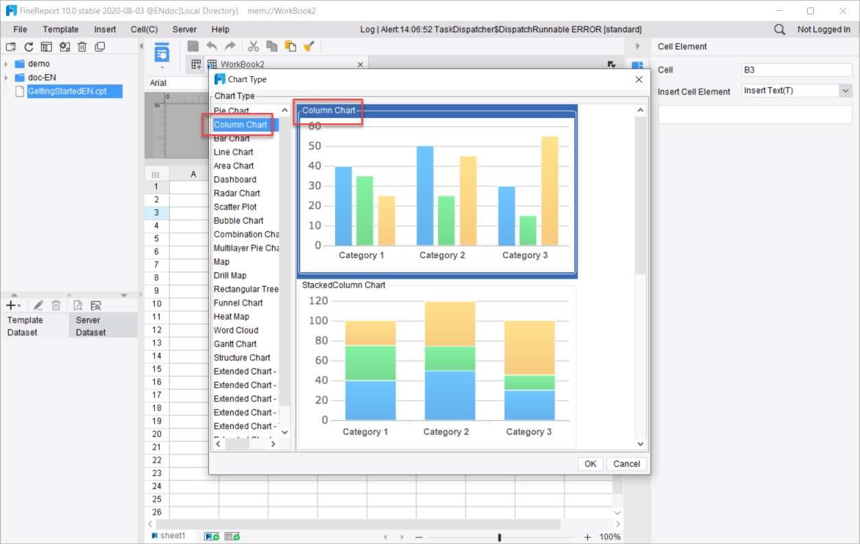
1) Here we take the Floating Chart-Column Chart as an example for brief explanations. Click [Insert] → [Floating Element] → [Insert Chart], and select Ordinary Column Chart.
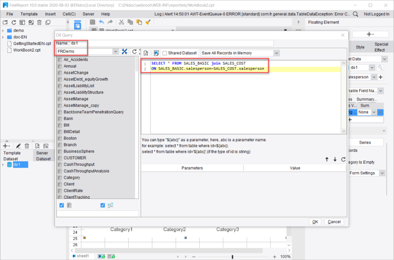
2) Create a new database query ds1, select FRDemo as the database, and the query statement is as follows:
SELECT * FROM SALES_BASIC join SALES_COST
ON SALES_BASIC.Salesperson = SALES_COST.Salesperson
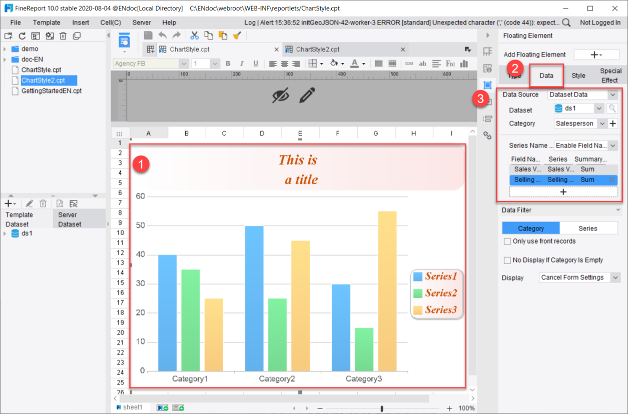
3) Double-click on the chart, bind the chart data, select ds1 in [Dataset] and select Salesperson in [Category]. Series Name is set as [Enable Field Name]. Add Sales Volume and select Sum for Summary Method; add Selling Cost and select None for Summary Method. Save the chart.
III. Adjust Series Style编辑
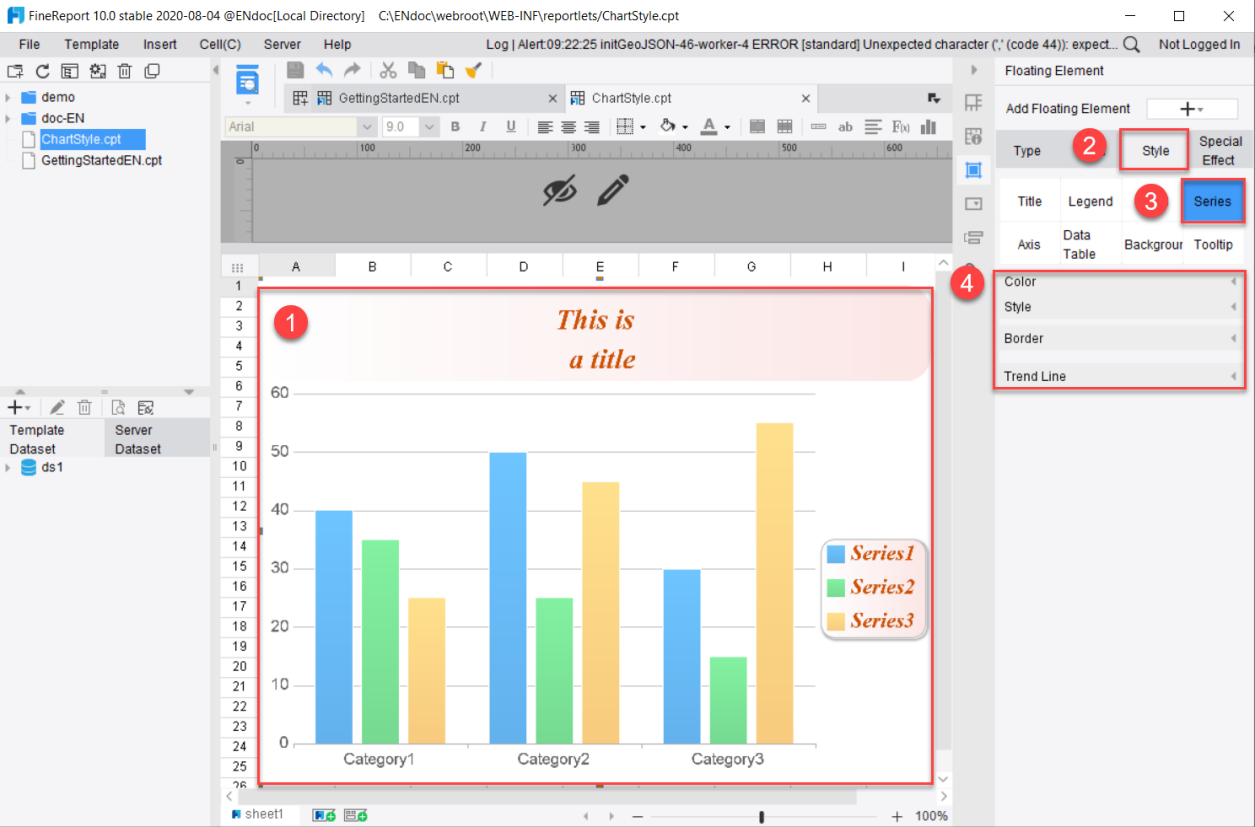
Double-click the chart and select [Style]>[Series] on the right to perform series style adjustment. The series properties vary with the types of charts. This document will introduce seven settings: Color, Style, Border, Trend Line, Big Data, Line and Marker. Adjustments made to the style can be seen in real time in the floating chart effect on the left. The following shows the series setting panel of a column chart:
1. Series Color
This section sets the color scheme of the series.
The color settings available for each chart may be different. This section takes the Combination Chart and Map as examples for illustration. When there is no description for a certain setting, it indicates that there is no such setting for this chart type.
Note: This setting is not available for the Heat Map.
Available settings include:
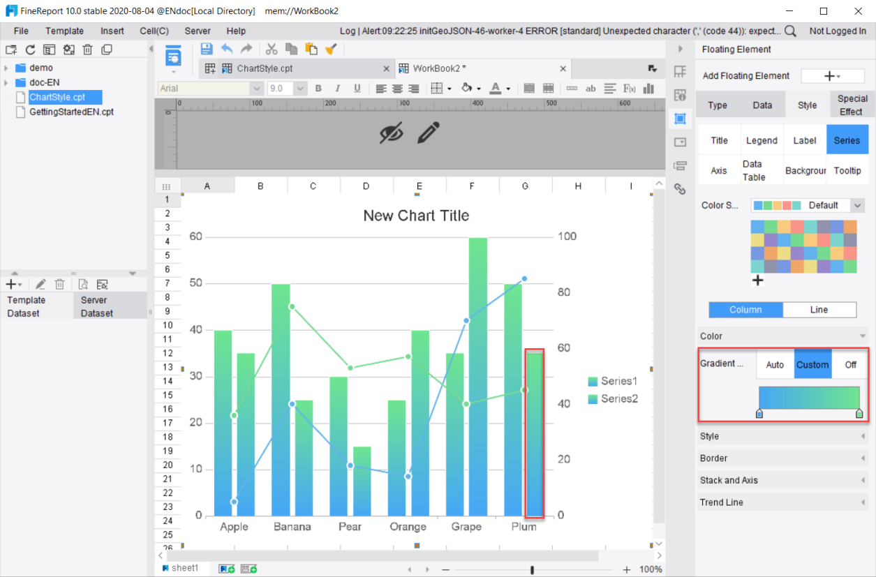
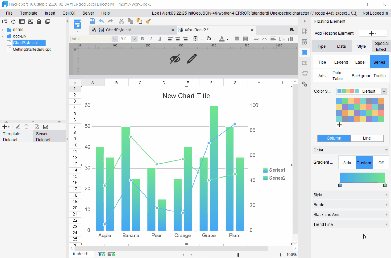
Gradient: Series colors can be set as gradient.
Auto: The series colors automatically become gradient according to the color scheme.
Custom: Users can click on the buttons on the left and right to customize the colors of the left and right gradient sections.
Off: Disable the gradient style and the color of the graph is displayed according to the color scheme without gradient effect.
Color Scheme: The Designer provides built-in color schemes and users may also customize the color scheme. For details on color schemes, please refer to the document 图表预定义配色.
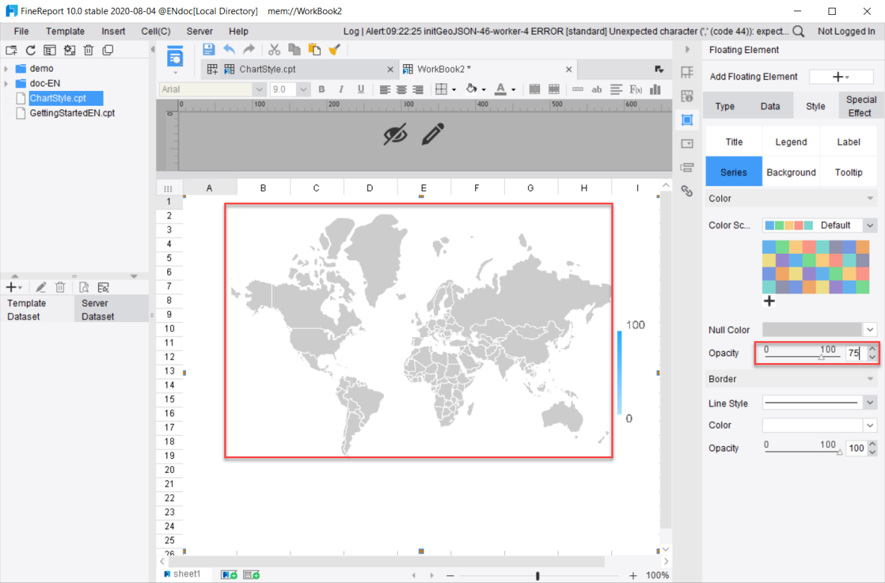
Opacity: Adjust the opacity of the color.
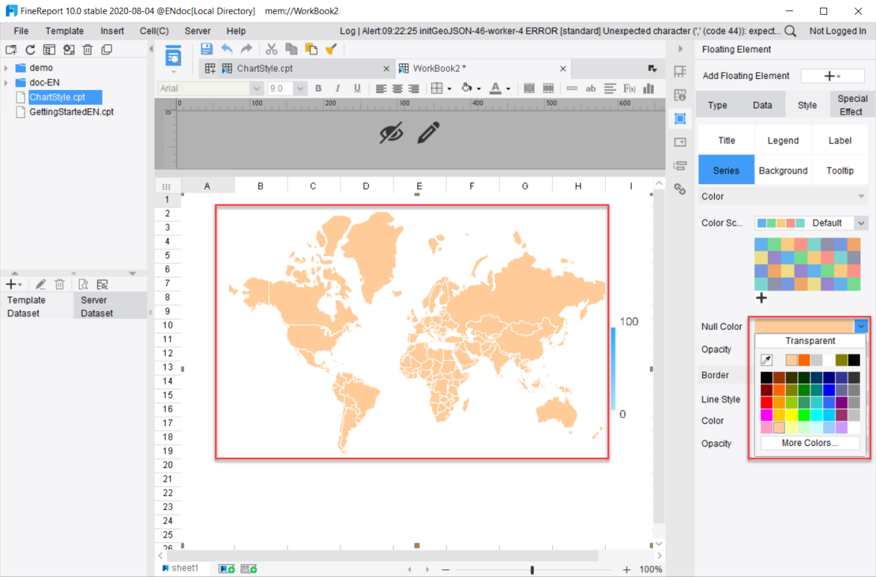
Null Color: Only available for maps, it is used to set what color to display if there is no data in a certain area.
2. Series Style
This section sets the style of the series.
The style of series is closely related to the type of chart. Different types of charts can be set in different styles. This section will make an introduction by different chart types. For detailed settings, please refer to the specific documentation of each type of chart.
1) Column Chart, Bar Chart, Combination Chart
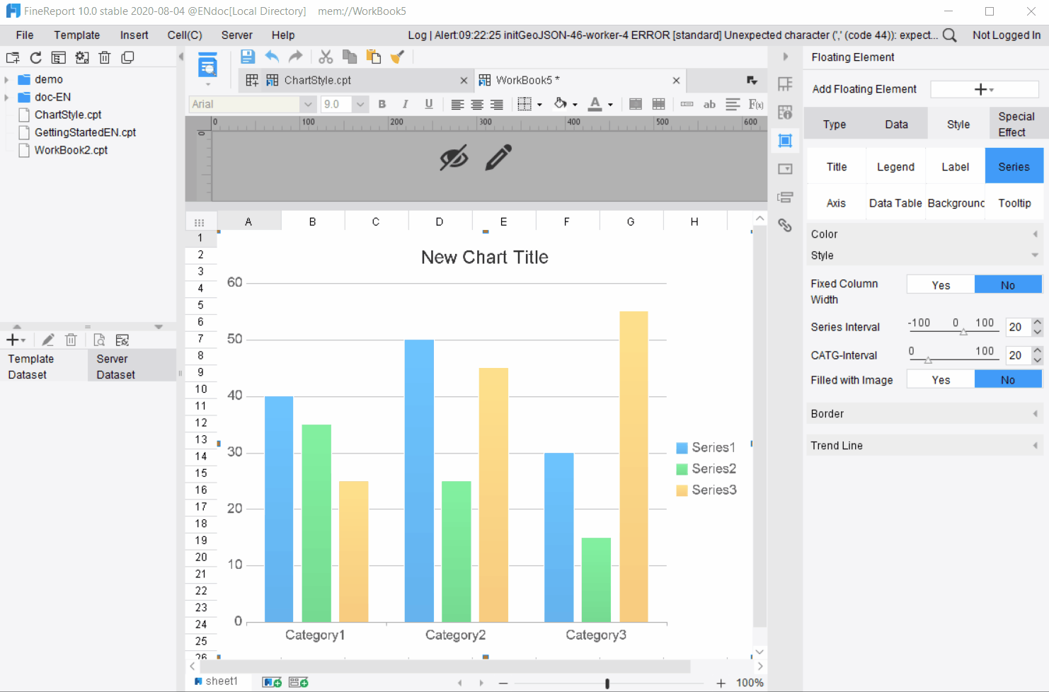
Fixed Column Width: Select [Yes] to customize the column width and select [No] to enable the system to automatically adjust the column width
Series Interval: Set the distance between the series, which can be a negative number. When the number is negative, the columns may be overlapped to some extent. When the column width is fixed, the Series Interval cannot be adjusted.
CATG-Interval: Set the distance between the categories.
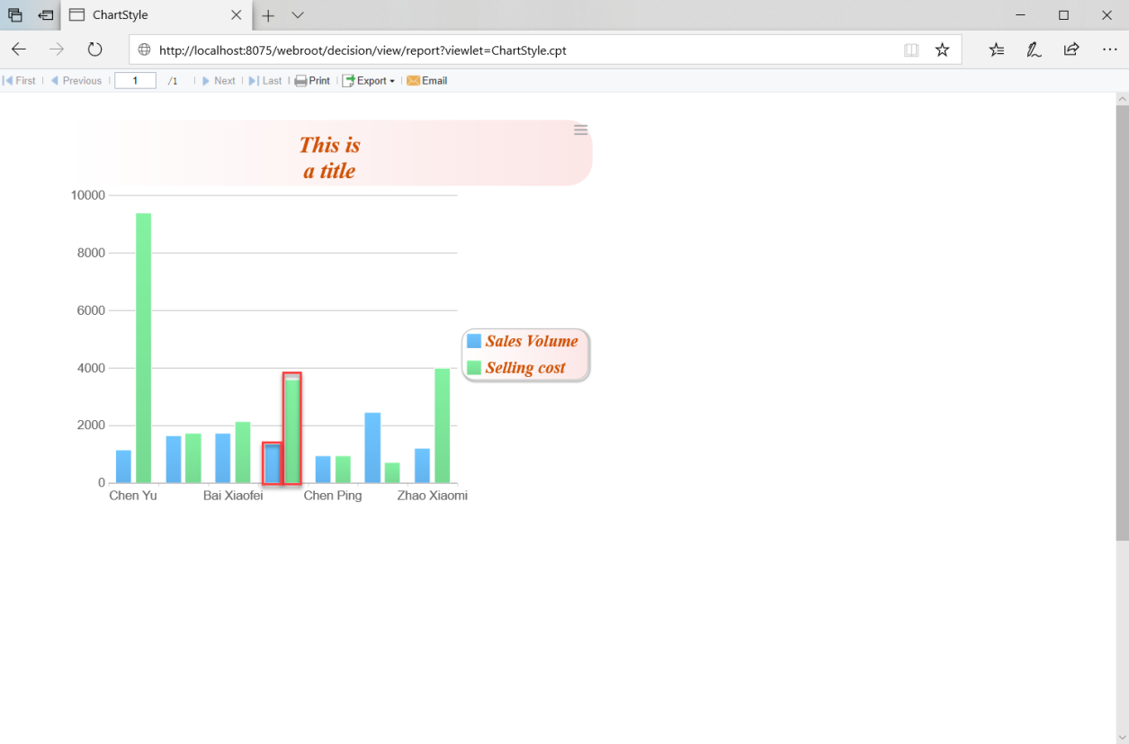
Filled with Image: Fill different series with images. Please refer to the chapter on 图表条件显示.
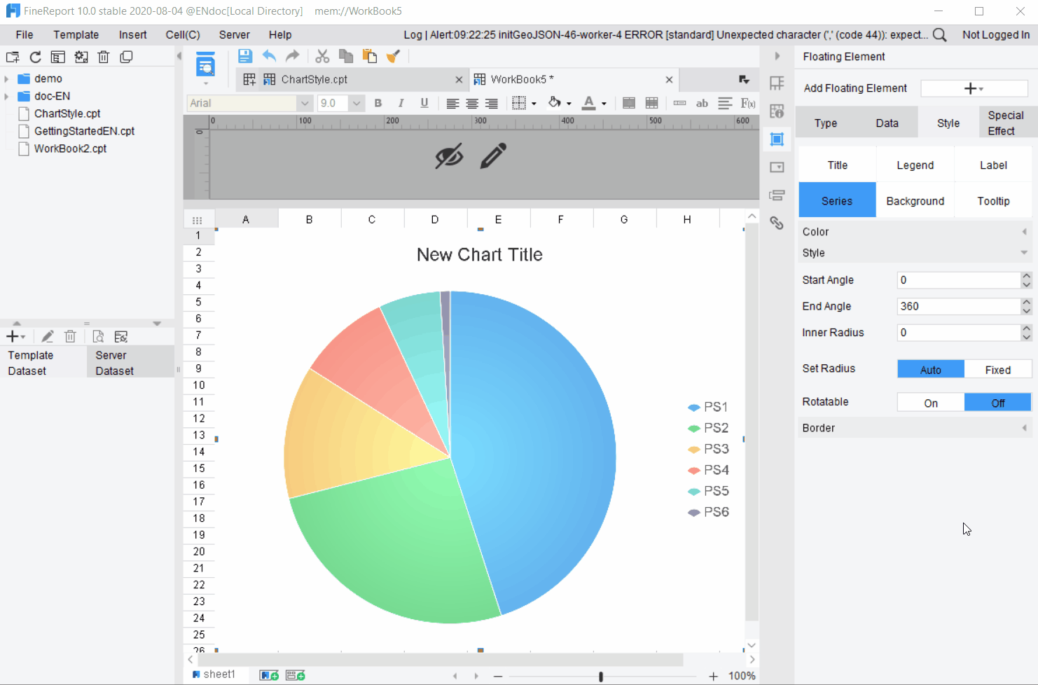
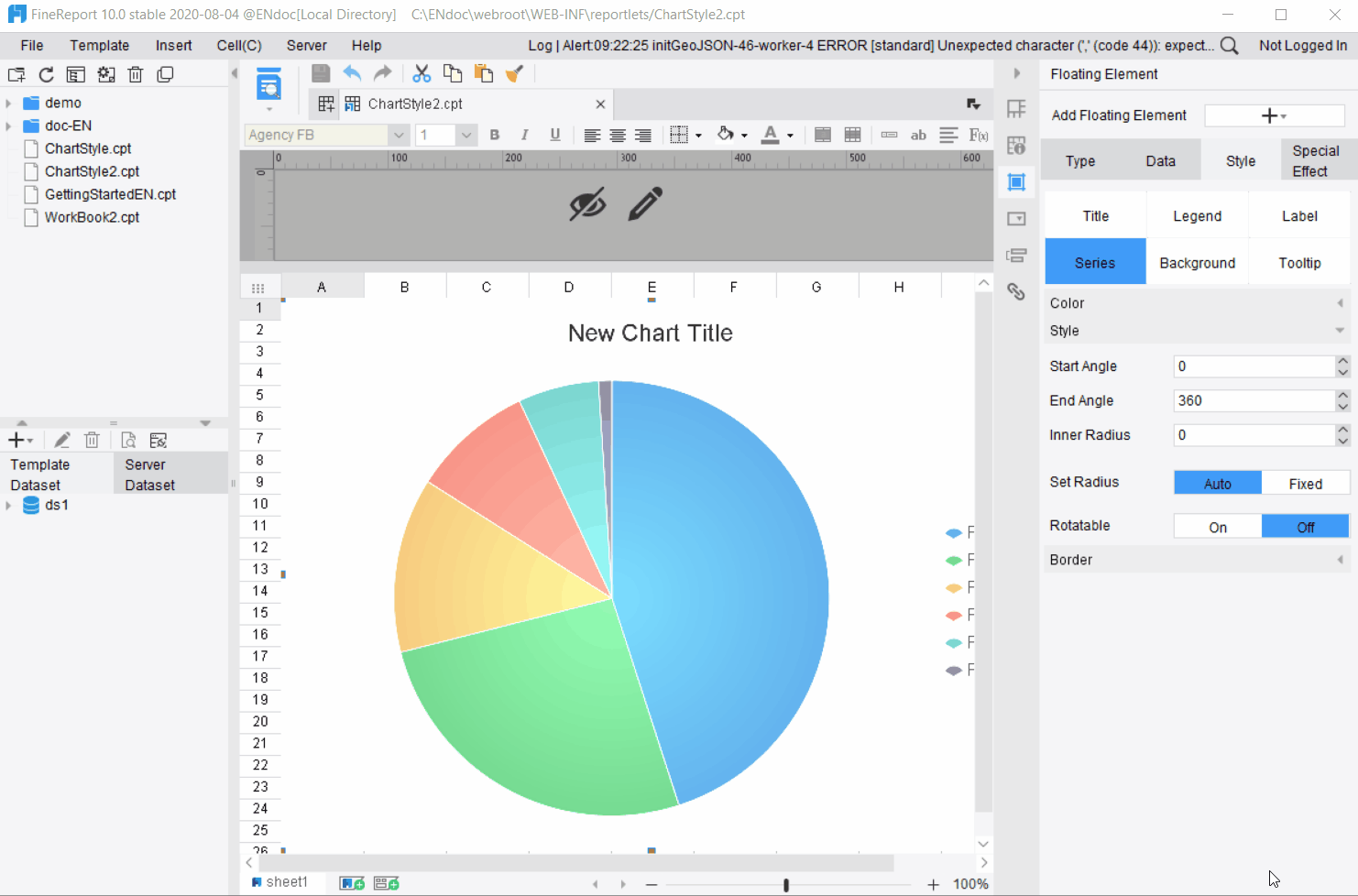
2) Pie Chart
Start Angle: Set the start angle of the pie chart, ranging from 0 to 360.
End Angle: Set the end angle of the pie chart, ranging from 0 to 360.
Inner Radius: Set the pie chart as a ring effect. The larger the proportion of inner radius, the larger the inner radius of the ring, which ranges from 0 to 100.
Set Radius: Set the radius of the pie chart in Auto and Fixed modes. The value can be customized in Fixed mode.
Rotatable: When enabled, users can drag the sector to rotate the pie chart, which is similar to the effect of a roulette.
3) Multi-layer Pie Chart
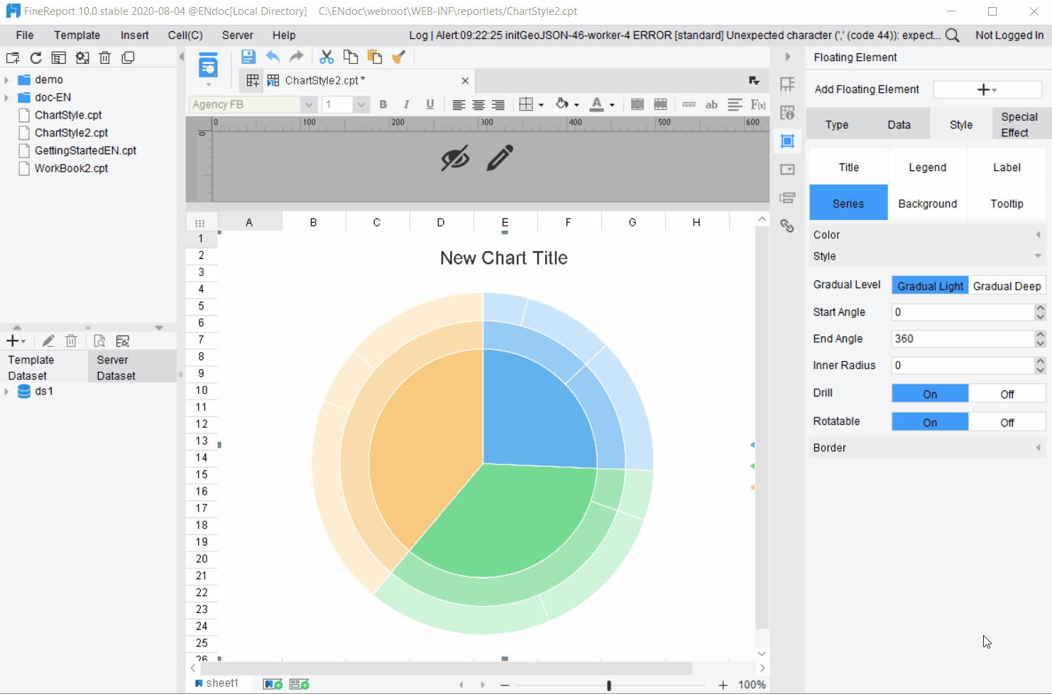
Gradual Level: Users can control the level of gradation by two options: Gradual Light and Gradual Deep.
Start Angle: Set the start angle of the pie chart as an integer ranging from 0 to 360. It is 0 by default.
End Angle: Set the end angle of the pie chart as an integer ranging from 0 to 360. It is 360 by default.
Inner Radius: Set the pie chart as a ring effect. The larger the proportion of inner radius, the larger the inner radius of the ring, which ranges from 0 to 100.
Drill: Here you can set whether or not the multi-layer pie chart supports drill down. It is enabled by default.
Rotatable: When enabled, users can drag the sector to rotate the pie chart, which is similar to the effect of a roulette. It is enabled by default.
4) Multi-pointer Gauge
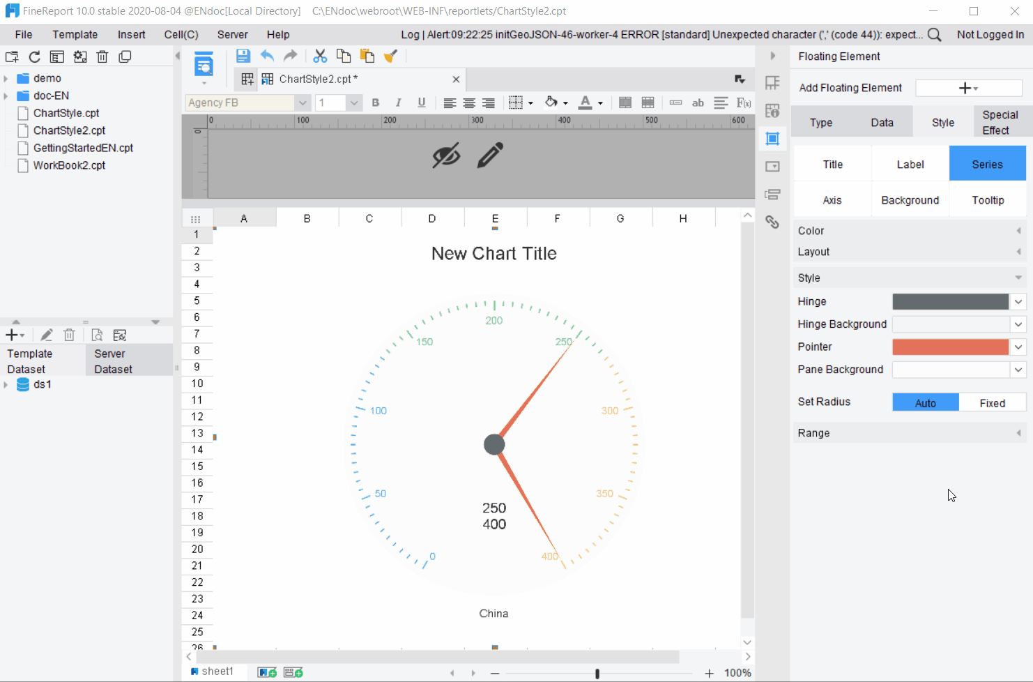
Hinge: Select the color of the hinge.
Hinge Background: Select the background color around the hinge.
Pointer: Select the color of the pointer.
Pane Background: Select the background color of the pane.
Set Radius: Select [Auto] to use the default radius; select [Fixed] to customize the radius of the gauge.
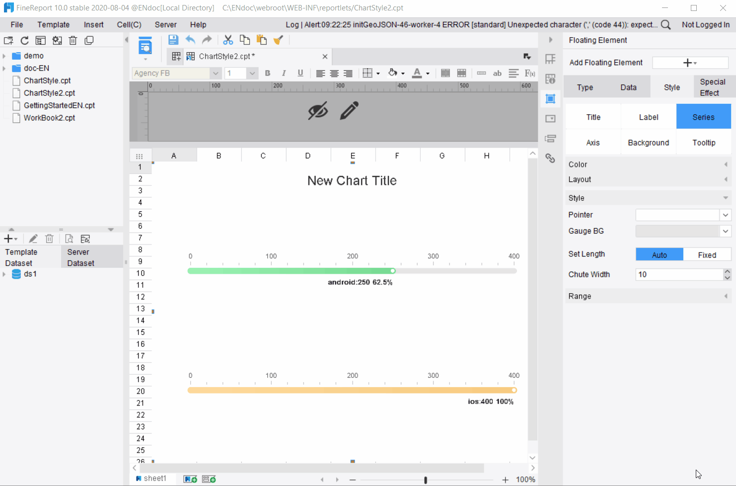
5) Percent Ring Gauge, Percentage Chute Gauge, Tube Gauge
Pointer: Set the color of the pointer and the default setting is transparent.
Chute: Set the color of the chute and the default setting is Light Gray.
Set Radius: Set the radius of a chart. Select [Auto] to use the default radius; select [Fixed] to customize the radius of the gauge.
Chute Width: Adjust the size of the chute area.
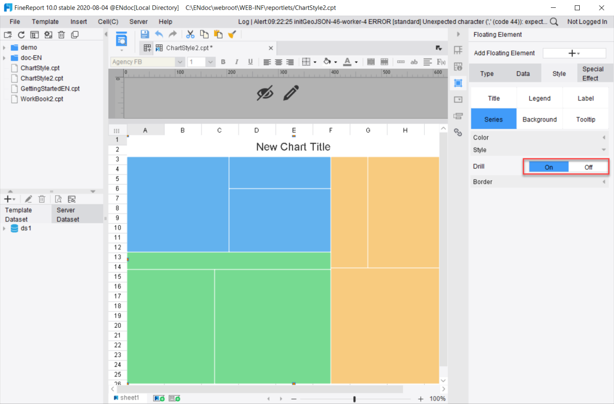
6) Rectangular Tree Diagram
Drill: Set whether or not to enable the drill function
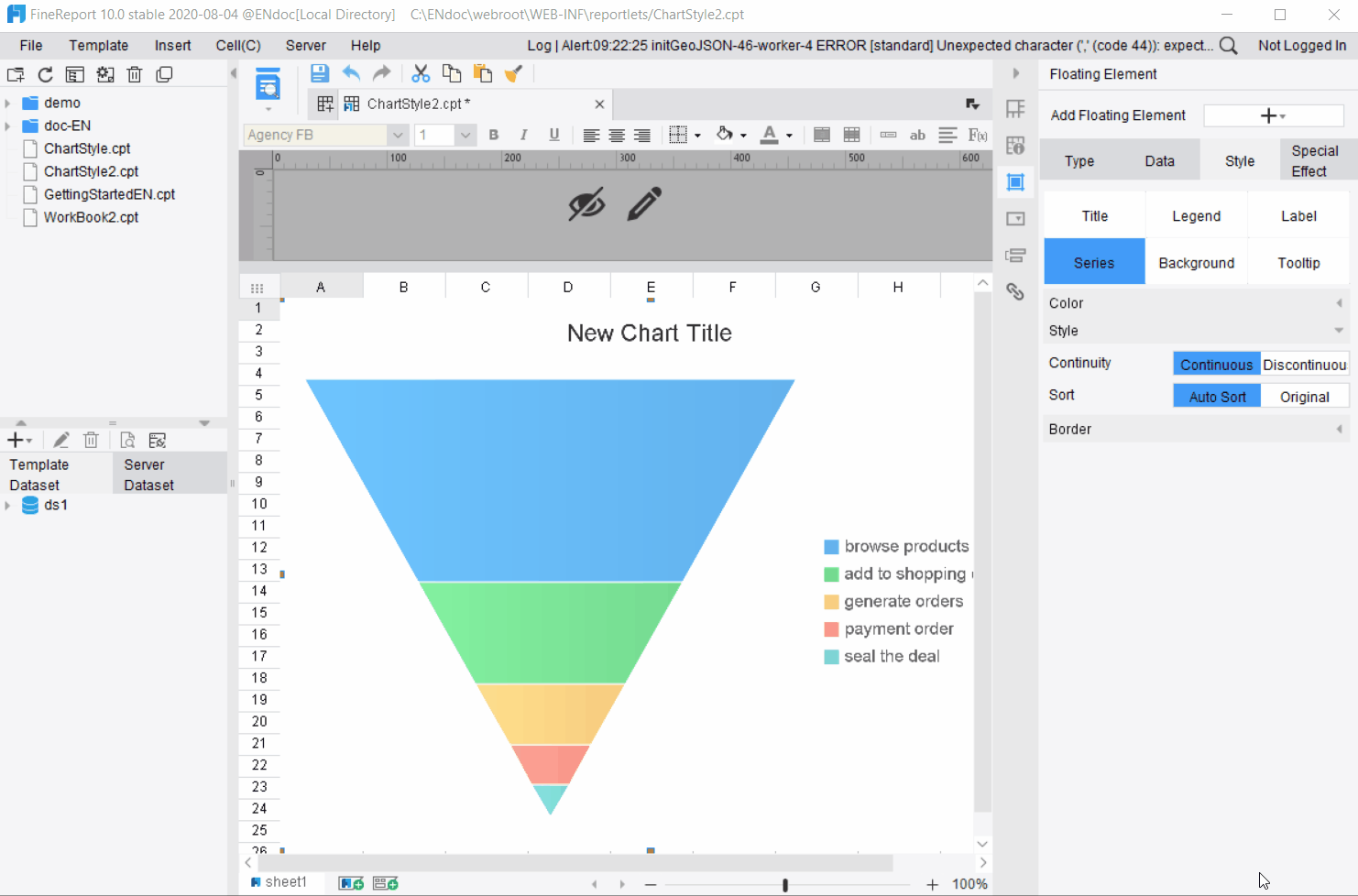
7) Funnel Plot
Continuity: You can set the continuity of the series graphs as [Continuous] and [Discontinuous]; it is set as [Continuous] by default or it can be changed according to the actual situation.
Sort: There are two options: [Auto Sort], which is sorted by the series value, and [Original] which means to display in the order of dataset. The default setting is [Auto Sort].
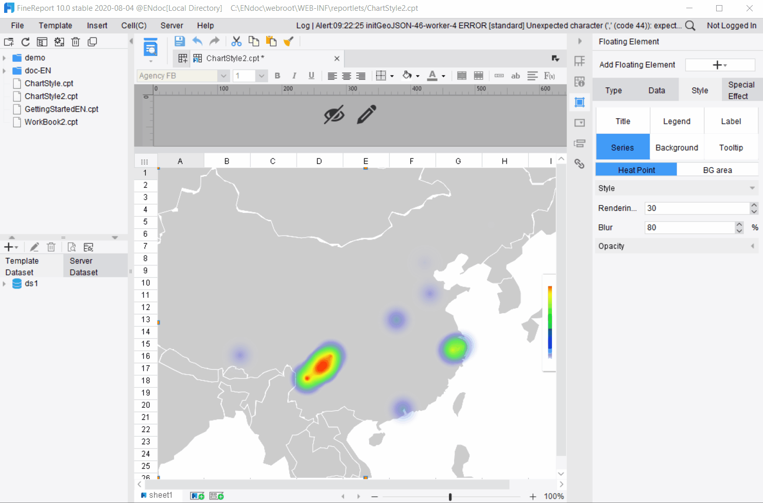
8) Heat Map
Rendering Radius: Set the radius of the hot spot.
Blur: Set the fuzziness of the hot spot.
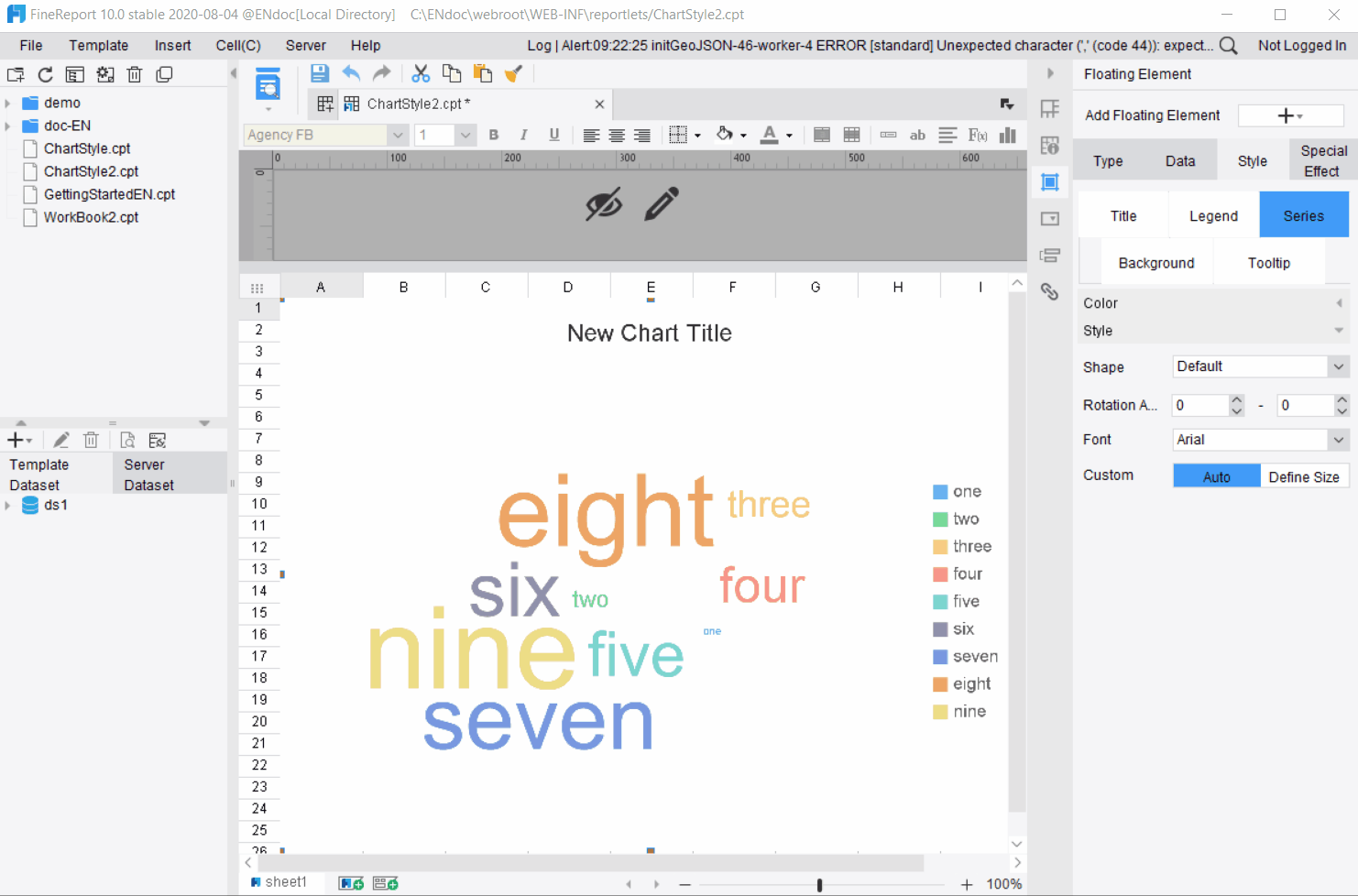
9) Word Cloud
Shape: Shapes available include Default, Cloud, Funnel, Pyramid, Hut, Thumb, Map and Currency. You can choose the shape of the word cloud as needed.
Rotation Angle: Control the rotation angle of the word from -90 to 90.
Font: Select the font of the word.
Custom: There are two options: [Auto] and [Define Size]. [Define Size] can be used to adjust the size of words.
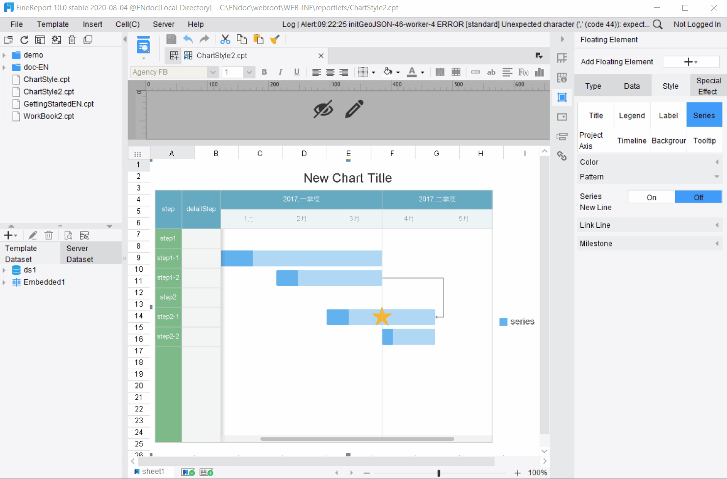
10) Gantt Chart
Series New Line: Set whether or not to display the series by project and in different lines. It is set as [Off] by default, i.e., the series of the same project are displayed in the same line.
3. Series Border
This section sets the color scheme of the series.
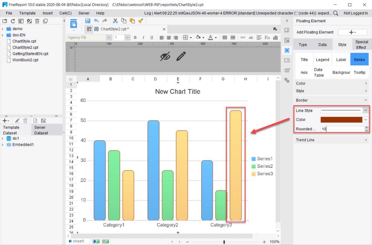
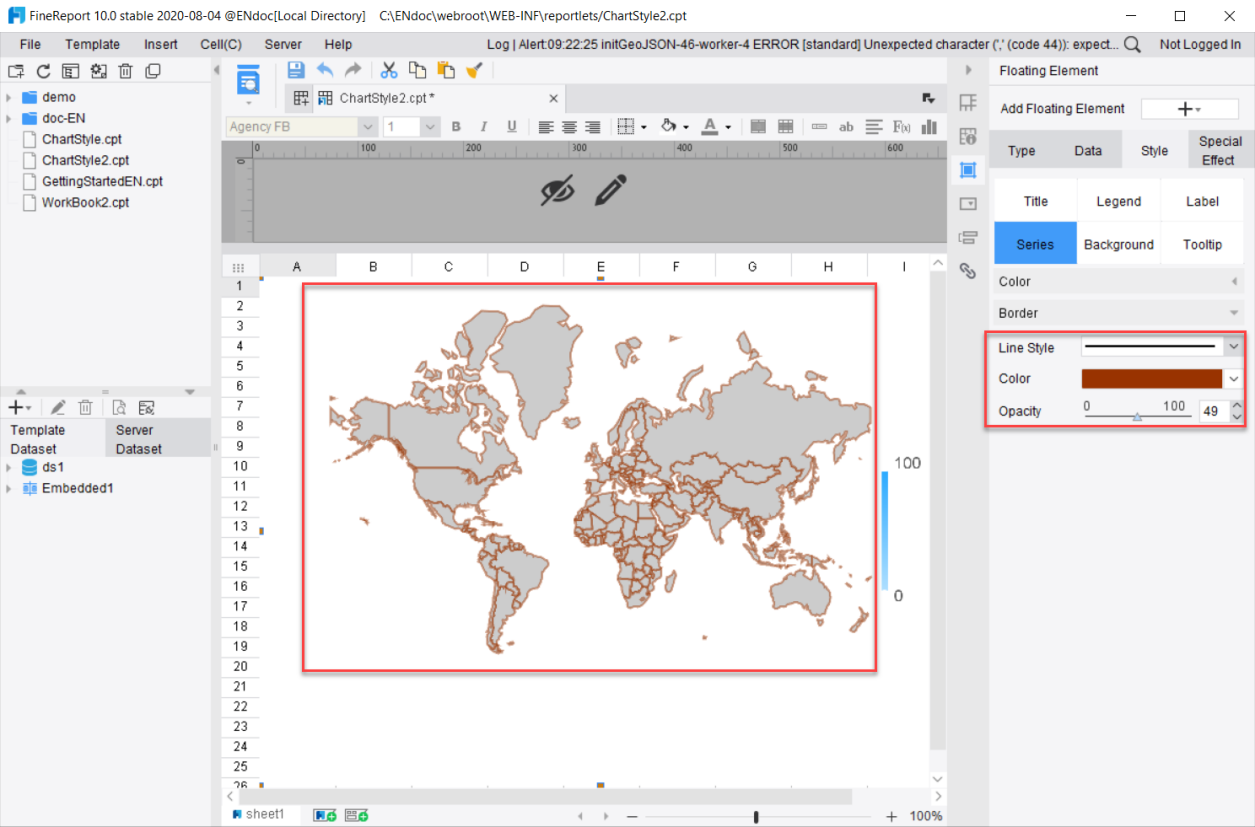
The border settings available for each chart may be different. This section takes the Column Chart and Map as examples for illustration. When there is no description for a certain setting, it indicates that there is no such setting for this chart type.
Line Style: Drop down to select the thickness of the border line or unselect any border line.
Color: Set the color of the border line.
Rounded Corners: Set rounded corners for the border.
Opacity: Only available for maps, it is used to set the opacity of the border line.
4. Trend line
Trend line, an attribute of the series, is used to depict the trend of data changes.
Charts with configurable trend lines include: Bar Chart, Line Chart, Scatter Plot, Combination Chart, Column Chart and Area Chart.
Items that can be set are as follows:
Name: Set the name of the trend line
Line Style: Can be set to solid line or dotted line
Line Width: Set the thickness of the trend line
Color: Set the color of the trend line
Type: There are four types of trend lines, namely Exponential, Linear, Logarithmic and Polynomial Fitting.
Forecast: Set the forecast period of the trend line to analyze the values of the past and predict those of the future.
1) The horizontal axis is the Category axis.
Please refer to 图表坐标轴 for the axis settings.
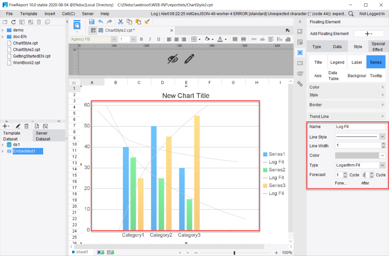
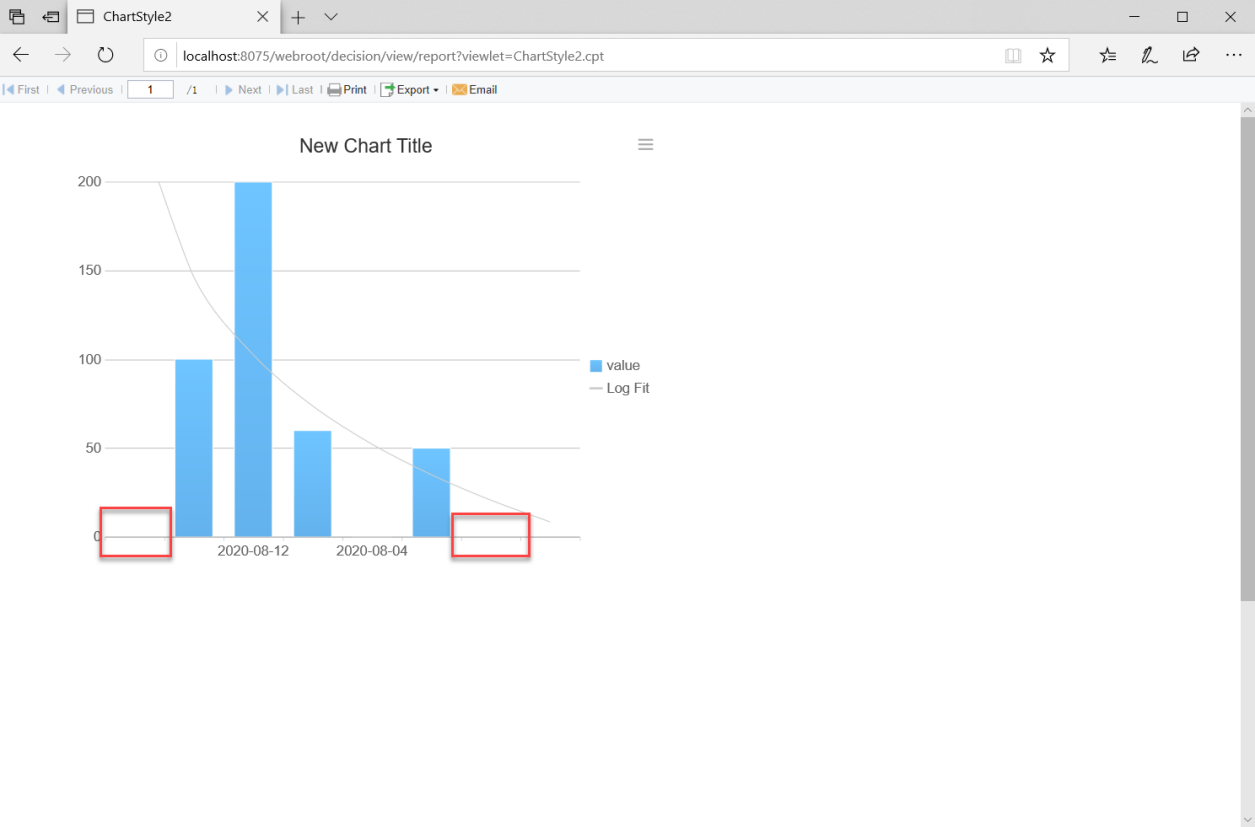
When the horizontal axis is the category axis, the forecast category axis label is left blank.
Select Thick Line, Gray, and Logarithmic Fitting, as shown in the following diagram and the forecast period covers forward by 1 period and backward by 2 periods.
2) The horizontal axis is the time axis or the numeric value axis.
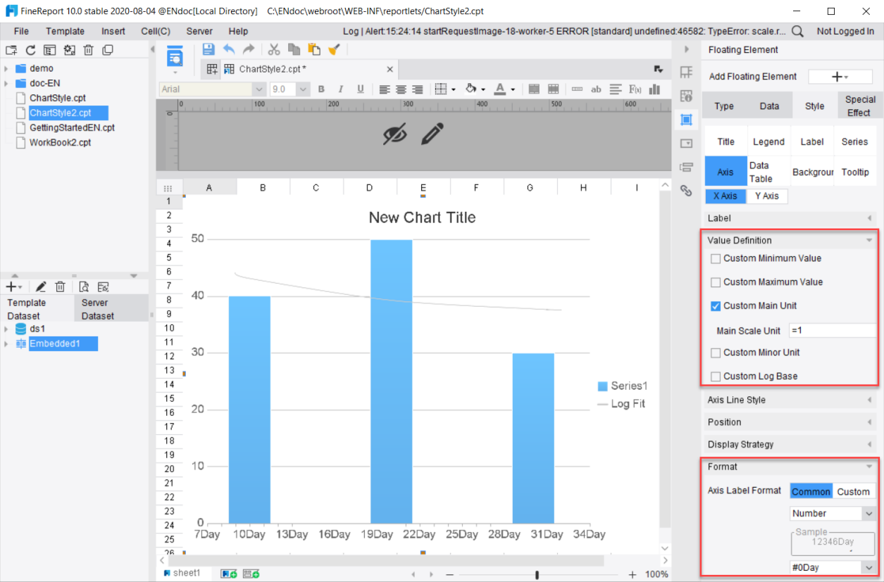
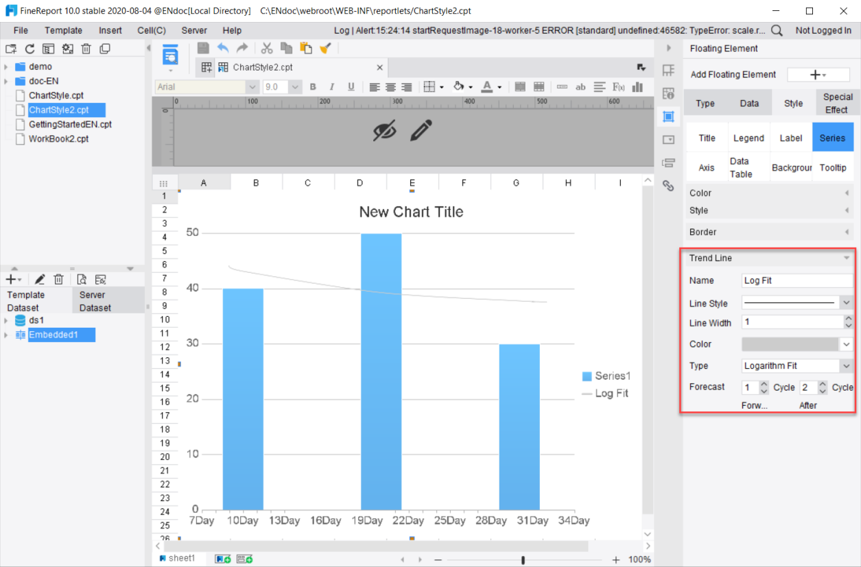
If the horizontal axis is the time axis or the value axis, a forecast period is equal to the value represented by the main unit in the axis value definition. If the period covers forward or backward by n periods, the predicted value of the chart will be pushed forward or backward by n units, and the corresponding axis label values will be displayed.
Take the numeric axis as an example, whose value definition and format are as follows:
Go back to the trend line settings of [Style]>[Series]. Select Thick Line, Gray, and Logarithmic Fitting, as shown in the following diagram, and the forecast period covers forward by 1 period and backward by 2 periods. Save the settings and preview.
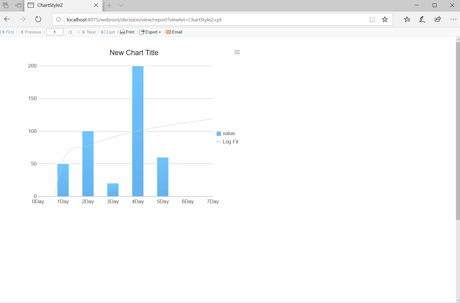
Note: Click on the series legend, the trend line corresponding to the series will be hidden or displayed and the trend line legend will be grayed out or displayed.
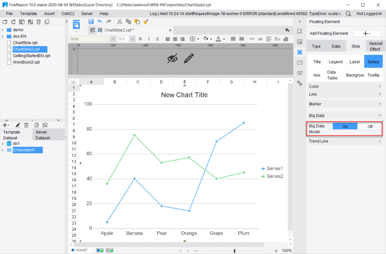
5. Large Data Volume Mode
For large data size reaching a level of ten thousand and above, it takes a long time for the chart to load. In this case, the Large Data Volume Mode can be enabled. Once enabled, the display effect will be optimized and the display speed will be increased by 20 times.
The following charts are provided with Large Data Volume Mode: Line Chart, Area Chart, Scatter Plot, Bubble Chart, Flow Map, Spot Map and Combination Map.
6. Line
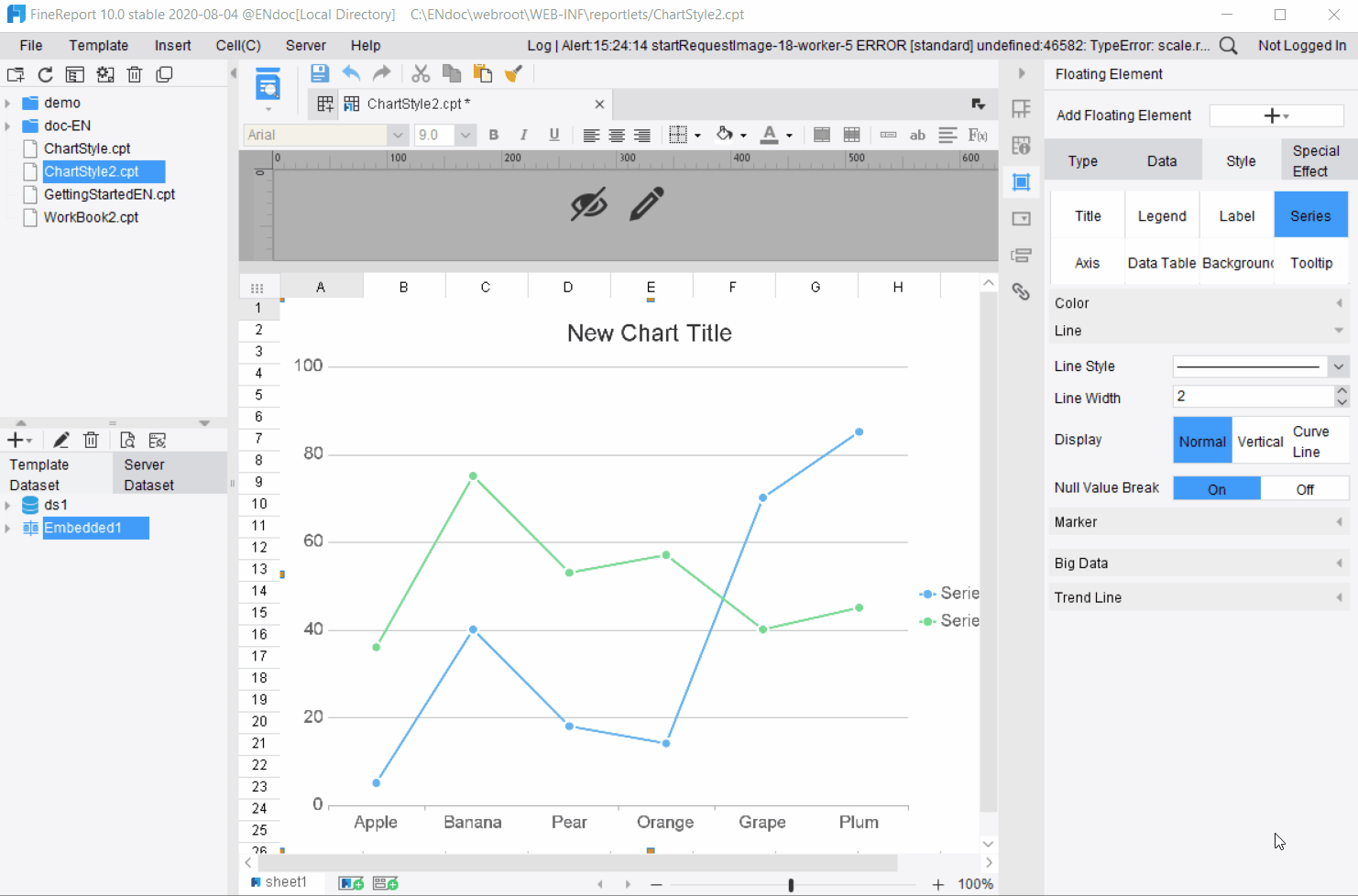
When Line Style is found under Series of a chart, it means that you can set up the attributes of the line style.
Charts with configurable line styles include: Line Chart, Area Chart, Radar Map, Scatter Plot, and Combination Chart. Take Line Chart as an example.
Available settings include:
Line Style: Can be set to solid line or dotted line
Line Width: Set the thickness of the line
Display: Display the lines as Normal, Vertical and Curve Line.
Null Value Break: When enabled, the line will break at markers with empty values.
7. Marker
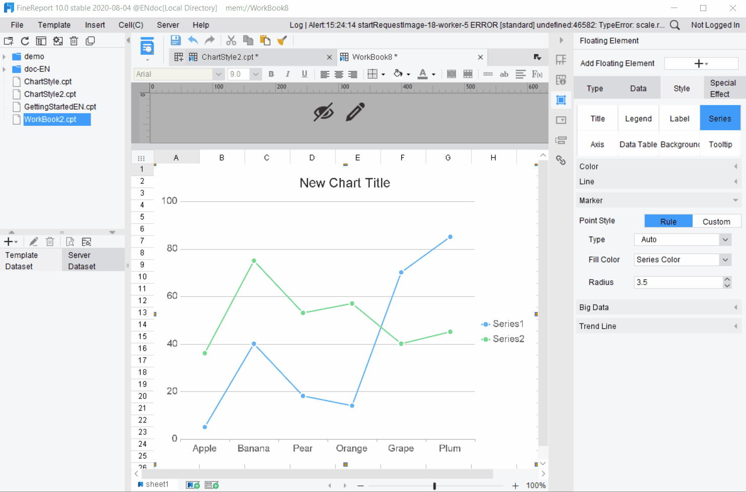
When Marker is found under Series of a chart, it means that you can set up the attribute of the markers.
Charts with configurable markers include: Line Chart, Area Chart, Radar Map, Scatter Plot, and Combination Chart.
Point Style: Select Custom to use filled images as points. When selecting Fill with Image, you can set the width and height of images.
Type: Change the shape of the marker.
Fill Color: Set the color of the marker.
Radius: Adjust the size of the marker.
Charts with configurable markers are different in terms of the marker types, which are described separately below:
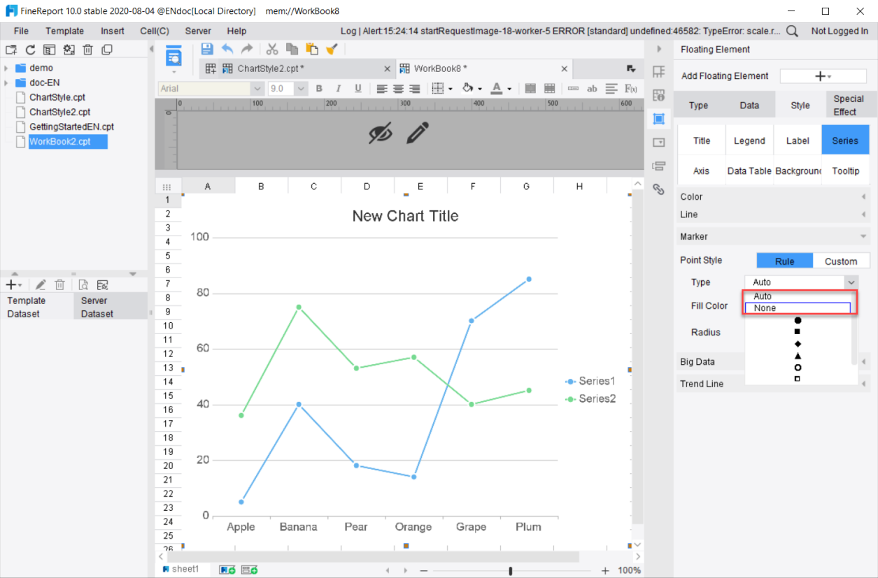
1) Line Chart
Auto: When Auto is selected, a solid circle marker or no marker will be displayed automatically according to the visual design rules.
None: When None is selected, the marker will not be displayed, but the default marker will be displayed when the mouse is hovering over the line chart.
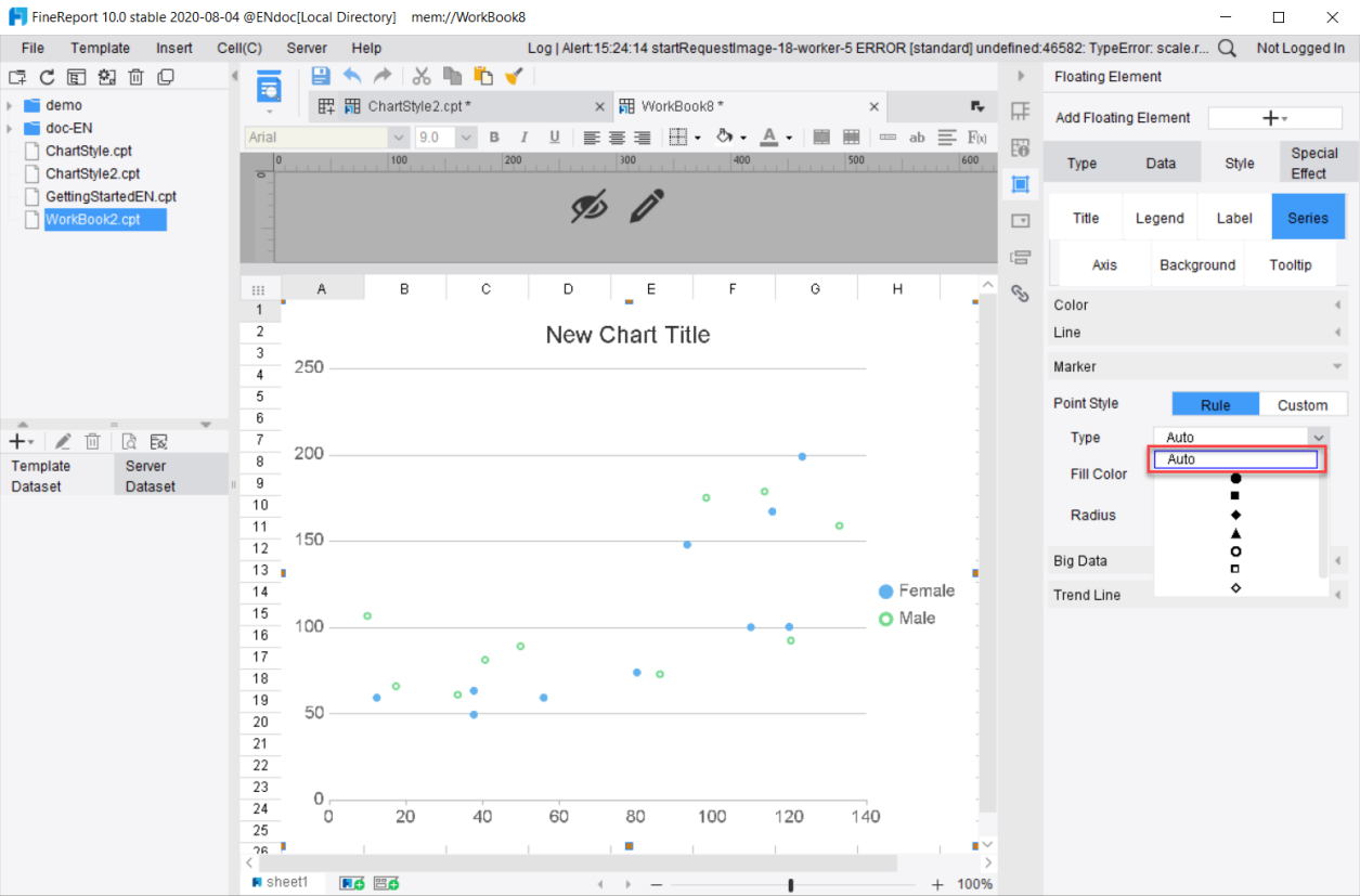
2) Scatter Plot
Auto: When Auto is selected, the conventional built-in marker type will be automatically assigned according to the number of series.
There is no [None] option for the chart.
3) Area Chart, Radar Map
None: When None is selected, the marker will not be displayed on the front end, but the default marker will be displayed when the mouse is hovering over the line chart.
There is no [Auto] option for the chart.
