历史版本3 :ECharts图表复用官方主题 返回文档
编辑时间:
内容长度:图片数:目录数:
修改原因:
1. 概述编辑
1.1 版本说明
| 报表服务器版本 | JAR包版本 |
|---|---|
| 10.0 | 10.0.19 |
1.2 问题描述
使用 ECharts图表插件 的时候,因为初始化的主题不是很美观,自己设置又太麻烦了,那么我们怎么样使用echarts的官方主题呢?
1.3 解决方案
2种方法
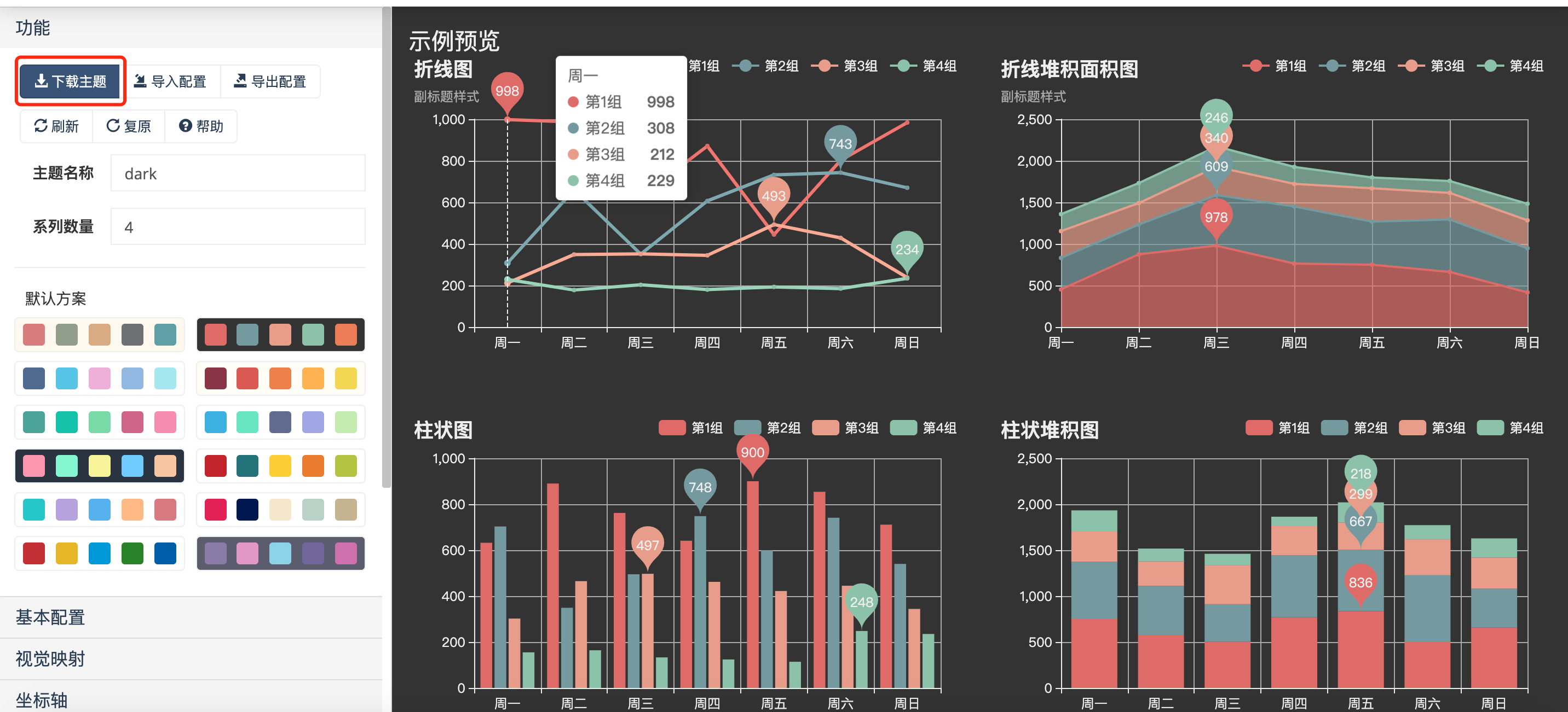
从echarts官网复制自己选择的主题样式 Echarts 主题设置页面,添加到设计器的echarts图表 代码编辑器内实现。
从echarts官网下载自己选择的主题样式 Echarts 主题设置页面,保存到设计器目录内,通过jquery引用实现。
2. 示例编辑
第一种
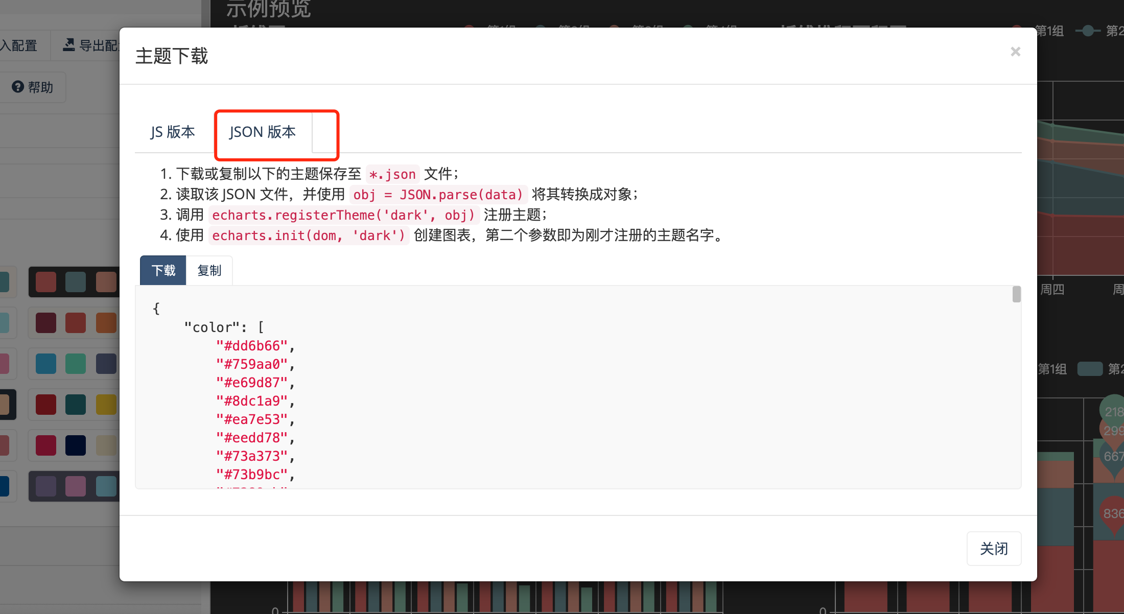
先从 Echarts 主题设置页面 复制 theme 配置。
点击下载主题,选择json版本,点击复制
在代码编辑器内获取dom 并初始化
// 先获取dom节点
var dom = myChart.getDom();
// 重新初始化echarts实例
myChart.dispose();
创建一个 theme的变量接受刚才复制的json配置
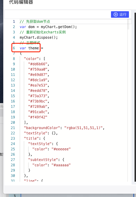
修改自己的option配置
myChart.setOption(option)完整代码
// 先获取dom节点
var dom = myChart.getDom();
// 重新初始化echarts实例
myChart.dispose();
// 主题样式
var theme =
{
"color": [
"#dd6b66",
"#759aa0",
"#e69d87",
"#8dc1a9",
"#ea7e53",
"#eedd78",
"#73a373",
"#73b9bc",
"#7289ab",
"#91ca8c",
"#f49f42"
],
"backgroundColor": "rgba(51,51,51,1)",
"textStyle": {},
"title": {
"textStyle": {
"color": "#eeeeee"
},
"subtextStyle": {
"color": "#aaaaaa"
}
},
"line": {
"itemStyle": {
"borderWidth": 1
},
"lineStyle": {
"width": 2
},
"symbolSize": 4,
"symbol": "circle",
"smooth": false
},
"radar": {
"itemStyle": {
"borderWidth": 1
},
"lineStyle": {
"width": 2
},
"symbolSize": 4,
"symbol": "circle",
"smooth": false
},
"bar": {
"itemStyle": {
"barBorderWidth": 0,
"barBorderColor": "#ccc"
}
},
"pie": {
"itemStyle": {
"borderWidth": 0,
"borderColor": "#ccc"
}
},
"scatter": {
"itemStyle": {
"borderWidth": 0,
"borderColor": "#ccc"
}
},
"boxplot": {
"itemStyle": {
"borderWidth": 0,
"borderColor": "#ccc"
}
},
"parallel": {
"itemStyle": {
"borderWidth": 0,
"borderColor": "#ccc"
}
},
"sankey": {
"itemStyle": {
"borderWidth": 0,
"borderColor": "#ccc"
}
},
"funnel": {
"itemStyle": {
"borderWidth": 0,
"borderColor": "#ccc"
}
},
"gauge": {
"itemStyle": {
"borderWidth": 0,
"borderColor": "#ccc"
}
},
"candlestick": {
"itemStyle": {
"color": "#fd1050",
"color0": "#0cf49b",
"borderColor": "#fd1050",
"borderColor0": "#0cf49b",
"borderWidth": 1
}
},
"graph": {
"itemStyle": {
"borderWidth": 0,
"borderColor": "#ccc"
},
"lineStyle": {
"width": 1,
"color": "#aaa"
},
"symbolSize": 4,
"symbol": "circle",
"smooth": false,
"color": [
"#dd6b66",
"#759aa0",
"#e69d87",
"#8dc1a9",
"#ea7e53",
"#eedd78",
"#73a373",
"#73b9bc",
"#7289ab",
"#91ca8c",
"#f49f42"
],
"label": {
"color": "#eee"
}
},
"map": {
"itemStyle": {
"areaColor": "#eee",
"borderColor": "#444",
"borderWidth": 0.5
},
"label": {
"color": "#000"
},
"emphasis": {
"itemStyle": {
"areaColor": "rgba(255,215,0,0.8)",
"borderColor": "#444",
"borderWidth": 1
},
"label": {
"color": "rgb(100,0,0)"
}
}
},
"geo": {
"itemStyle": {
"areaColor": "#eee",
"borderColor": "#444",
"borderWidth": 0.5
},
"label": {
"color": "#000"
},
"emphasis": {
"itemStyle": {
"areaColor": "rgba(255,215,0,0.8)",
"borderColor": "#444",
"borderWidth": 1
},
"label": {
"color": "rgb(100,0,0)"
}
}
},
"categoryAxis": {
"axisLine": {
"show": true,
"lineStyle": {
"color": "#eeeeee"
}
},
"axisTick": {
"show": true,
"lineStyle": {
"color": "#eeeeee"
}
},
"axisLabel": {
"show": true,
"color": "#eeeeee"
},
"splitLine": {
"show": true,
"lineStyle": {
"color": [
"#aaaaaa"
]
}
},
"splitArea": {
"show": false,
"areaStyle": {
"color": [
"#eeeeee"
]
}
}
},
"valueAxis": {
"axisLine": {
"show": true,
"lineStyle": {
"color": "#eeeeee"
}
},
"axisTick": {
"show": true,
"lineStyle": {
"color": "#eeeeee"
}
},
"axisLabel": {
"show": true,
"color": "#eeeeee"
},
"splitLine": {
"show": true,
"lineStyle": {
"color": [
"#aaaaaa"
]
}
},
"splitArea": {
"show": false,
"areaStyle": {
"color": [
"#eeeeee"
]
}
}
},
"logAxis": {
"axisLine": {
"show": true,
"lineStyle": {
"color": "#eeeeee"
}
},
"axisTick": {
"show": true,
"lineStyle": {
"color": "#eeeeee"
}
},
"axisLabel": {
"show": true,
"color": "#eeeeee"
},
"splitLine": {
"show": true,
"lineStyle": {
"color": [
"#aaaaaa"
]
}
},
"splitArea": {
"show": false,
"areaStyle": {
"color": [
"#eeeeee"
]
}
}
},
"timeAxis": {
"axisLine": {
"show": true,
"lineStyle": {
"color": "#eeeeee"
}
},
"axisTick": {
"show": true,
"lineStyle": {
"color": "#eeeeee"
}
},
"axisLabel": {
"show": true,
"color": "#eeeeee"
},
"splitLine": {
"show": true,
"lineStyle": {
"color": [
"#aaaaaa"
]
}
},
"splitArea": {
"show": false,
"areaStyle": {
"color": [
"#eeeeee"
]
}
}
},
"toolbox": {
"iconStyle": {
"borderColor": "#999"
},
"emphasis": {
"iconStyle": {
"borderColor": "#666"
}
}
},
"legend": {
"textStyle": {
"color": "#eeeeee"
}
},
"tooltip": {
"axisPointer": {
"lineStyle": {
"color": "#eeeeee",
"width": "1"
},
"crossStyle": {
"color": "#eeeeee",
"width": "1"
}
}
},
"timeline": {
"lineStyle": {
"color": "#eeeeee",
"width": 1
},
"itemStyle": {
"color": "#dd6b66",
"borderWidth": 1
},
"controlStyle": {
"color": "#eeeeee",
"borderColor": "#eeeeee",
"borderWidth": 0.5
},
"checkpointStyle": {
"color": "#e43c59",
"borderColor": "#c23531"
},
"label": {
"color": "#eeeeee"
},
"emphasis": {
"itemStyle": {
"color": "#a9334c"
},
"controlStyle": {
"color": "#eeeeee",
"borderColor": "#eeeeee",
"borderWidth": 0.5
},
"label": {
"color": "#eeeeee"
}
}
},
"visualMap": {
"color": [
"#bf444c",
"#d88273",
"#f6efa6"
]
},
"dataZoom": {
"backgroundColor": "rgba(47,69,84,0)",
"dataBackgroundColor": "rgba(255,255,255,0.3)",
"fillerColor": "rgba(167,183,204,0.4)",
"handleColor": "#a7b7cc",
"handleSize": "100%",
"textStyle": {
"color": "#eeeeee"
}
},
"markPoint": {
"label": {
"color": "#eee"
},
"emphasis": {
"label": {
"color": "#eee"
}
}
}
};
myChart = echarts.init(dom, theme);
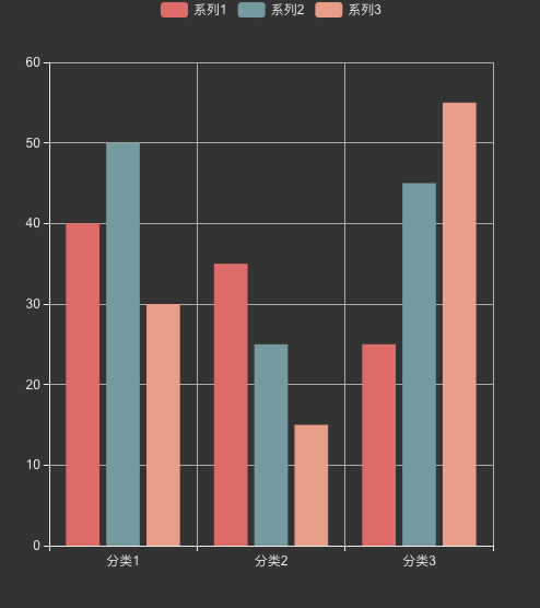
var TABLE_DATA = [
["分类名", "系列1", "系列2", "系列3"],
["分类1", "40", "50", "30"],
["分类2", "35", "25", "15"],
["分类3", "25", "45", "55"],
];
var option = {
legend: {},
tooltip: {},
dataset: {
// 提供一份数据。
source: TABLE_DATA,
},
// 声明一个 X 轴,类目轴(category)。默认情况下,类目轴对应到 dataset 第一列。
xAxis: { type: "category" },
// 声明一个 Y 轴,数值轴。
yAxis: {},
// 声明多个 bar 系列,默认情况下,每个系列会自动对应到 dataset 的每一列。
series: [{ type: "bar" }, { type: "bar" }, { type: "bar" }],
};
myChart.setOption(option);
第二种
先从 Echarts 主题设置页面 下载 theme 配置。

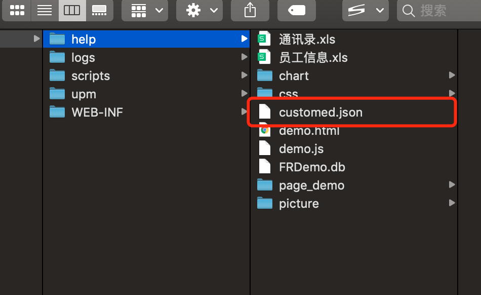
存放到设计器目录内/webroot/help
在echarts代码编辑器内输入代码
$.getJSON('/webroot/help/customed.json', function (themeJSON) {
  // 先获取dom节点
  var dom = myChart.getDom();
  // 重新初始化echarts实例
  myChart.dispose();
  echarts.registerTheme('custom', themeJSON);
  myChart = echarts.init(dom, 'custom');
  var TABLE_DATA = [
    ["分类名", "系列1", "系列2", "系列3"],
    ["分类1", "40", "50", "30"],
    ["分类2", "35", "25", "15"],
    ["分类3", "25", "45", "55"],
  ];
  var option = {
    legend: {},
    tooltip: {},
    dataset: {
      // 提供一份数据。
      source: TABLE_DATA,
    },
    // 声明一个 X 轴,类目轴(category)。默认情况下,类目轴对应到 dataset 第一列。
    xAxis: { type: "category" },
    // 声明一个 Y 轴,数值轴。
    yAxis: {},
    // 声明多个 bar 系列,默认情况下,每个系列会自动对应到 dataset 的每一列。
    series: [{ type: "bar" }, { type: "bar" }, { type: "bar" }],
  };
  myChart.setOption(option);
});
2.1 效果预览
注:frm、cpt均可使用,第二种方法代码编辑器运行的时候看不见