Overview编辑
Application Scenario
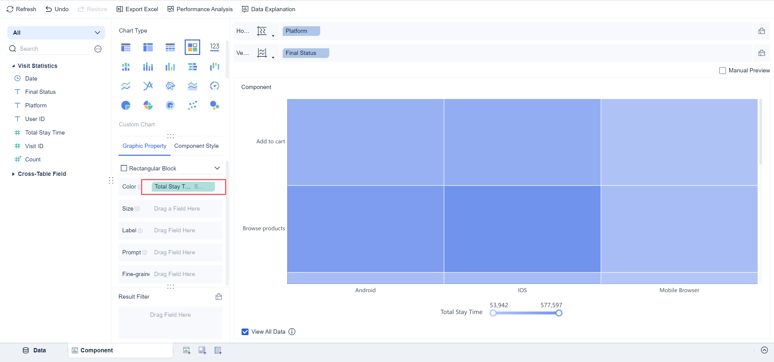
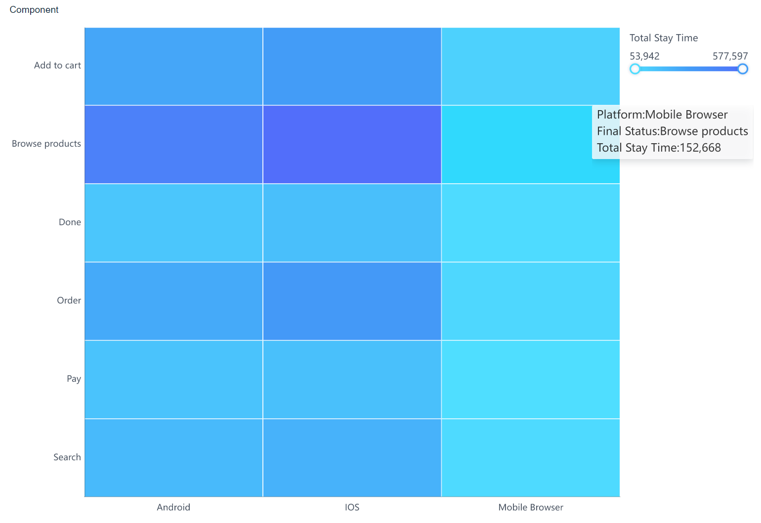
Rectangular block charts display the distribution of different data points in the form of rectangular blocks. The charts use color or block size to represent the corresponding indicator values. For example, rectangular block charts are used to display the distribution of access time for different platforms and statuses, as shown in the following figure. The longer the access time, the darker the color of the charts.

Function Description
It is evident to view which status users have spent the longest time on different platforms.
Procedure编辑
Data Preparation
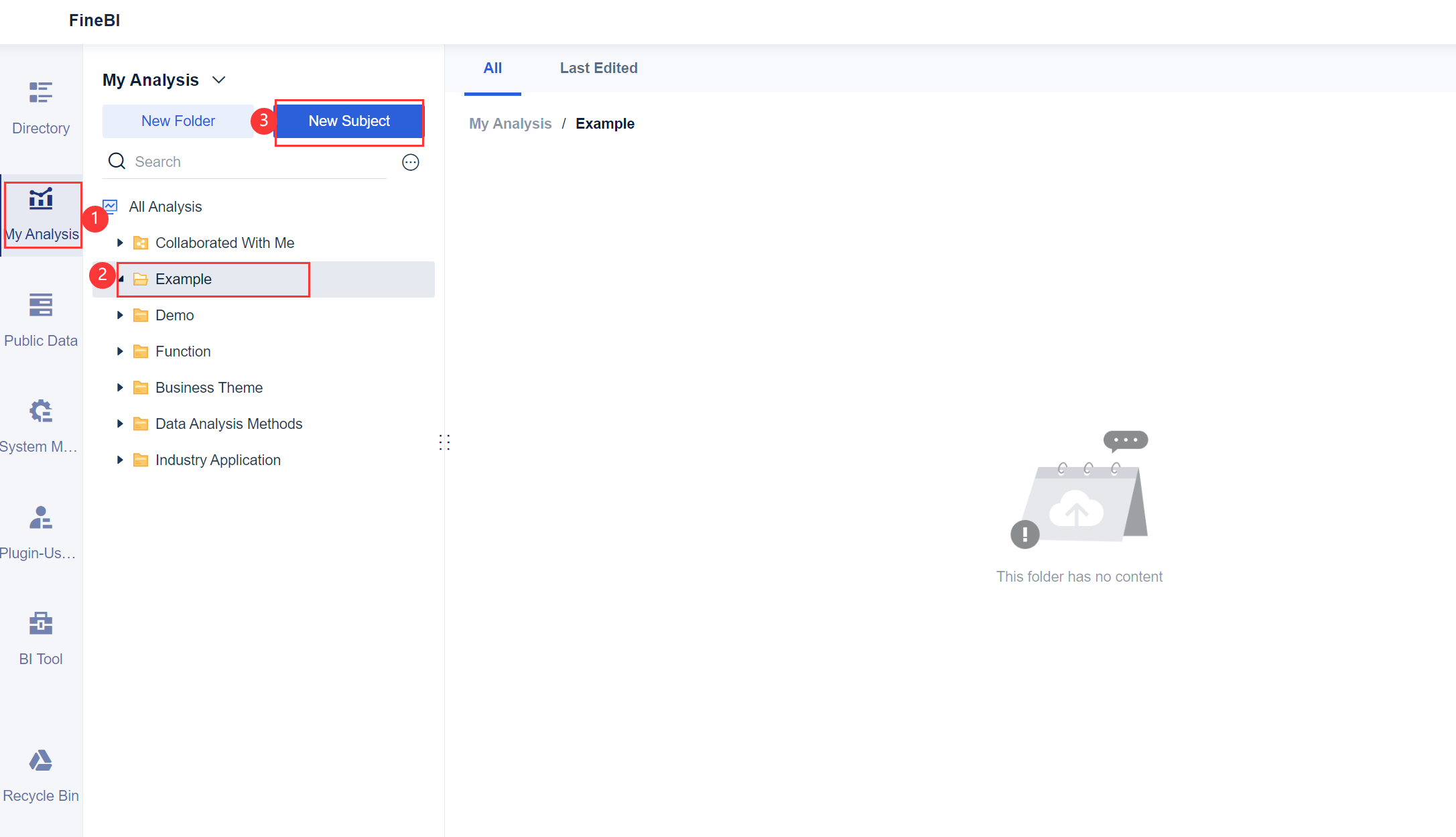
1. Log in to the system as the admin, click My Analysis, select a folder, and click New Subject, as shown in the following figure.
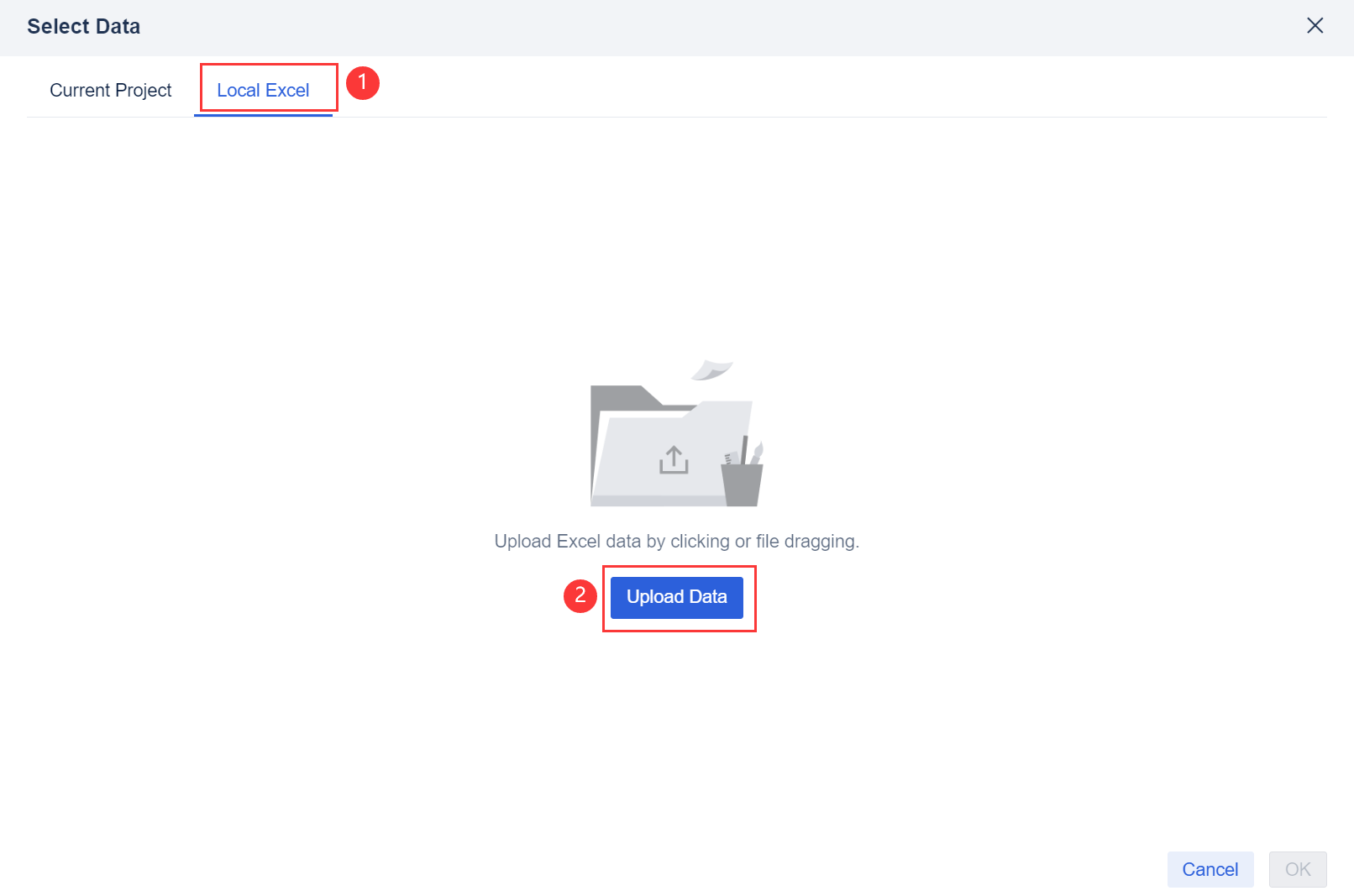
2. Click Local Excel and click Upload Data, as shown in the following figure.
You can download the example data. Visit Statistics.xlsx
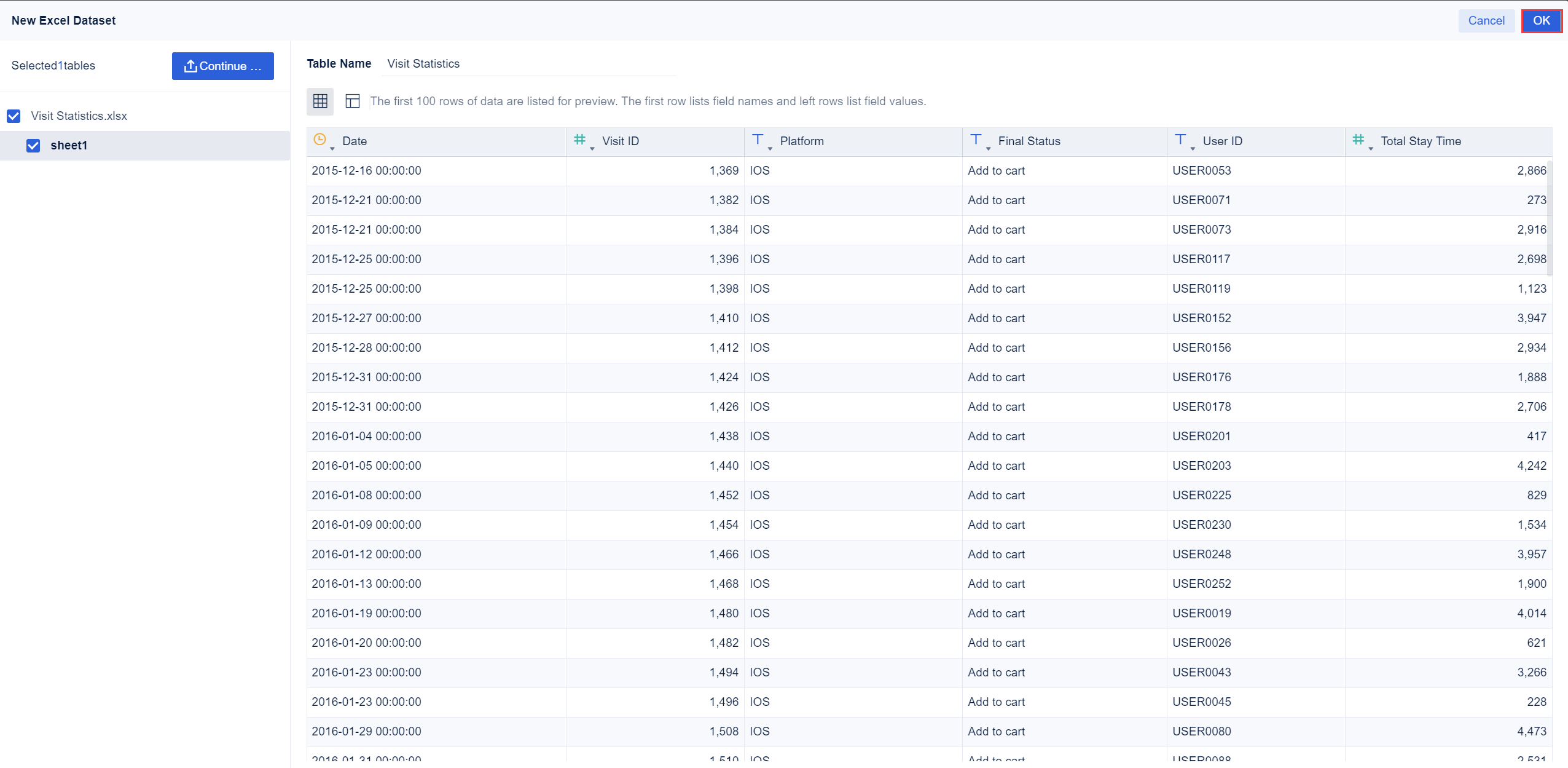
3. After the data is uploaded, click OK.
Component Creation
Click Component in the lower left corner.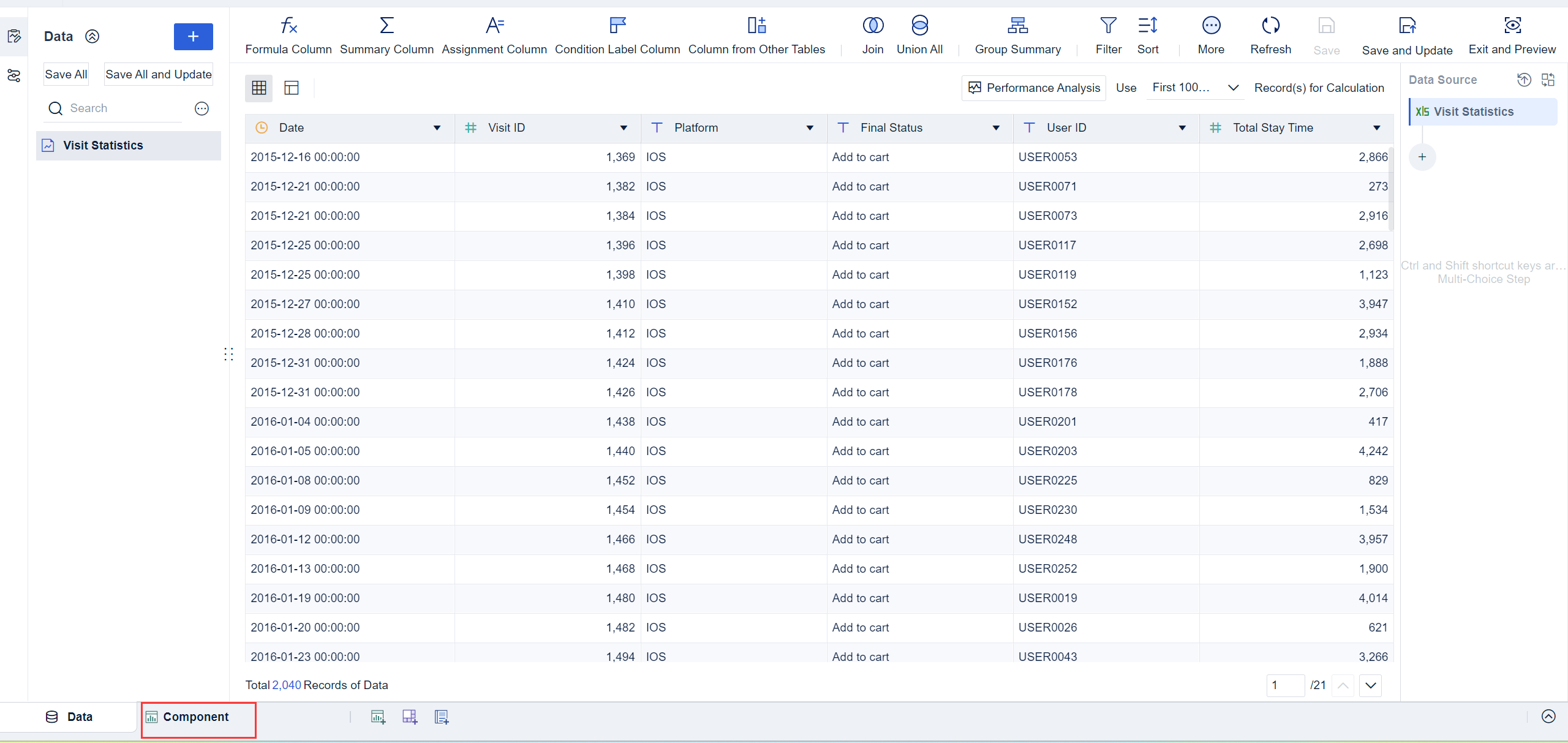
Chart Generation
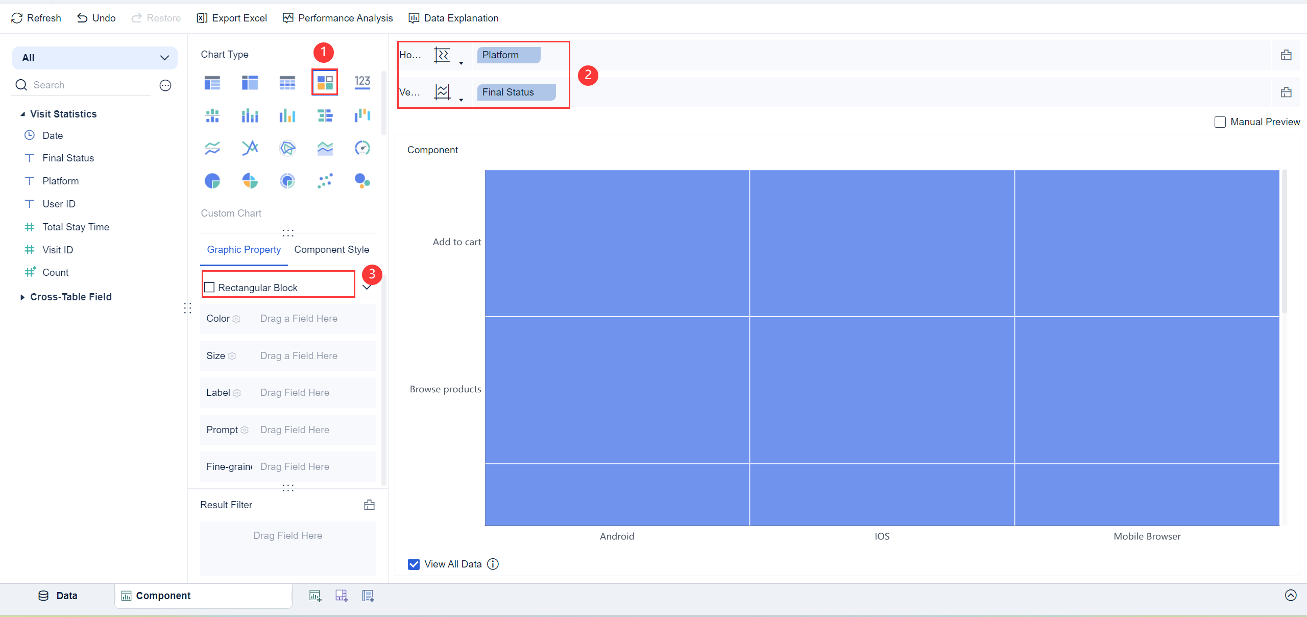
Create a rectangular block chart through the custom chart.
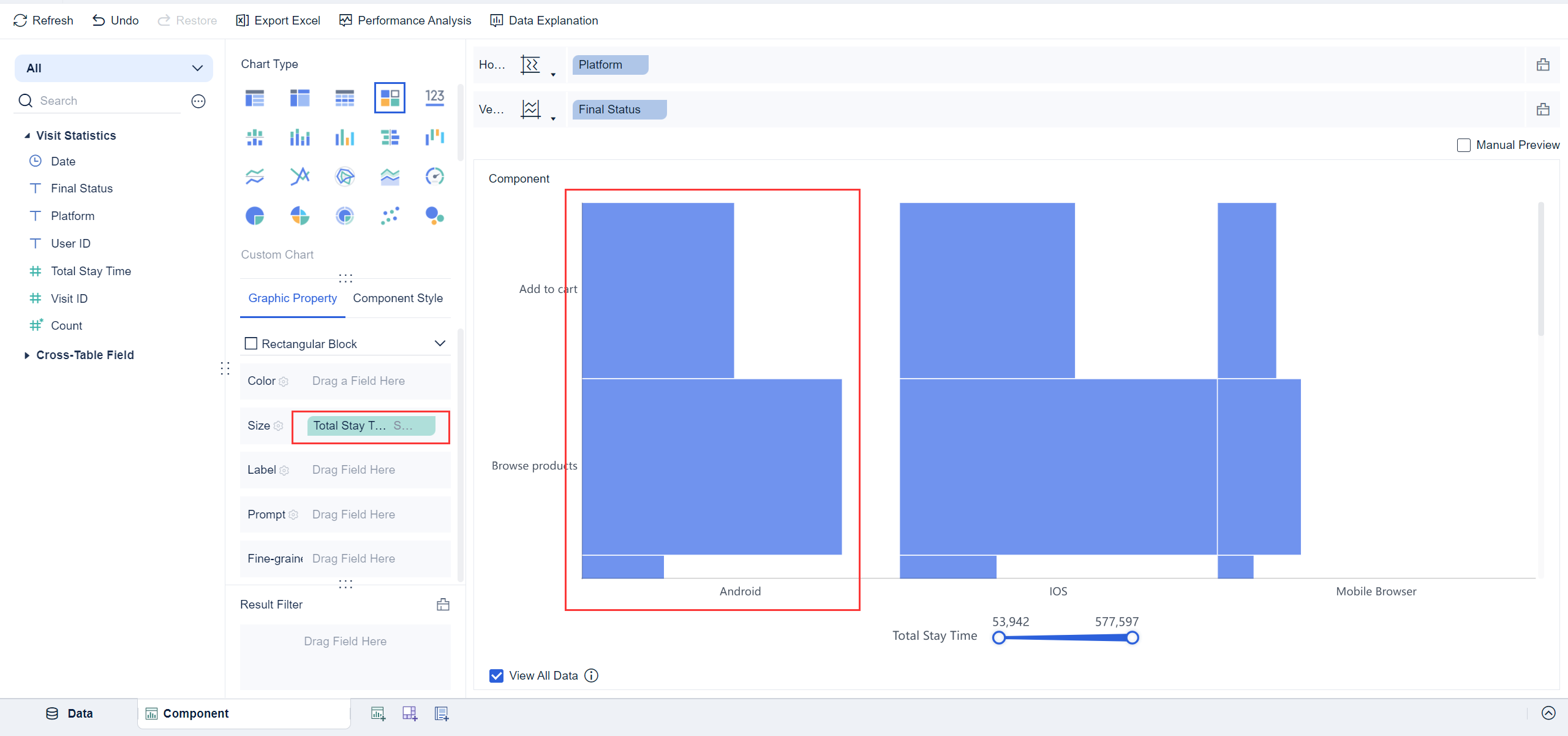
1. Click the Custom Chart icon in Chart Type and select Rectangular Block from the drop-down list in Graphic Property. Drag the Platform field into the Horizontal Axis and the Final Status field into the Vertical Axis, as shown in the following figure.
2. Rectangular blocks appear in the chart preview, but the distribution of the rectangular block in final status and the access time on the platform are not displayed. Therefore, you need to drag the Total Stay Time field into the Color bar of Graphic Property to indicate that the color in the chart is displayed according to the stay time.
 Note:
Note:
Component Beautifying
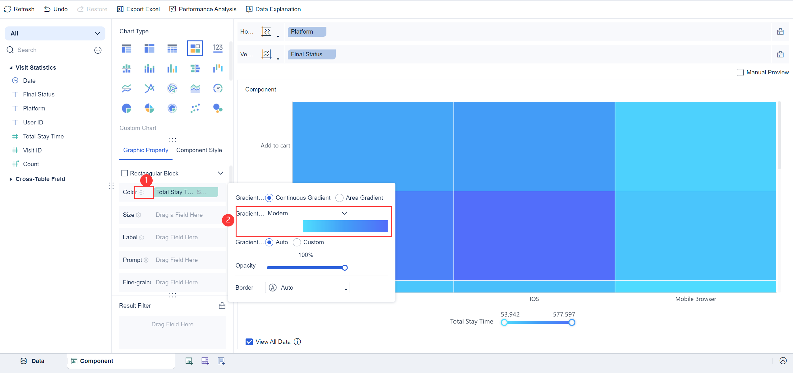
Click the icon ![]() of the Color bar in Graphic Property and set the Gradient Solution to Modern, as shown in the following figure.
of the Color bar in Graphic Property and set the Gradient Solution to Modern, as shown in the following figure.
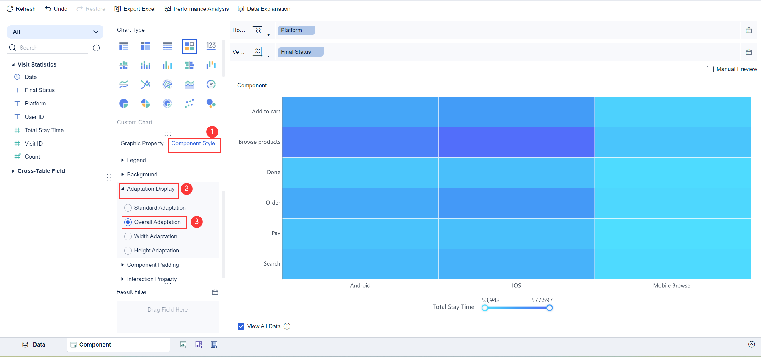
Click Adaptation Display in Component Style and select Overall Adaptation to view the overall effect of the created rectangular block chart in the chart preview, as shown in the following figure.
 Note:
Note:
Effect Display
On PC
On Mobile Terminals
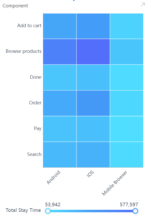
The following figure shows the preview effect on the DataAnalyst app and in HTML5.
Other Scenarios编辑
Field Exchange
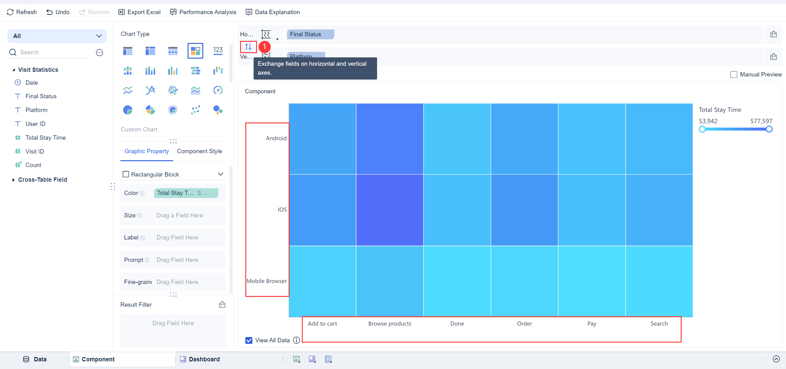
You can exchange the fields of horizontal and vertical axes by clicking ![]() . The effect preview is as follows.
. The effect preview is as follows.
Multiple Dimensions/Indicators
You can drag multiple fields into horizontal and vertical axes to display the data with multiple dimensions and indicators.
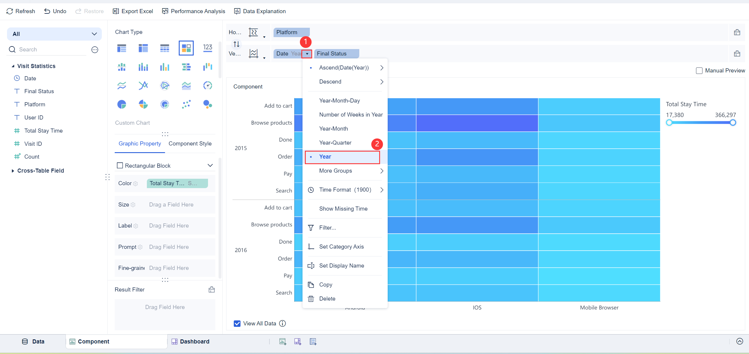
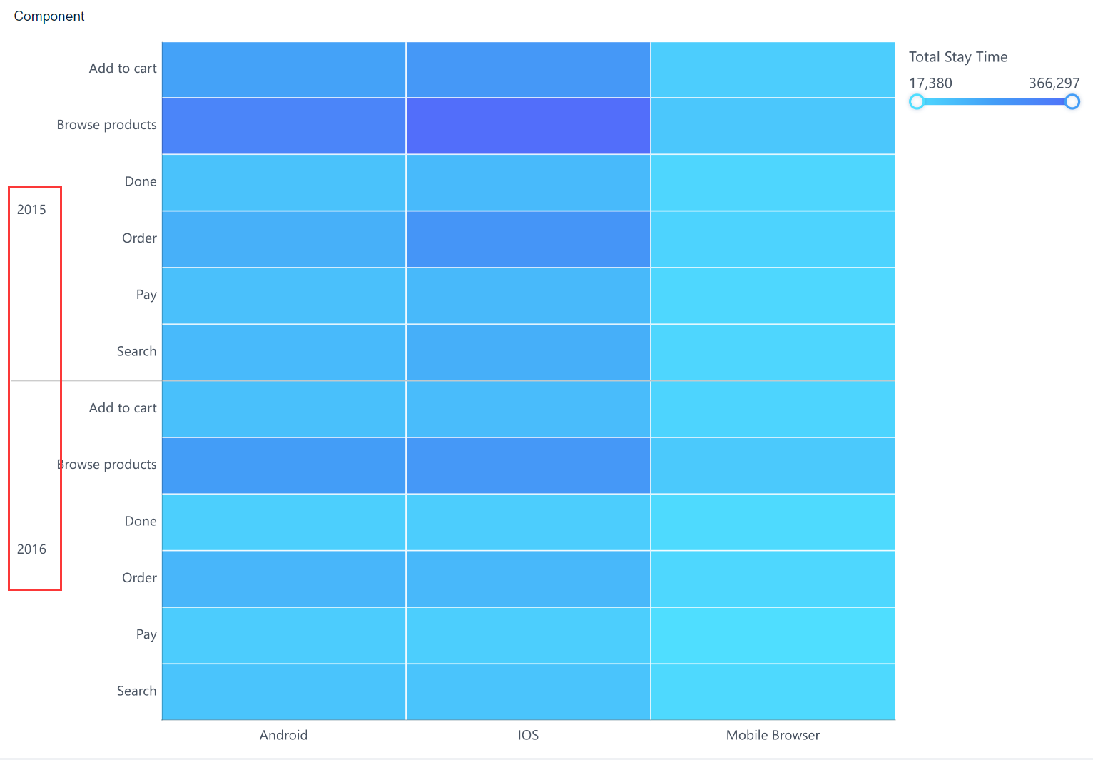
For example, if you want to display the distribution by year, you can drag the Date field into the position before the Final Status field, and click the icon ![]() to group the field by Year.
to group the field by Year.
The preview effect is shown in the following figure.
