目录:
- I. An Overview of Marimekko Chart
- II. Steps to Create a Marimekko Chart
- Other Scenarios
- III. A Conclusion of Marimekko Chart
- In conclusion, the Marimekko Chart stands out as a robust tool for visualizing complex data sets in a clear and structured manner. By allowing for the simultaneous representation of different data categories with variable dimensions, this chart type aids in highlighting significant trends and disparities across datasets. Its application across business analytics aids in enhancing strategic decision-making by offering a comprehensive view of data interactions and distributions. This visualization technique is thus invaluable for detailed analysis and presentation in various professional contexts.
I. An Overview of Marimekko Chart编辑
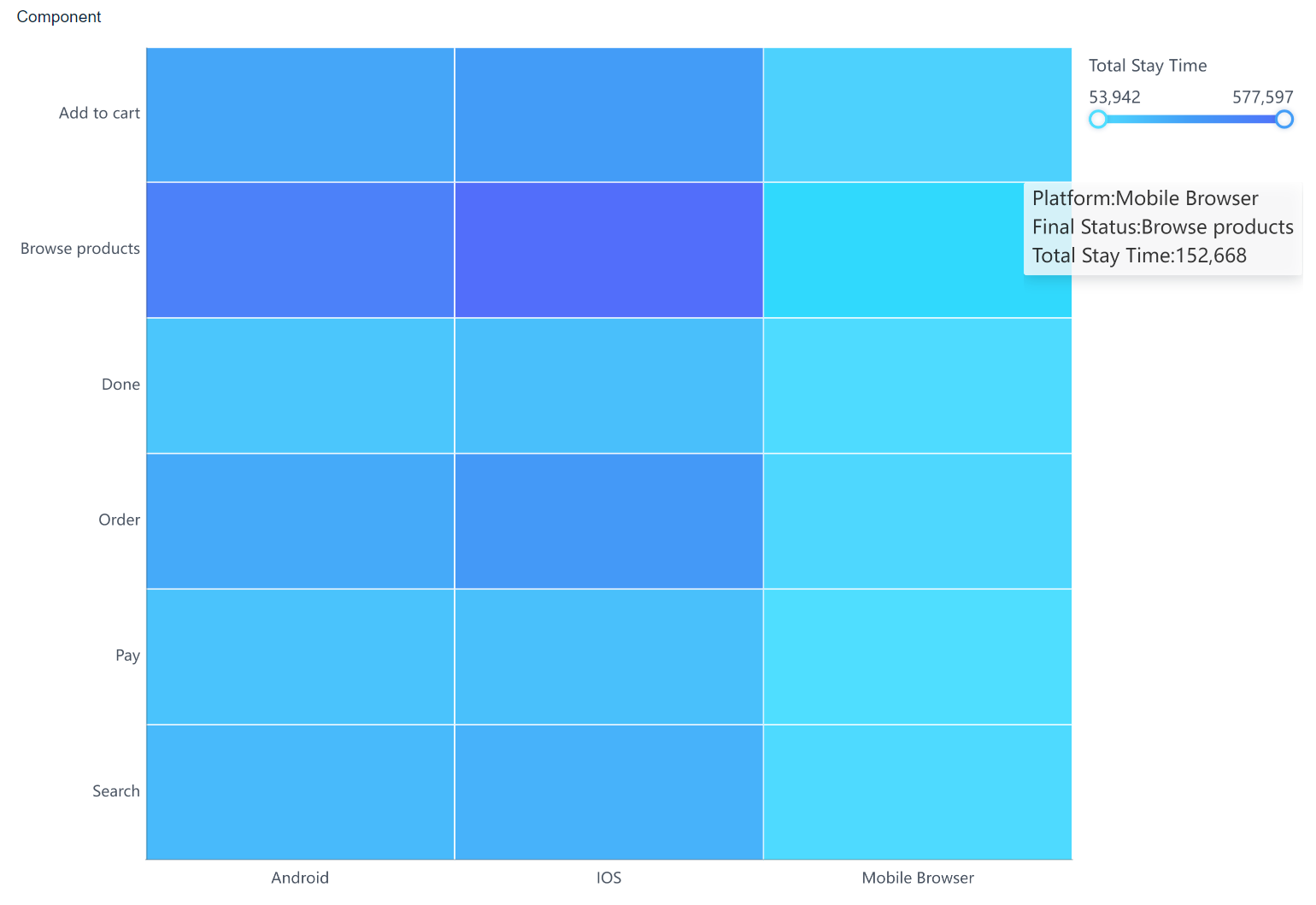
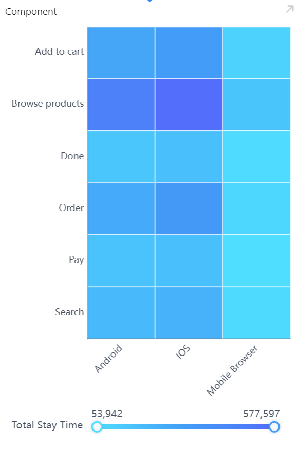
1) Marimekko Chart, also known as Mosaic Chart, is a valuable data visualization tool that represents different categories of data through varying widths and heights of its segments. This chart is crucial for providing a comprehensive view of the data, showing both the size of each segment relative to the whole and across different categories simultaneously. As illustrated in the diagram, the duration of visitation correlates positively with the depth of color in the chart.
2) In the workplace, Marimekko Charts are instrumental in strategic planning and analysis, helping stakeholders quickly discern the distribution and impact of various segments within a market or organization. Their use promotes better understanding and decision-making by highlighting critical areas of interest and potential growth opportunities within complex data sets.
3) Related Articles:Data Integration in Chart Visualizations、Comprehensive Chart Design Elements、Dynamic Chart Interactivity Features
II. Steps to Create a Marimekko Chart编辑
Data Preparation
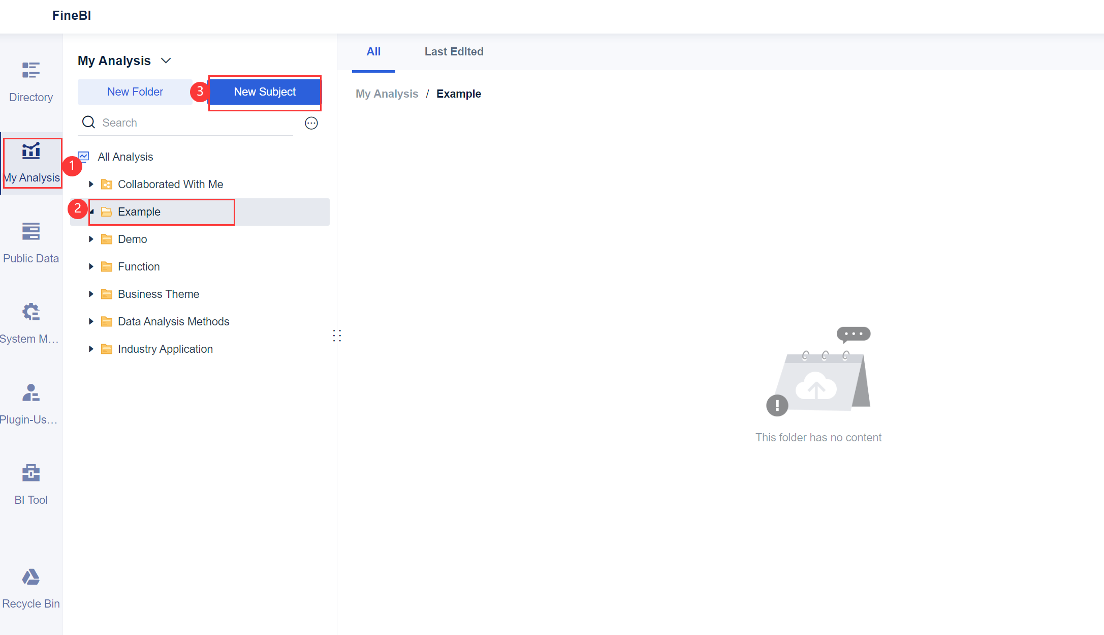
1. Log in to the system as the admin, click My Analysis, select a folder, and click New Subject, as shown in the following figure.
2. Click Local Excel and click Upload Data, as shown in the following figure.
You can download the example data. Visit Statistics.xlsx
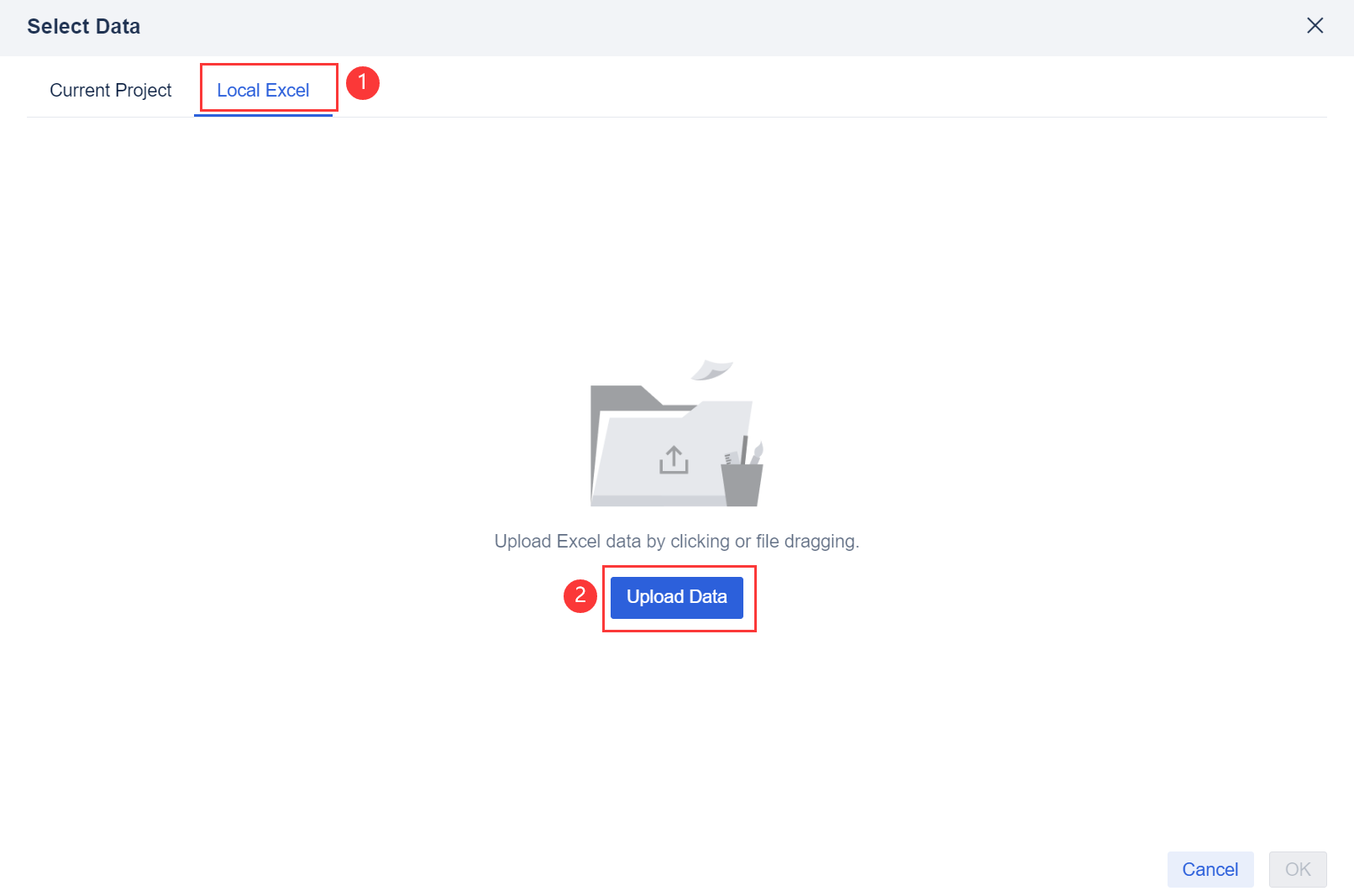
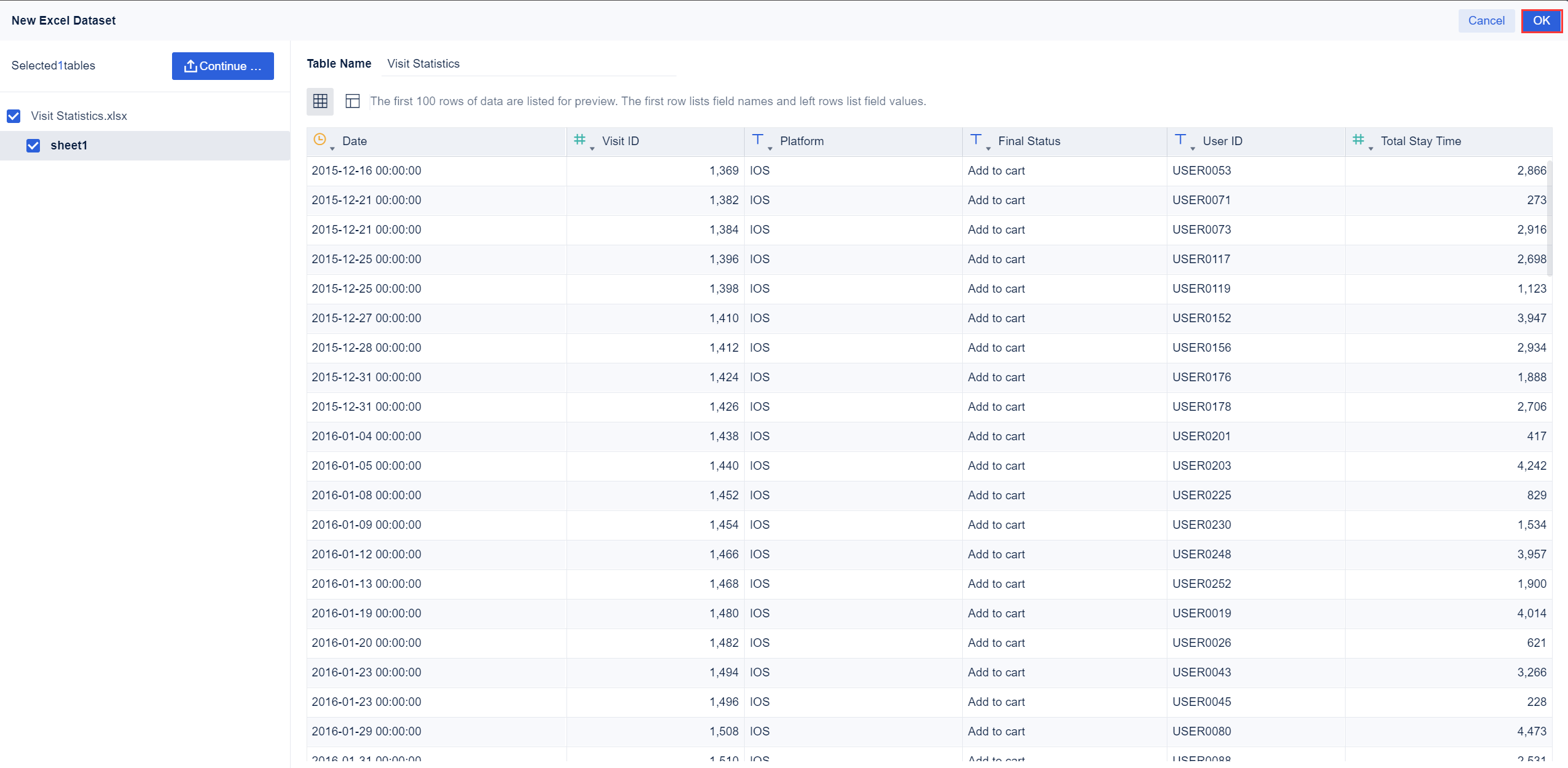
3. After the data is uploaded, click OK.
Component Creation
Click Component in the lower left corner.
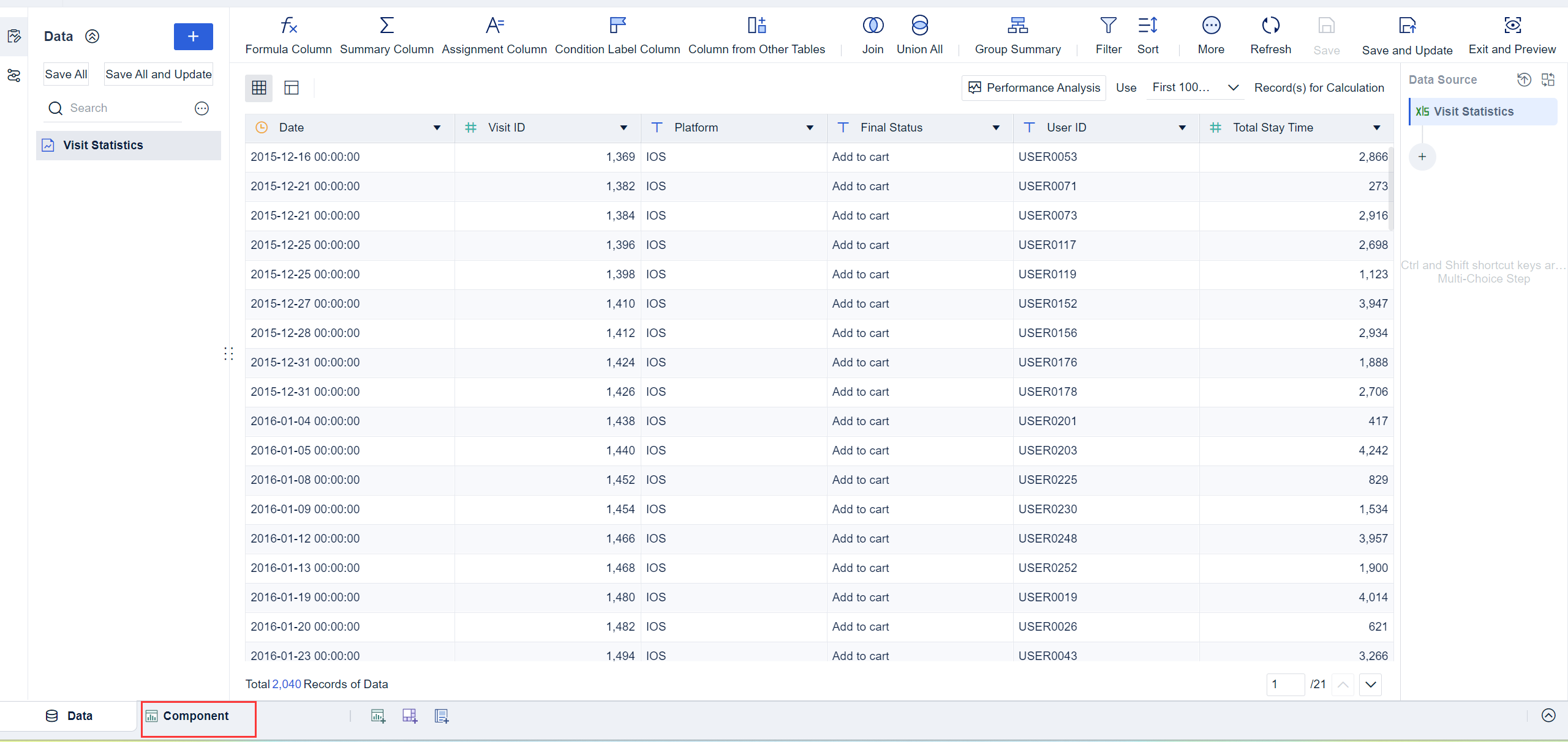
Chart Generation
Create a rectangular block chart through the custom chart.
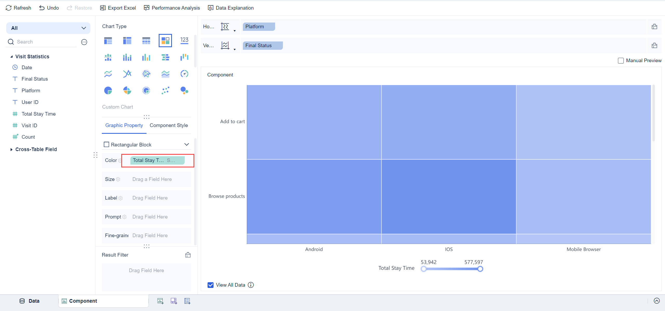
1. Click the Custom Chart icon in Chart Type and select Rectangular Block from the drop-down list in Graphic Property. Drag the Platform field into the Horizontal Axis and the Final Status field into the Vertical Axis, as shown in the following figure.
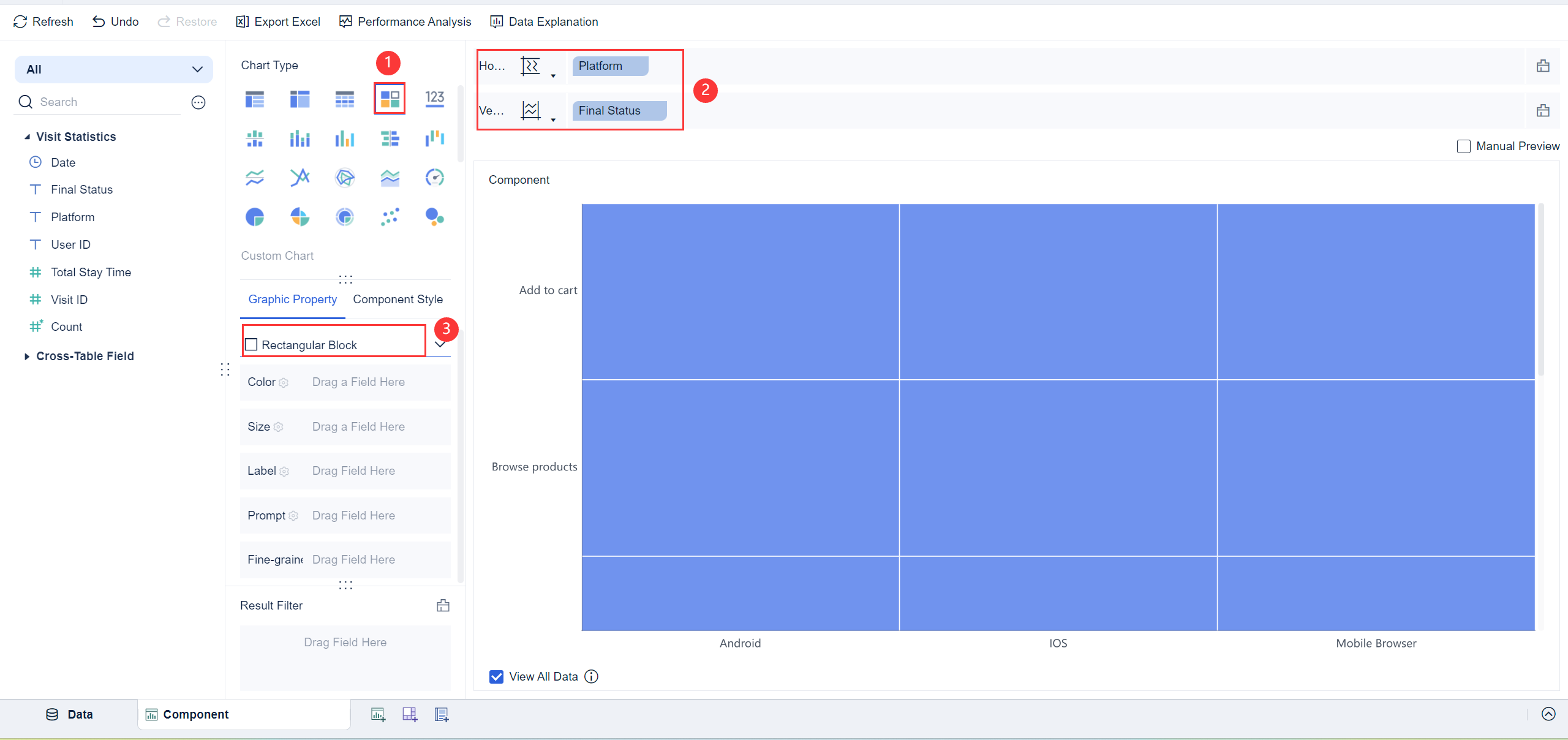
2. Rectangular blocks appear in the chart preview, but the distribution of the rectangular block in final status and the access time on the platform are not displayed. Therefore, you need to drag the Total Stay Time field into the Color bar of Graphic Property to indicate that the color in the chart is displayed according to the stay time.
 Note:
Note: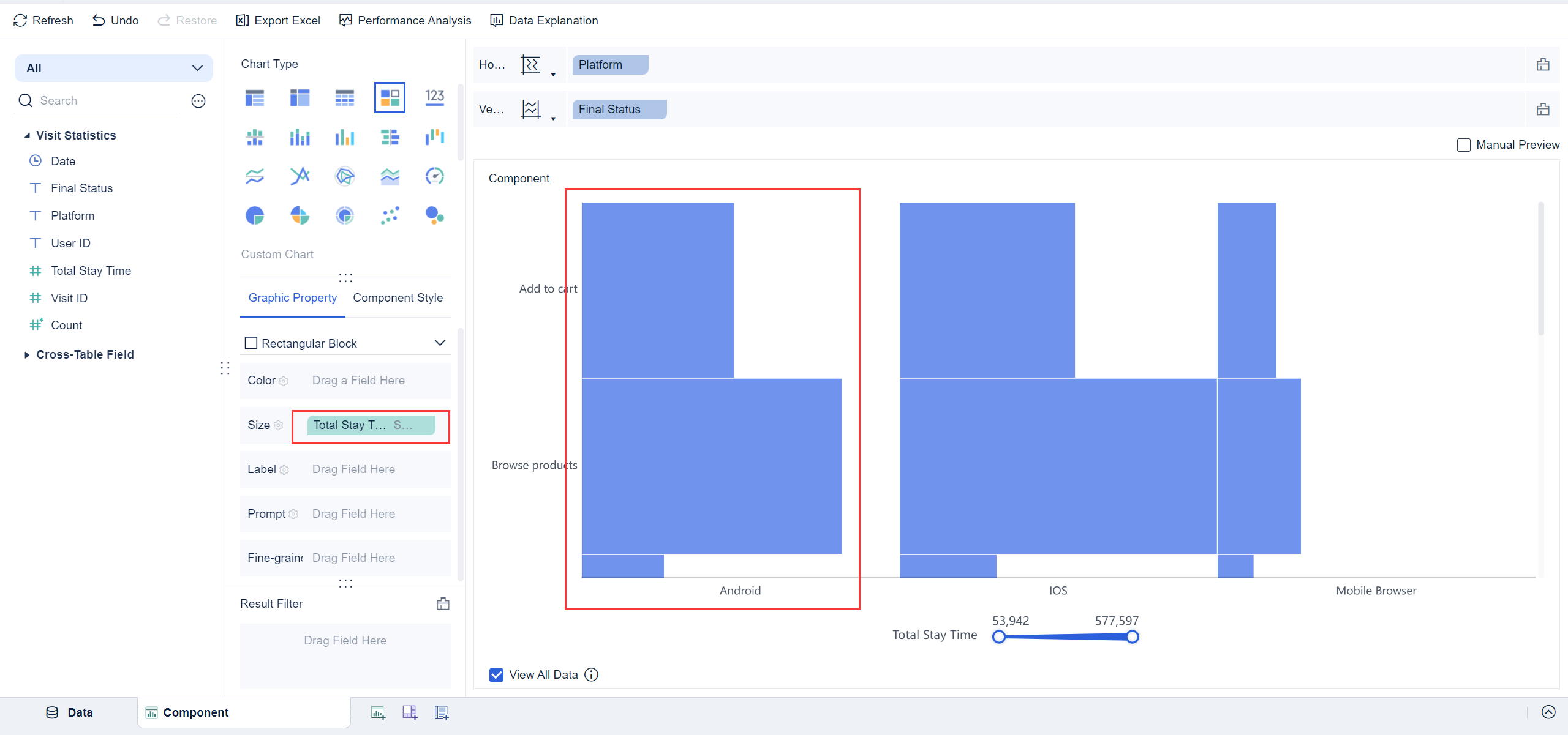
Component Beautifying
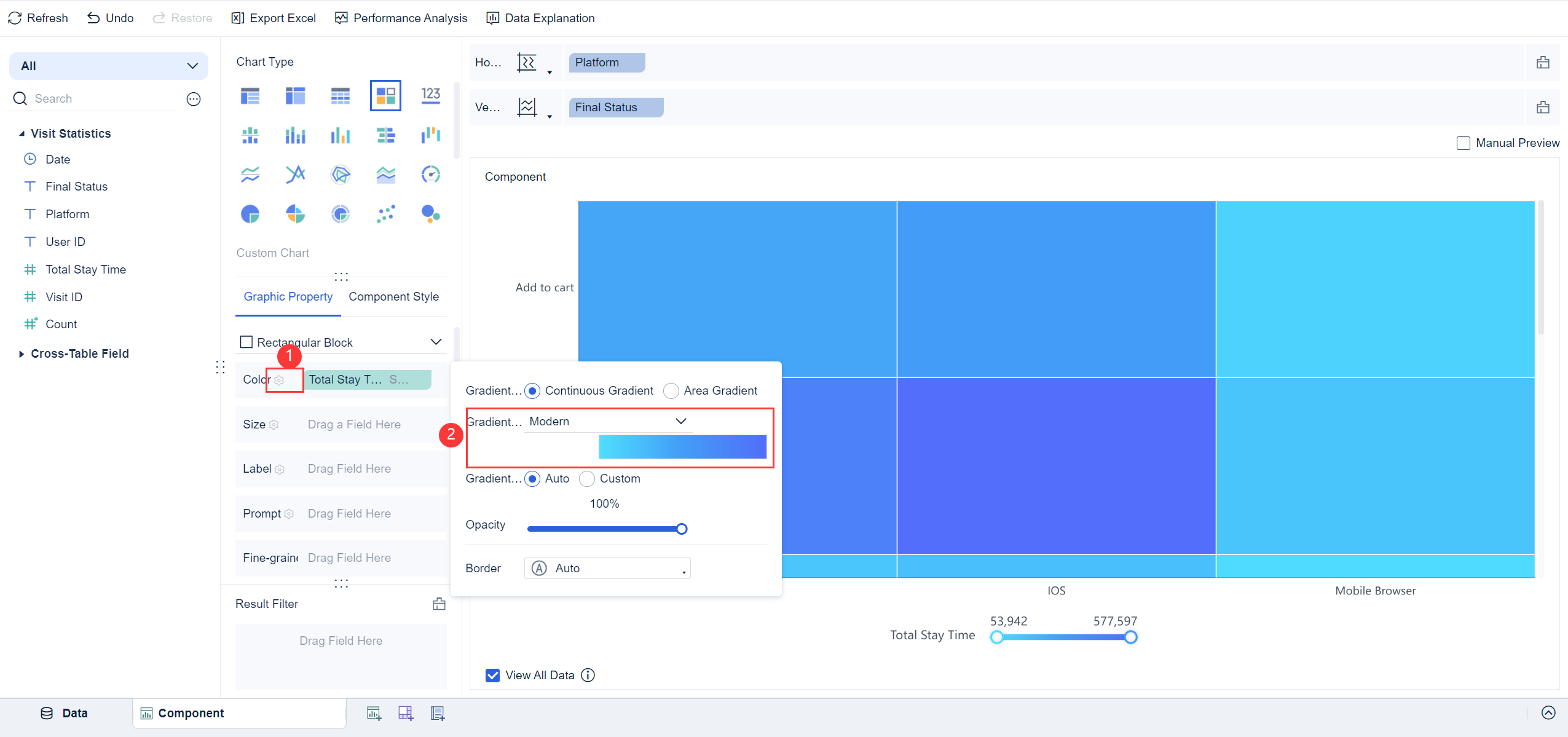
Click the icon ![]() of the Color bar in Graphic Property and set the Gradient Solution to Modern, as shown in the following figure.
of the Color bar in Graphic Property and set the Gradient Solution to Modern, as shown in the following figure.
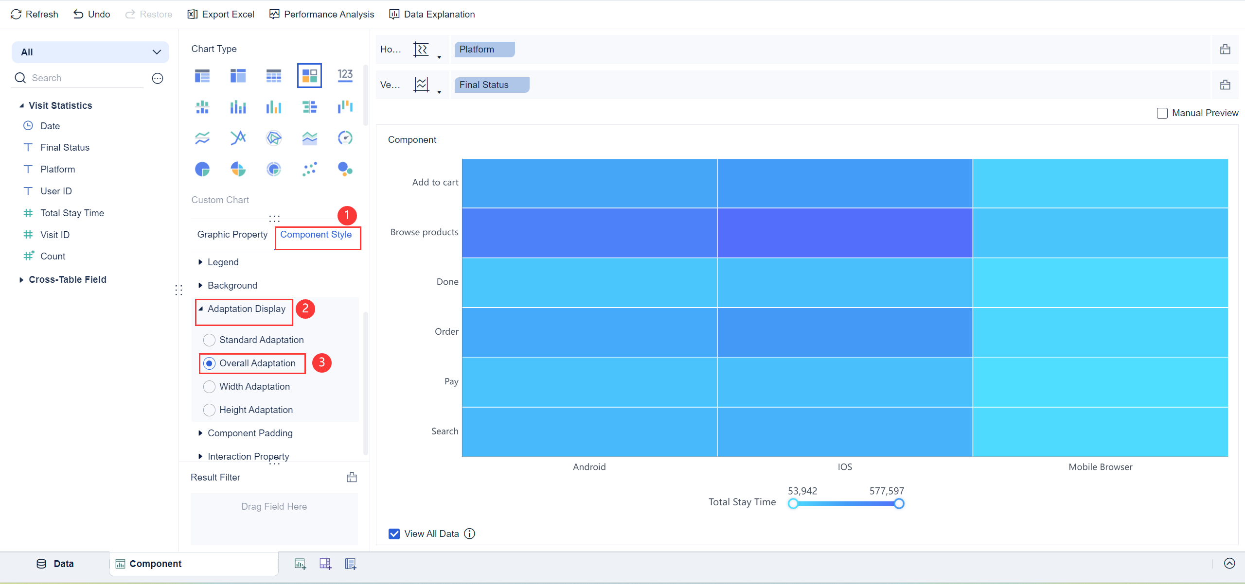
Click Adaptation Display in Component Style and select Overall Adaptation to view the overall effect of the created rectangular block chart in the chart preview, as shown in the following figure.
 Note:
Note:Effect Display
On PC

On Mobile Terminals
The following figure shows the preview effect on the DataAnalyst app and in HTML5.
Other Scenarios编辑
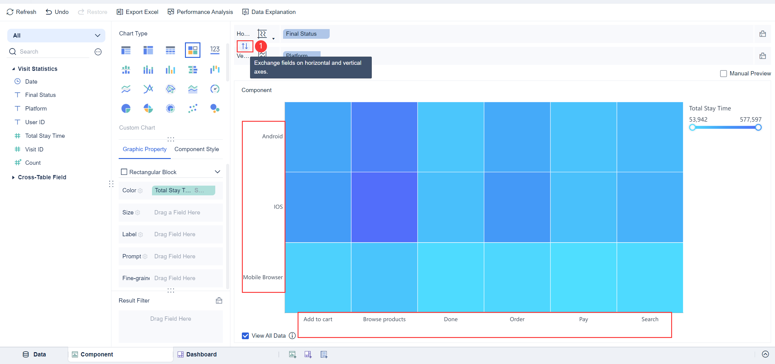
Field Exchange
You can exchange the fields of horizontal and vertical axes by clicking ![]() . The effect preview is as follows.
. The effect preview is as follows.
Multiple Dimensions/Indicators
You can drag multiple fields into horizontal and vertical axes to display the data with multiple dimensions and indicators.
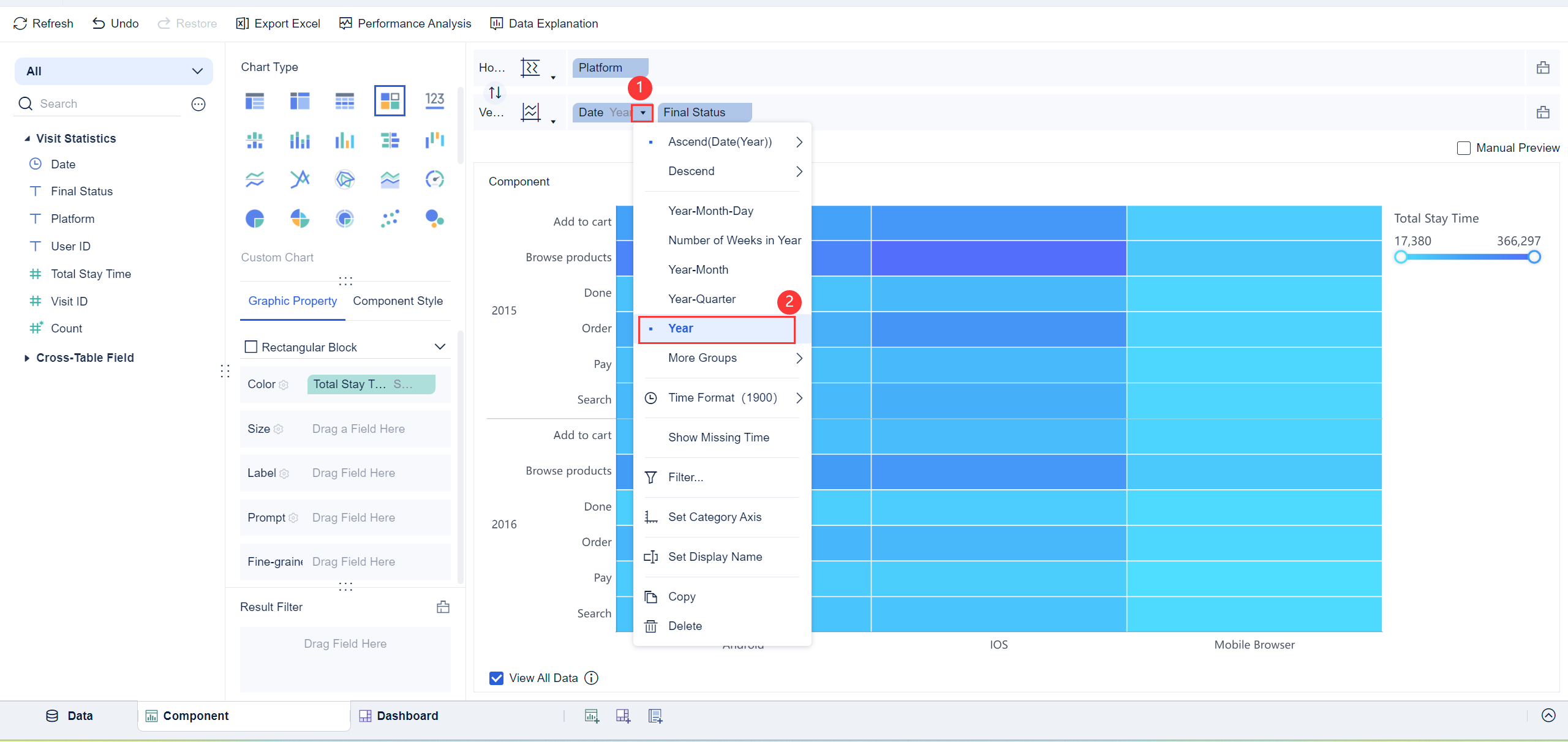
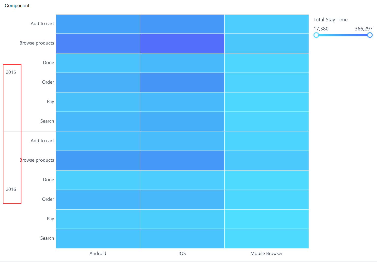
For example, if you want to display the distribution by year, you can drag the Date field into the position before the Final Status field, and click the icon ![]() to group the field by Year.
to group the field by Year.
The preview effect is shown in the following figure.
