Overview编辑
Version
FineBI Version | Functional Change |
6.0 | / |
Application Scenario
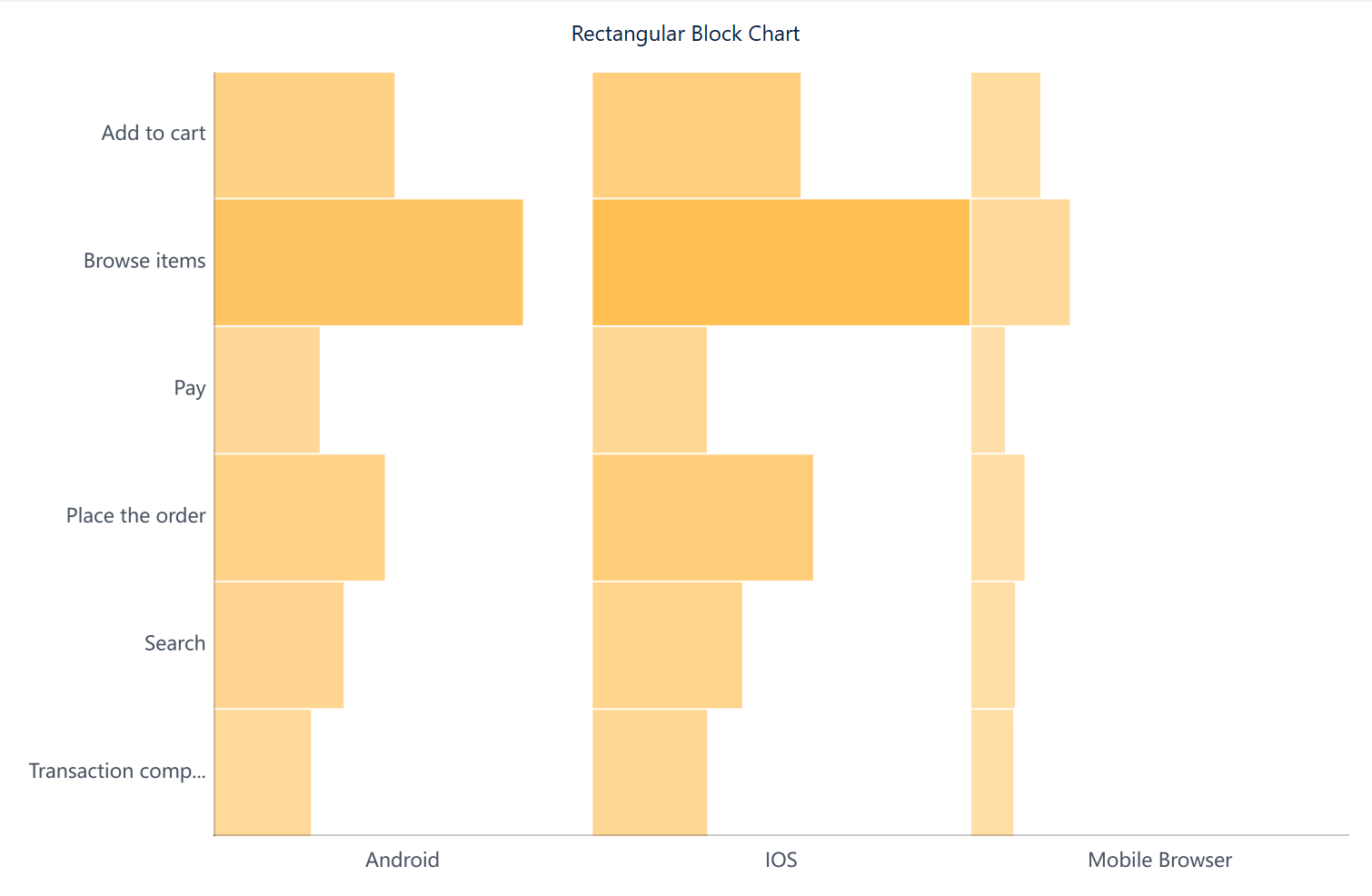
Rectangular block charts display the distribution of different data points in the form of rectangular blocks. The charts represent the corresponding indicator values through different colors or block sizes.
For example, you can use a rectangular block chart to display the distribution of the total dwell time of the latest access phase on different access platforms. The longer the access time, the darker the color and the larger the size of the rectangular block.
Basic Requirement
The basic requirements for rectangular block charts are as follows.
Chart Effect | Dimension Field | Indicator Field |
Rectangular Block Chart | > = 1 | = 1 |
Chart Feature
1. Advantage
Visual comparison: The charts can visually compare the values of different categories through the size or color of rectangular blocks.
Suitable for categorical data: The charts are particularly suitable for displaying the comparison of categorical data.
2. Disadvantage
Not suitable for continuous data: Continuous data or time series can be better displayed in a line chart.
Space efficiency: Rectangular block charts may need larger space during the display of a large data volume.
Procedure编辑
Data Preparation
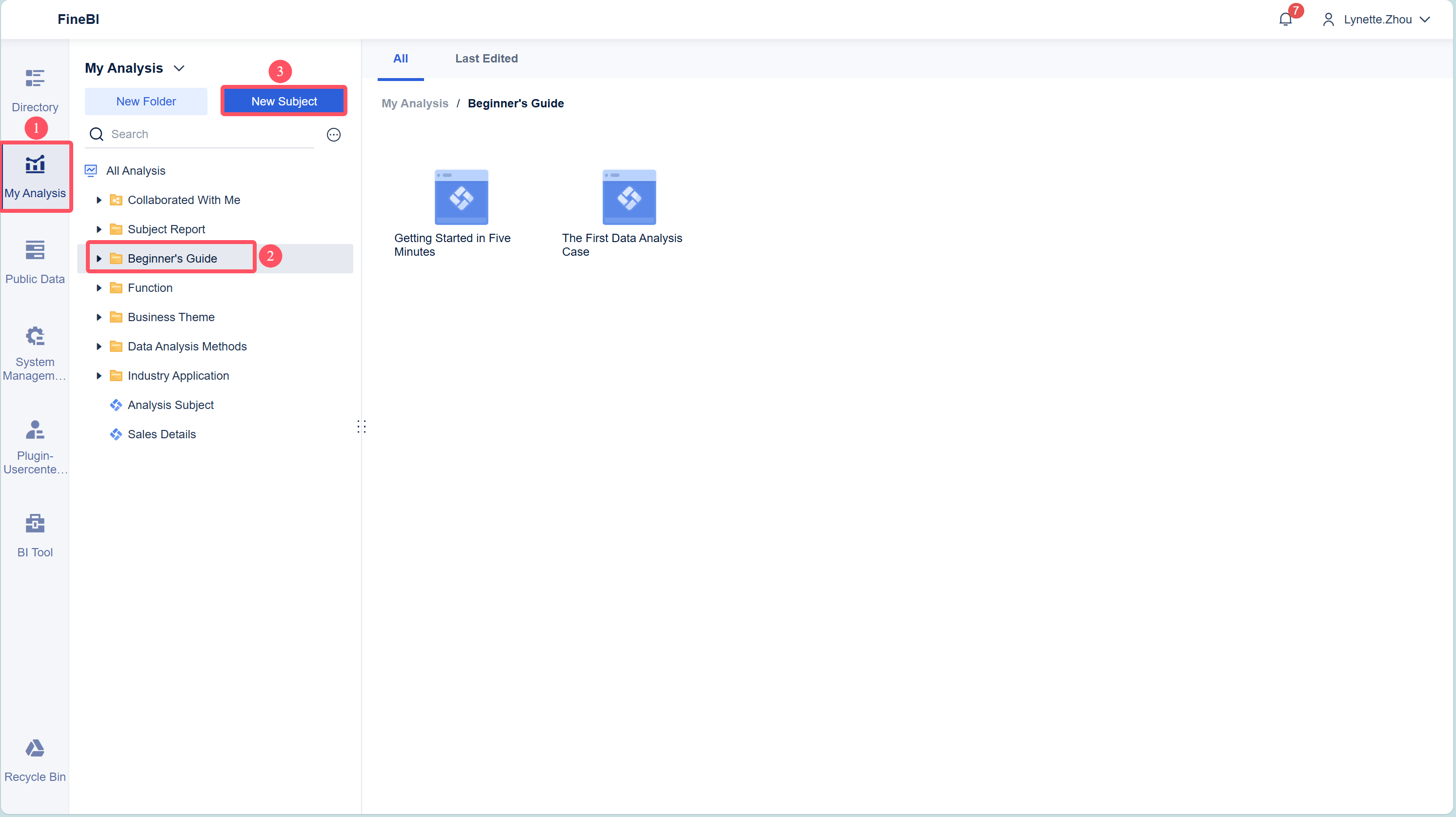
1. Log in to FineBI, click My Analysis, select a folder, and click New Subject, as shown in the following figure.
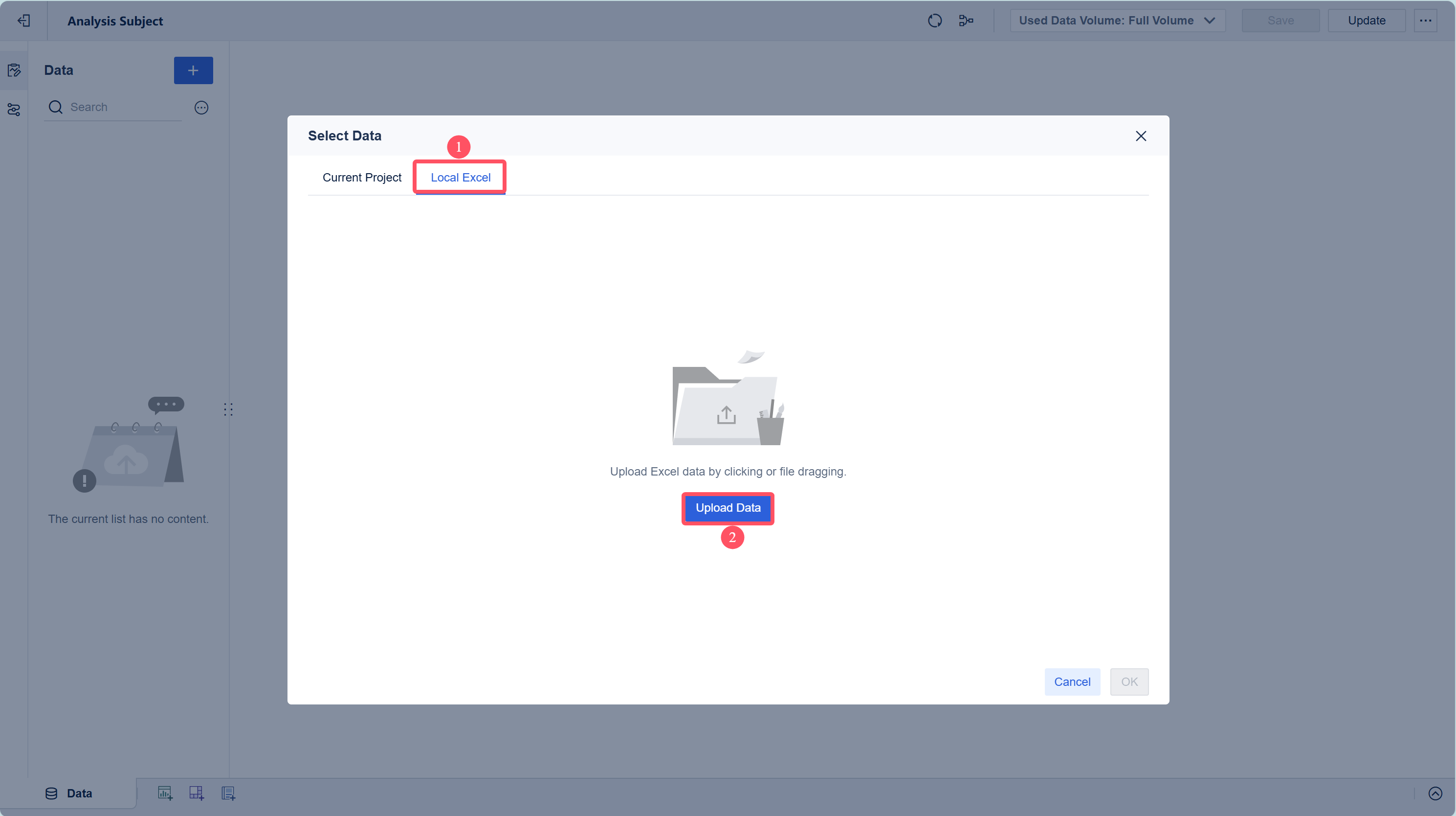
2. Choose Local Excel > Upload Data, as shown in the following figure.
Sample data:Access Information Table.xlsx
3. Click OK after the data is uploaded, as shown in the following figure.
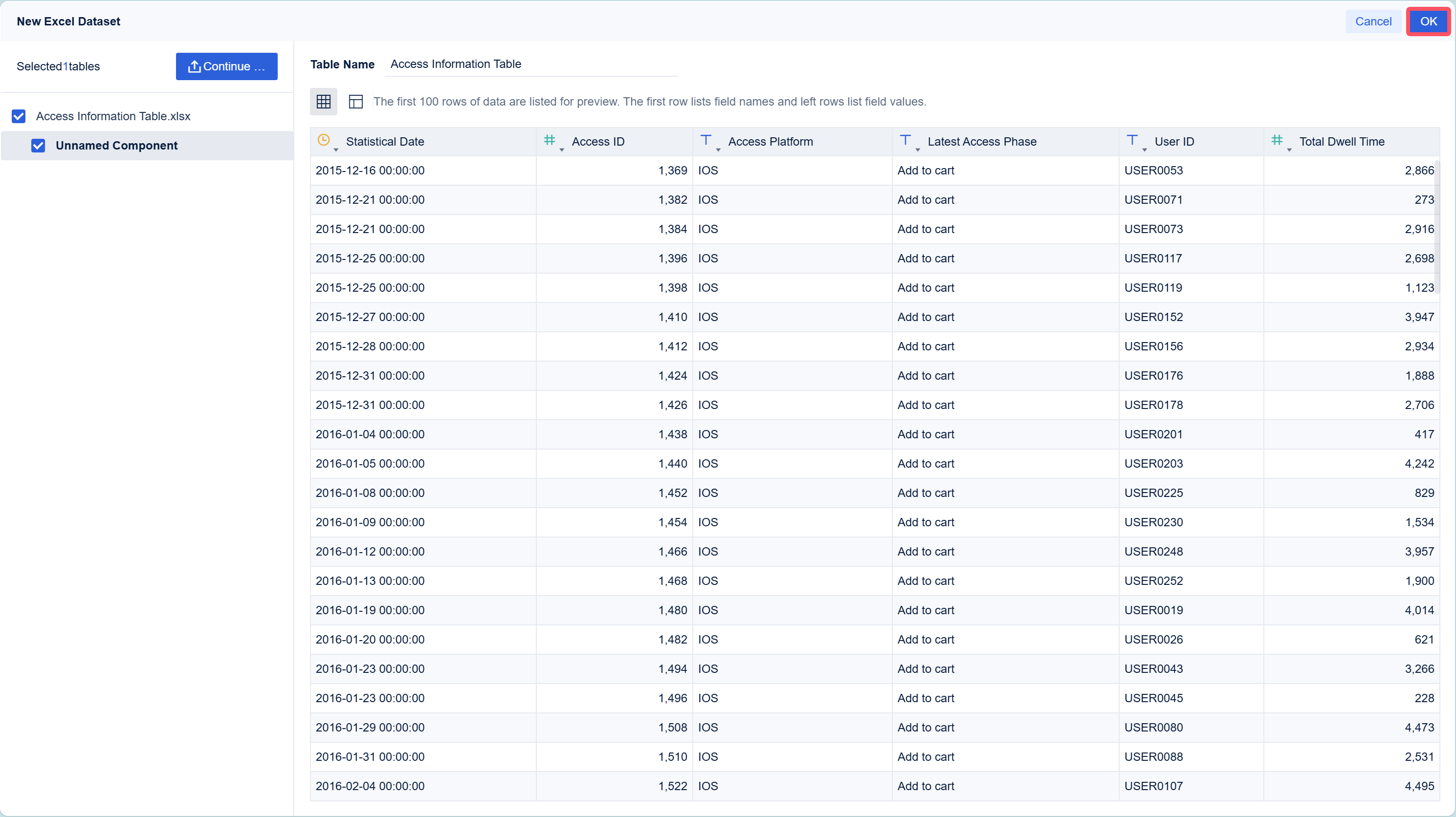
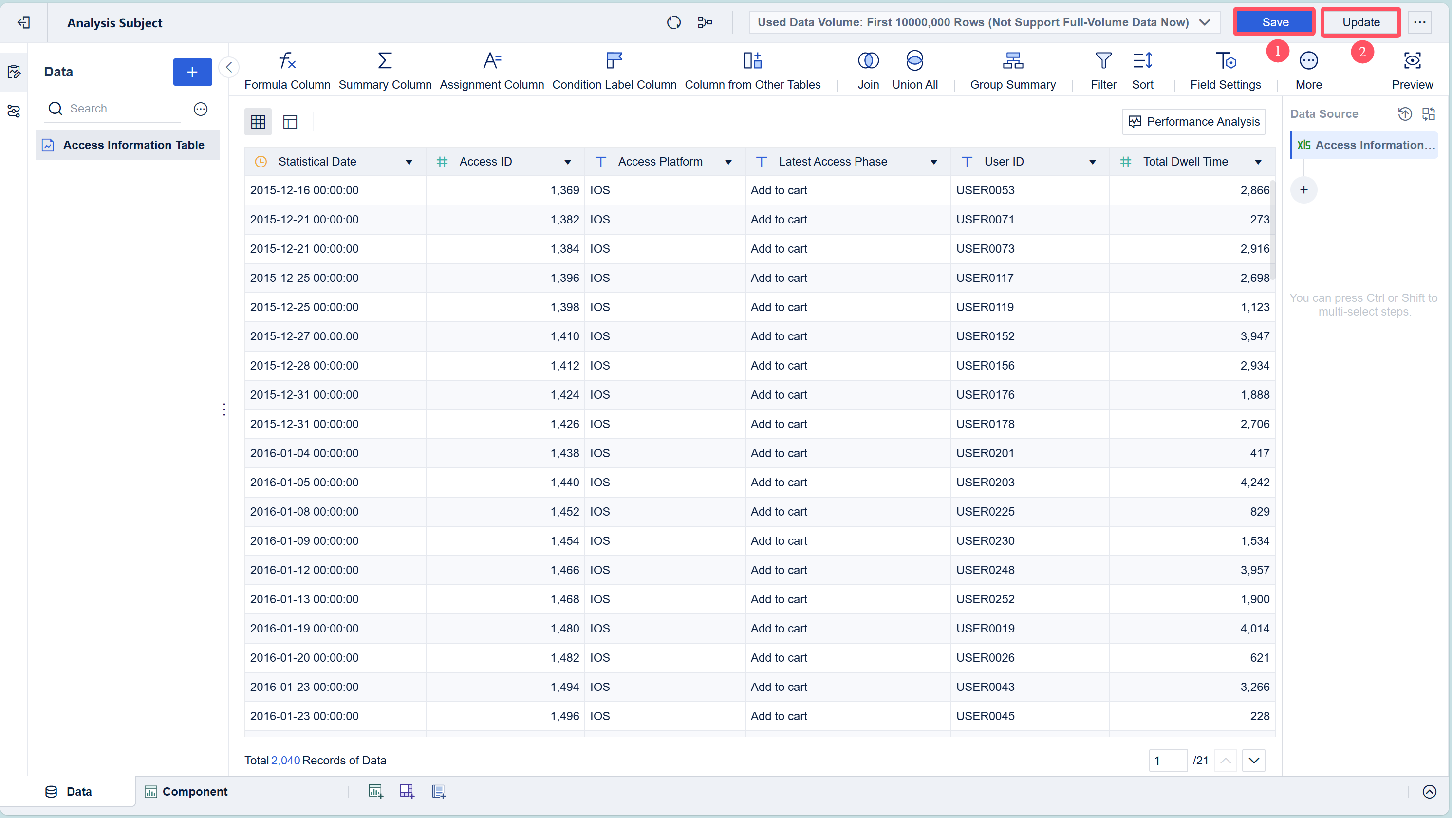
4. Click Save and Update to complete the data preparation, as shown in the following figure.
Component Creation
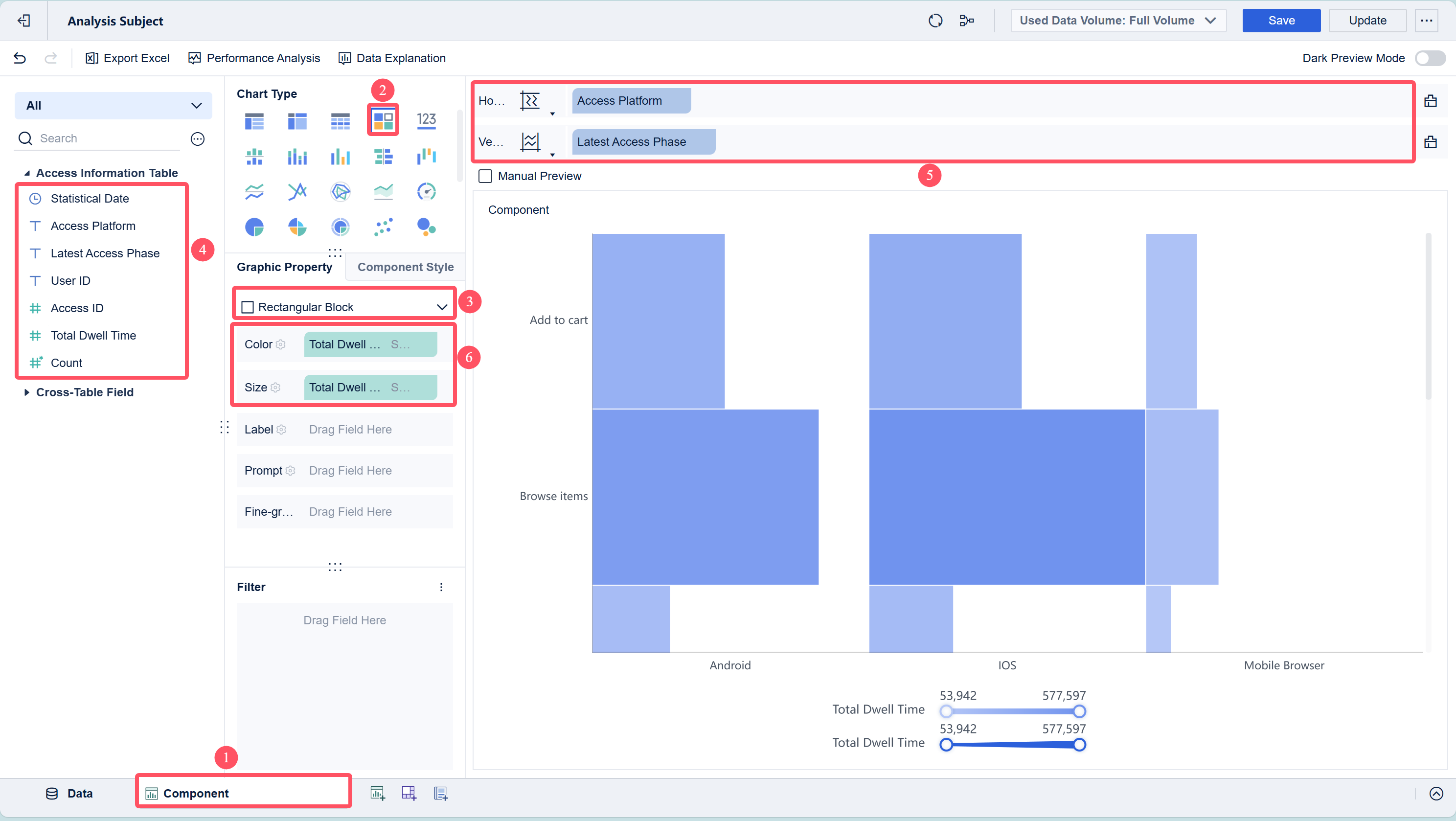
1. Click Component in the lower left corner.
2. Select Custom Chart in Chart Type, and select Rectangular Block from the drop-down list in Graphic Property.
3. Drag Access Platform from the left to-be-analyzed area to the horizontal axis of the analysis area, and drag Latest Access Phase to the vertical axis. Drag Total Dwell Time to the Color bar and Size bar under Graphic Property, as shown in the following figure.
Component Beautification
Removing the Legend
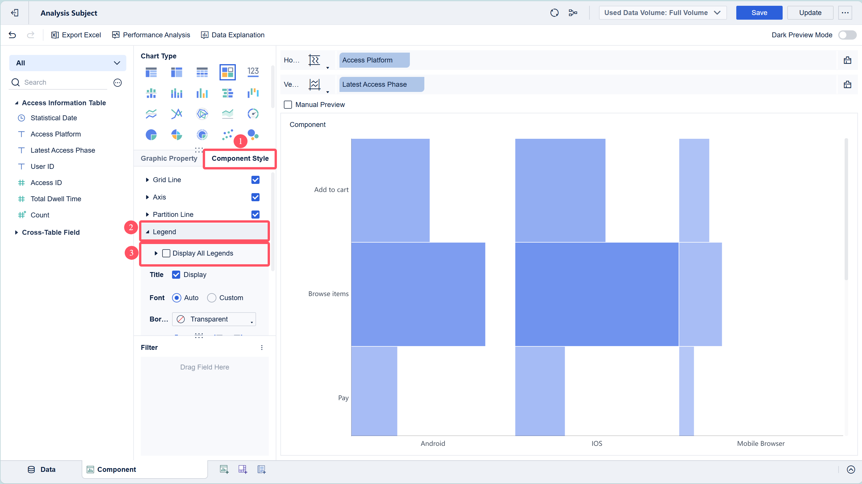
Choose Component Style > Legend and deselect Display All Legends, as shown in the following figure.
Adaptation Display
Choose Component Style > Adaptation Display and select Overall Adaptation, as shown in the following figure.
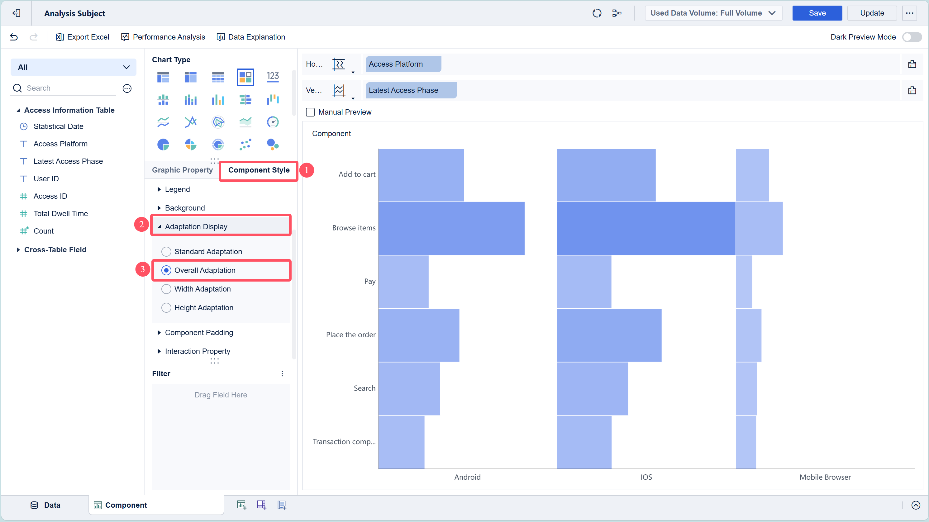
For details about the color, label, prompt, and fine-grained settings, see Graphic Property.
For details about the legend, gridline, background, and adaptation settings, see Chart Component Style.
Dashboard Creation
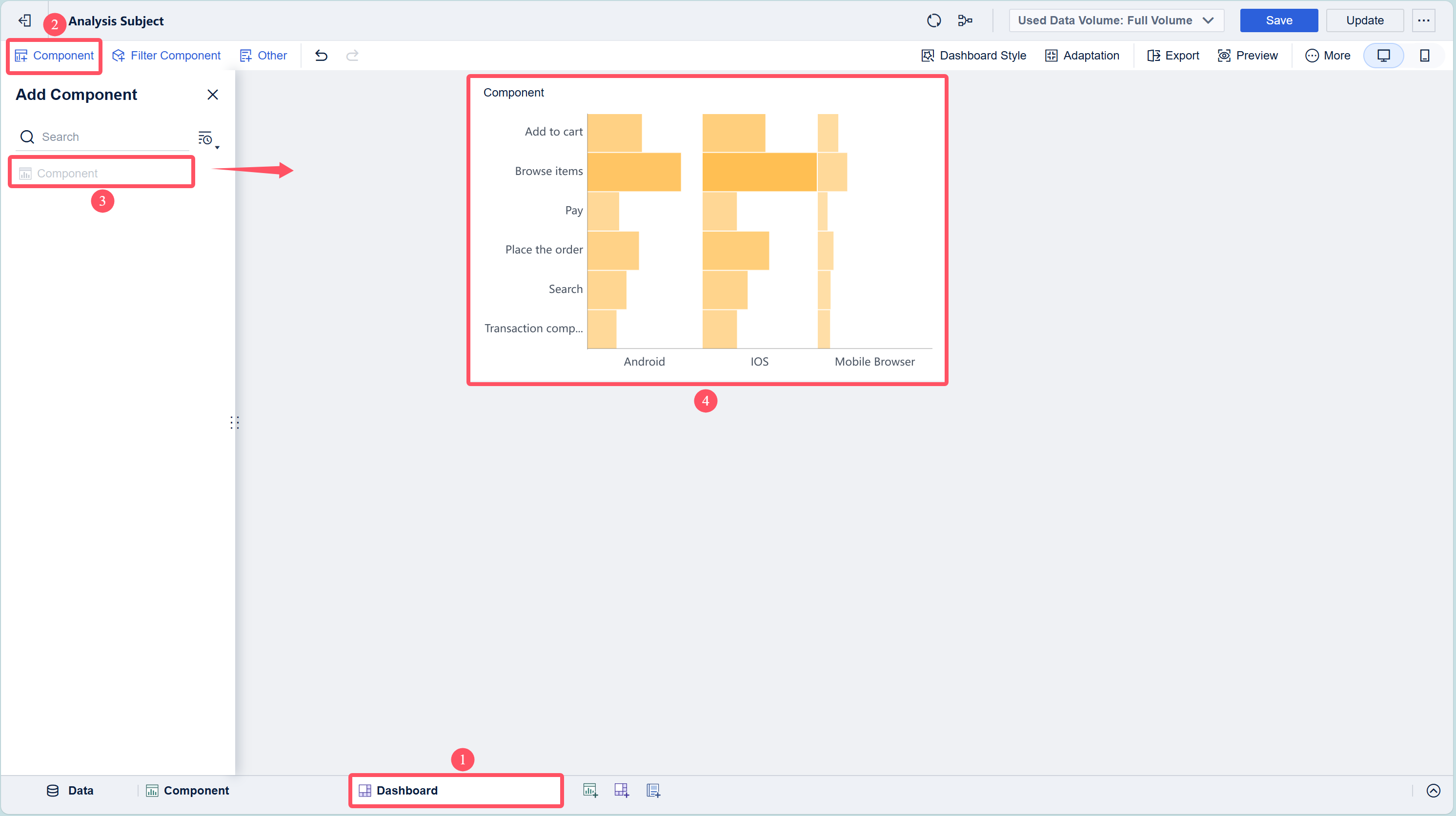
1. Click the Add Dashboard button at the bottom of the editing page of the analysis subject.
2. Drag the component into the dashboard on the dashboard editing page, as shown in the following figure.
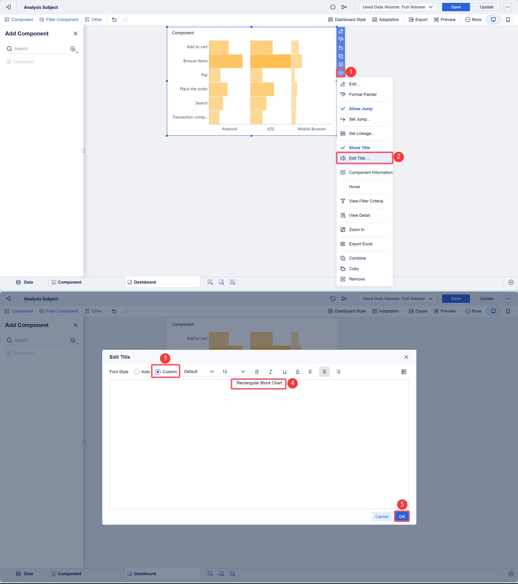
3. Select Edit Title from the drop-down list, and set Font Style to Custom. Set the title to Rectangular Block Chart, and click OK, as shown in the following figure.
Effect Display
PC

Mobile Terminal
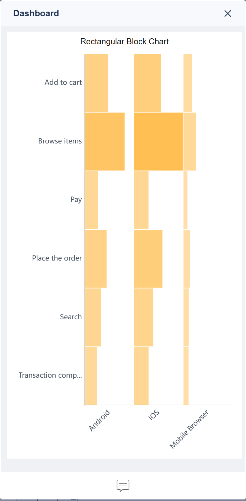
Other Scenarios编辑
Field Exchange
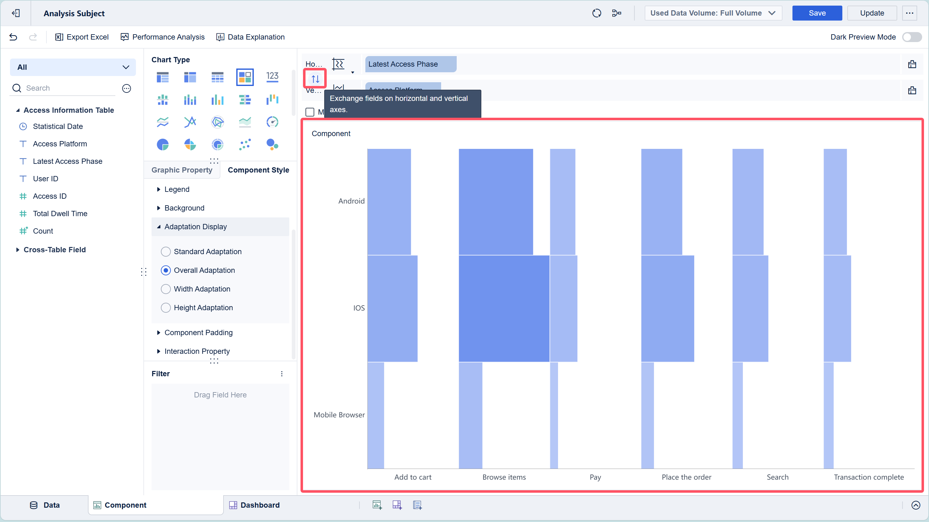
In rectangular block charts, you can exchange the field display of horizontal and vertical axes. Click the Exchange fields on horizontal and vertical axes. icon between the horizontal and vertical axis bars to exchange the fields. The following figure shows the effect.
Multiple Dimensions/Indicators
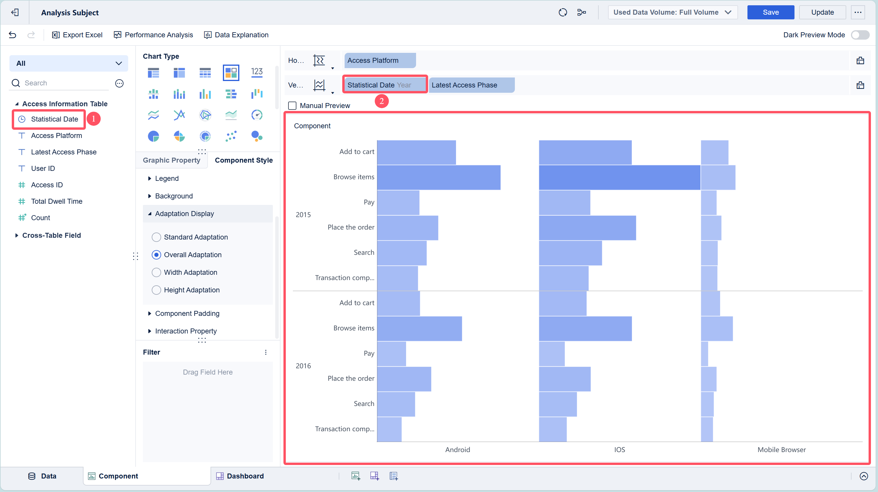
You can drag multiple fields into the horizontal and vertical axes for the multi-dimension and multi-indicator display.
For example, display the distribution of the total dwell time of the last access phase on different access platforms based on the year. Drag Statistical Date to the position before Latest Access Phase in the vertical axis. Select Year for the field grouping of Statistical Date from the drop-down list, as shown in the following figure.
