Overview编辑
Version
FineBI Version | Functional Change |
|---|---|
6.0 | / |
Application Scenario
The treemap chart, also known as the nested rectangular chart, is a visualization method for displaying hierarchical data. The chart recursively divides a rectangle into smaller rectangles, each representing the size or density of the data by the area or color depth.
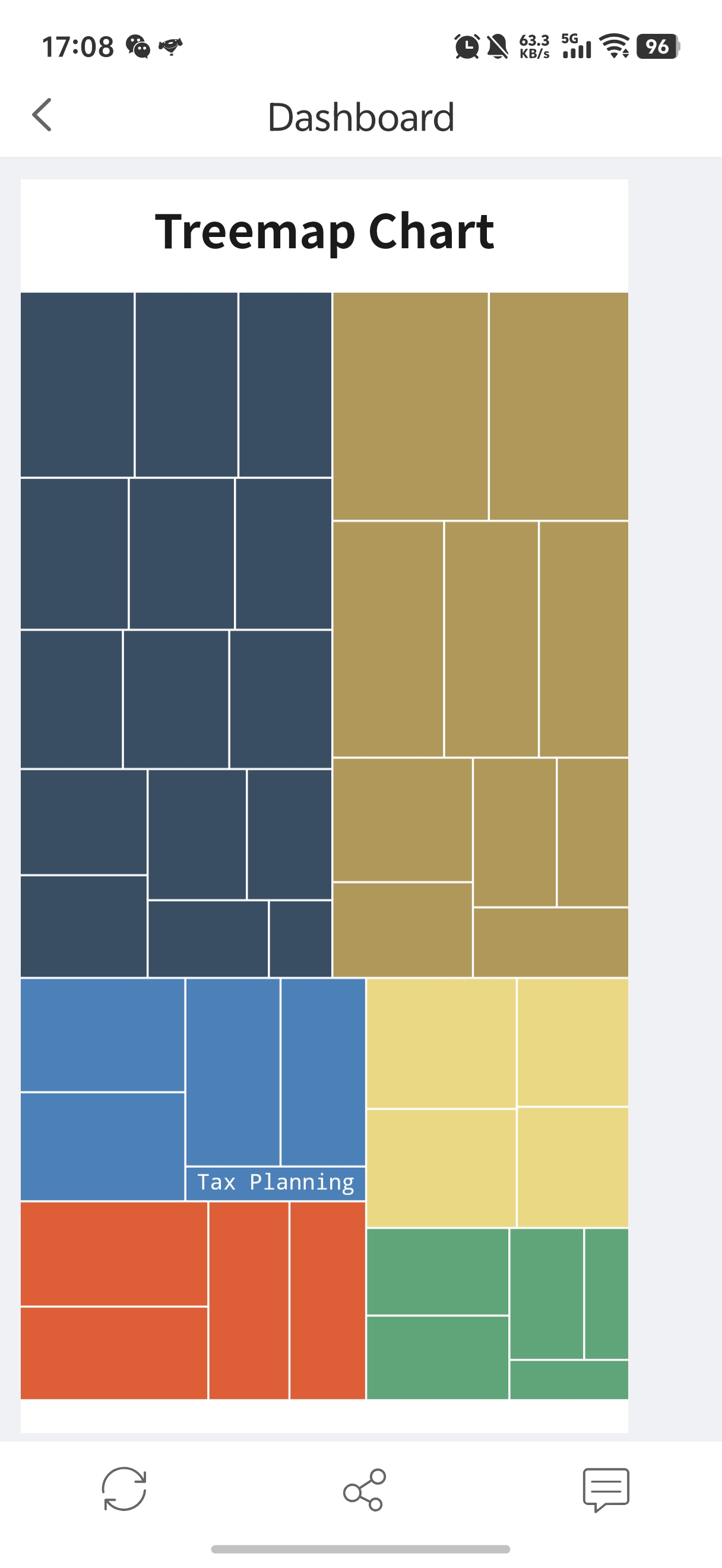
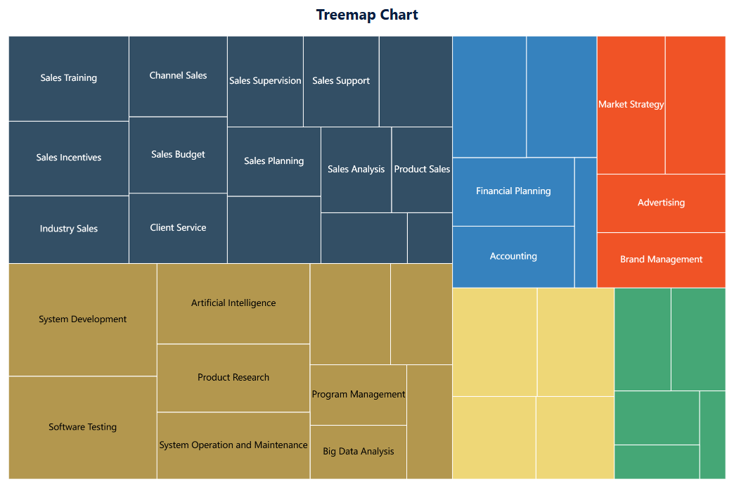
For example, you can use a treemap chart to show the number of employees in each group of each department in a company. Each color represents a department, and each block of the same color represents a group. The number and distribution of employees in a group of a department can be visually displayed through the size of the rectangular block, as shown in the following figure.
 Note:
Note:Basic Requirement
The basic requirements for treemap charts are as follows.
Chart Effect | Dimension Field | Indicator Field |
|---|---|---|
Treemap Chart | > = 1 | 1 |
Chart Feature
1. Advantage
Hierarchy display: Treemap charts are very suitable for displaying data with nested or hierarchical structures, such as organizational structures and directory trees.
Area encoding: The rectangle size of each sub-item is proportional to its data value, allowing a visual comparison of the values of different items.
2. Disadvantage
Complexity: Data with too many hierarchies or sub-items can make treemap charts complex and difficult to interpret.
Not suitable for all data: For non-hierarchical data or datasets that require the display of precise values, treemap charts may not be the best choice.
Example编辑
Data Preparation
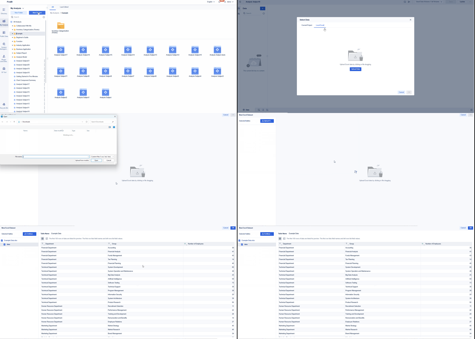
Example data: Example Data.xlsx
Upload the downloaded example data, as shown in the following figure.
Component Creation
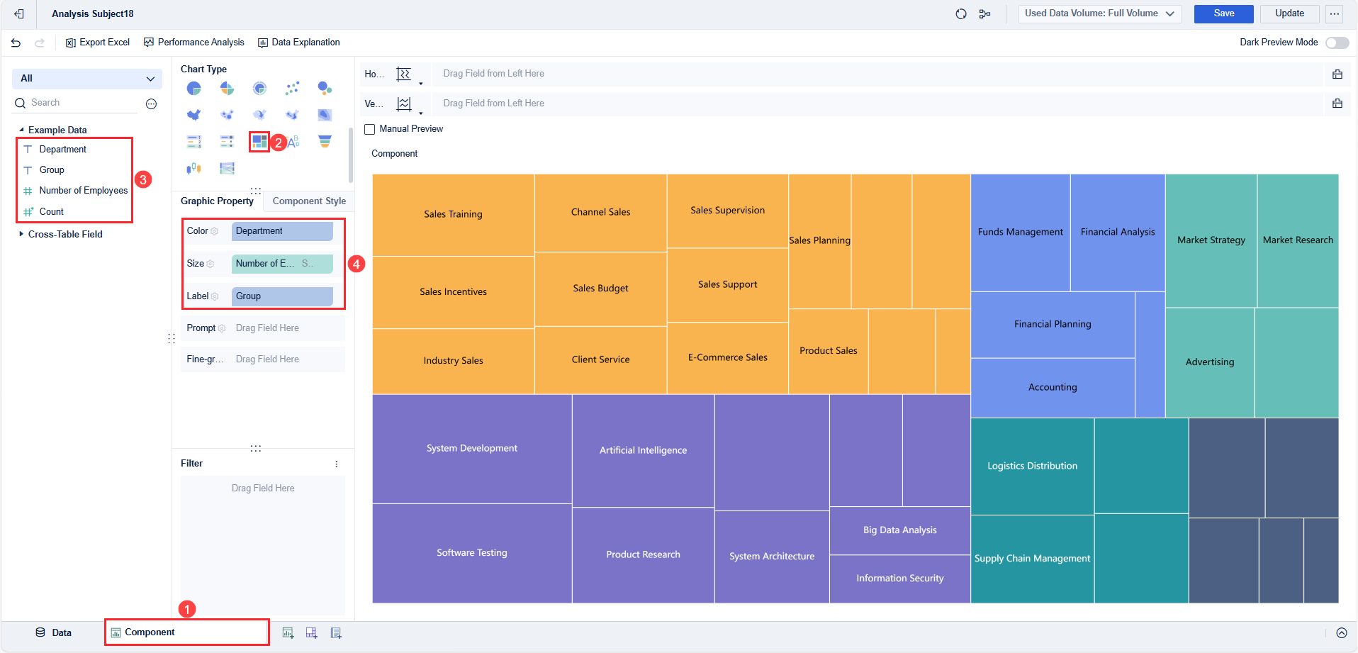
1. Click Component in the lower left corner, as shown in the following figure.
2. Select Treemap in Chart Type.
3. Drag Department from the left area into the Color bar in Graphic Property, drag Number of Employees into the Size bar, and drag Group into the Label bar, as shown in the following figure.
Different departments are represented by different colors.
The numbers of employees in each group are represented by the size of the rectangles.
The information about each group is displayed and the granularity of the chart is controlled by the label.
 Note:
Note:Component Beautification
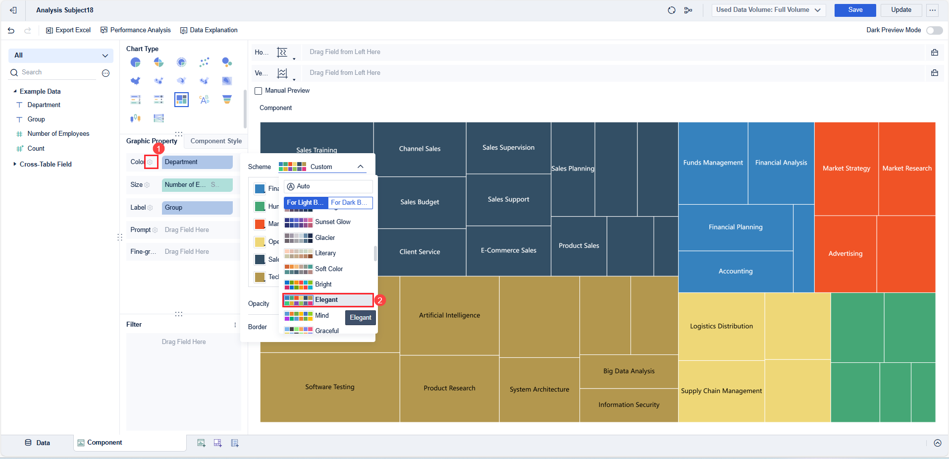
Click the setting icon next to Color in Graphic Property, and set Scheme to Elegent in the setting box that pops up, as shown in the following figure.
For details about the color, label, prompt, and fine-grained settings, see Graphic Property.
For details about the legend, gridline, background, and adaptation settings, see Chart Component Style.
Dashboard Creation
1. Click the ![]() icon at the bottom of the editing page of the analysis subject to add a dashboard.
icon at the bottom of the editing page of the analysis subject to add a dashboard.
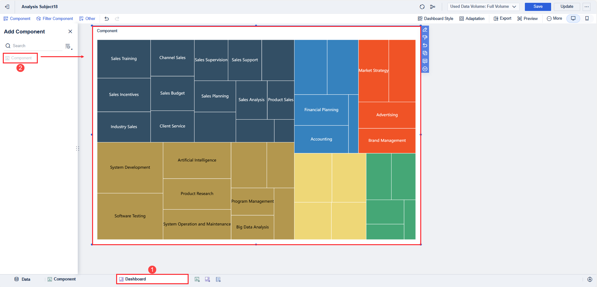
2. Drag the component into the dashboard on the dashboard editing page, as shown in the following figure.
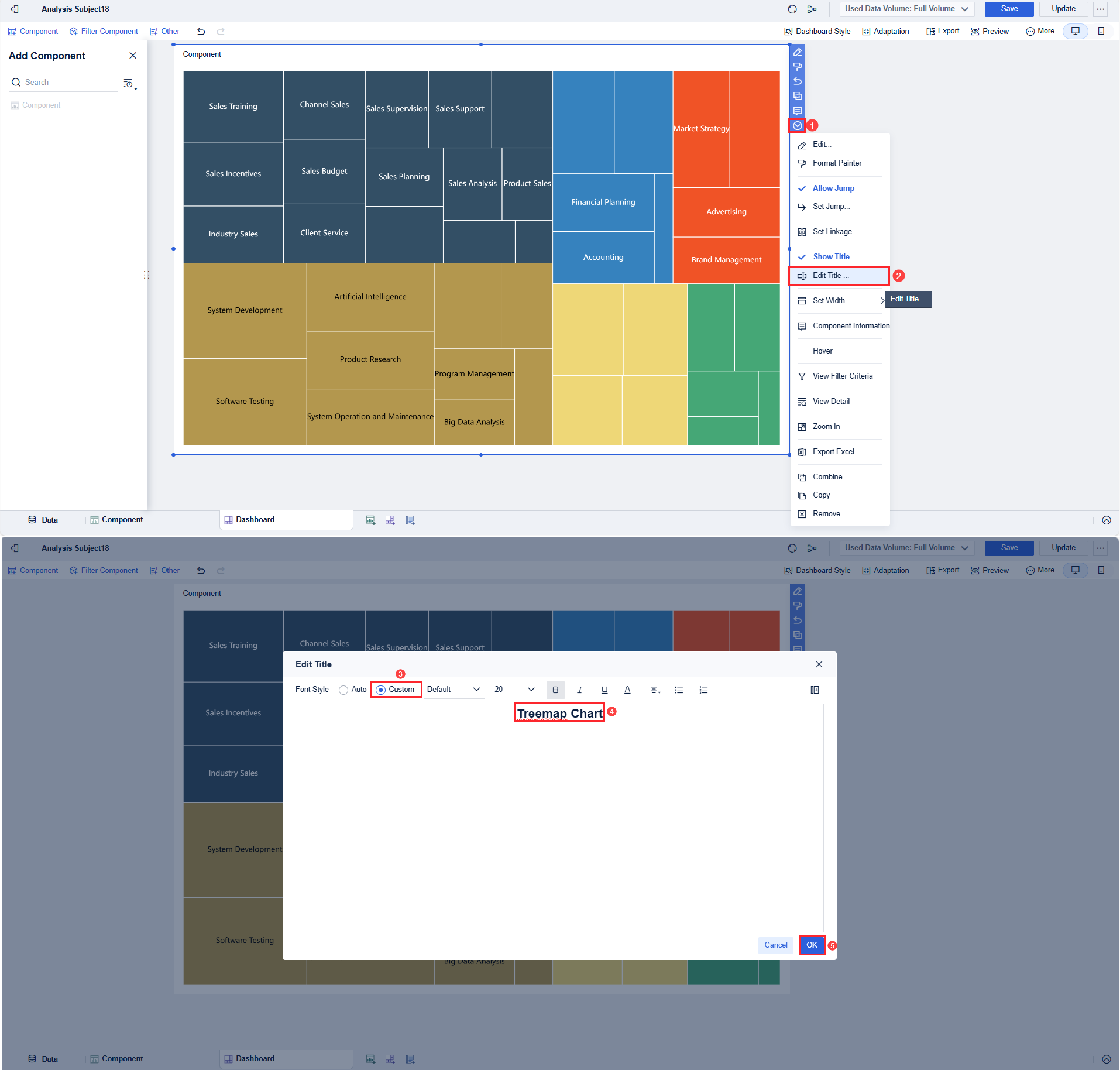
3. Select Edit Title from the drop-down list, and set Font Style to Custom. Set the title to Treemap Chart, and click OK, as shown in the following figure.
Effect Display
1. PC
2. Mobile Terminal
