Catalog:
I. Overview编辑
1) A line chart is a graph formed by marking values as points and connecting these points by lines. It can display trends that change with time or ordered categories.
2) The line chart is suitable for two-dimensional datasets, especially datasets whose trend is more important than single data points, and it is also suitable for superposition and comparison of multiple two-dimensional datasets. However, the line chart is not suitable for large datasets, and the percentage of each part in the whole cannot be seen intuitively.
3) There are three sub-types of line charts: ordinary line charts, stacked line charts and custom line charts.
Ordinary line chart: It is used to display trends that change with time or ordered categories. Data points can be displayed to represent single data values, or these data points may not be displayed.
Stacked line chart: The numerical values of each variable are stacked in order into the total amount, and the difference between the numerical values of each variable is the actual numerical value. It is suitable for showing the change of total quantity, the contribution of each variable and its change.
Custom line chart: Users can customize the attributes of stacking and axes.
4) Suggested Reading: 图表数据, 图表样式, 图表特效
| You will learn |
|---|
|
II. Steps编辑
This document takes the custom line chart as an example, and the chart settings of other subtypes are similar.
1. Data preparation
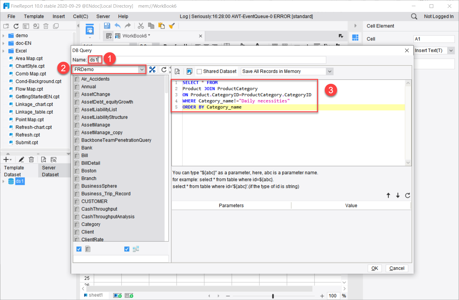
Create a new template data query ds1, and select FRDemo for data connection. Enter the following query statement:
SELECT * FROM
Product JOIN ProductCategory
ON Product.CategoryID=ProductCategory.CategoryID
WHERE Category_name!="Daily necessities"
ORDER BY Category_name
2. Insert a chart
Take the floating chart as an example. Reference Insert Floating Chart:
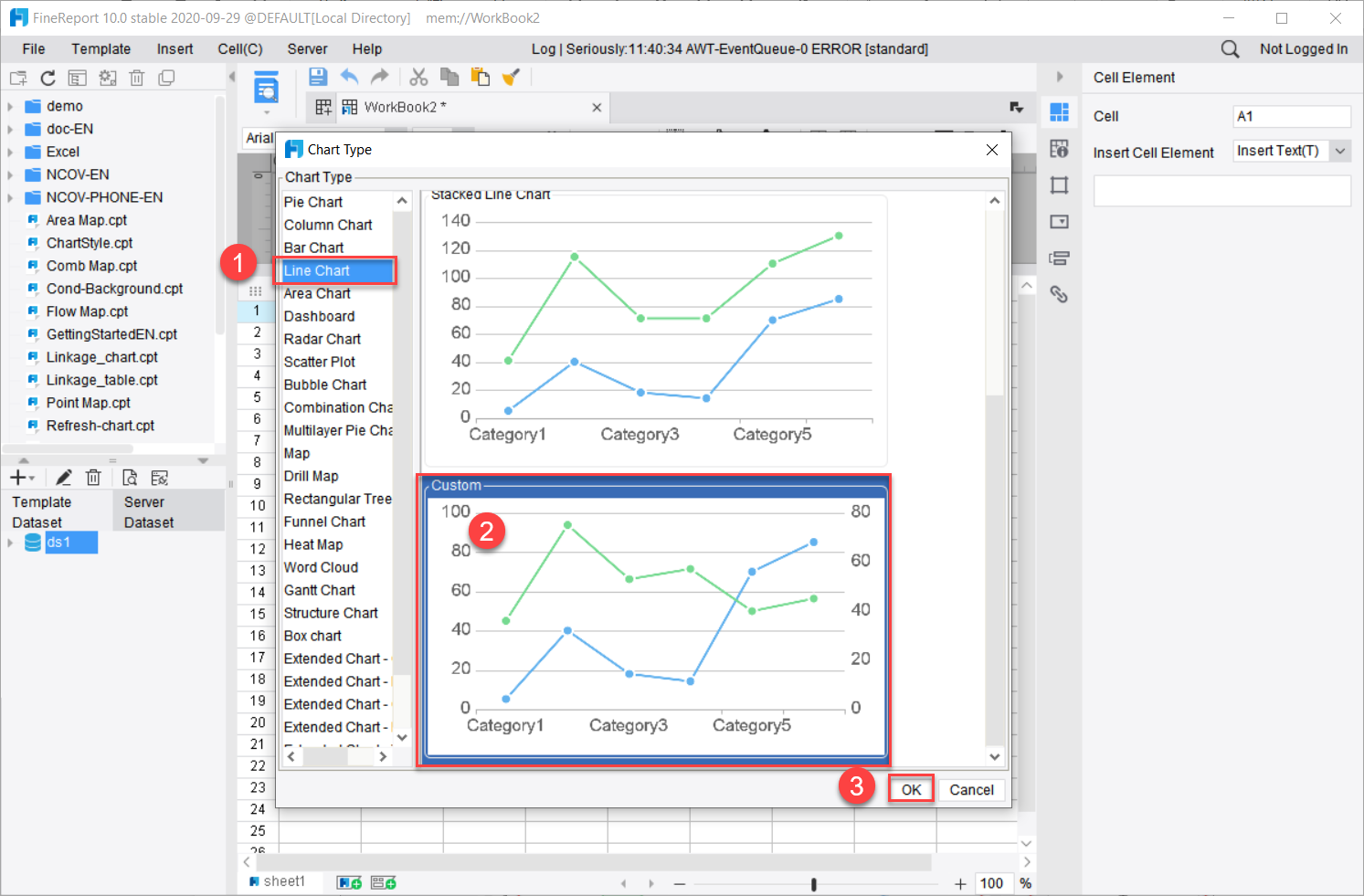
Pop up the [Chart Type] panel, and select [Line Chart] on the left.
Select [Custom]
Click [OK] to complete the insertion of the custom area chart.
3. Data Binding
Make the following settings for the custom line chart data:
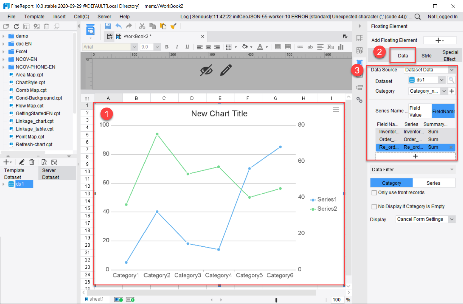
Double-click the chart
Click [Cell Element] on the right panel. Click [Data].
Select [Dataset data] for [Data source] and [ds1] for [Dataset].
Select [Category_name] for [Category]
Use field names as series names, and add [Inventory_quantity], [Order_quantity] and [Re_order_quantity]. The summary methods are all [Sum]
4. Style Setting
1. General style
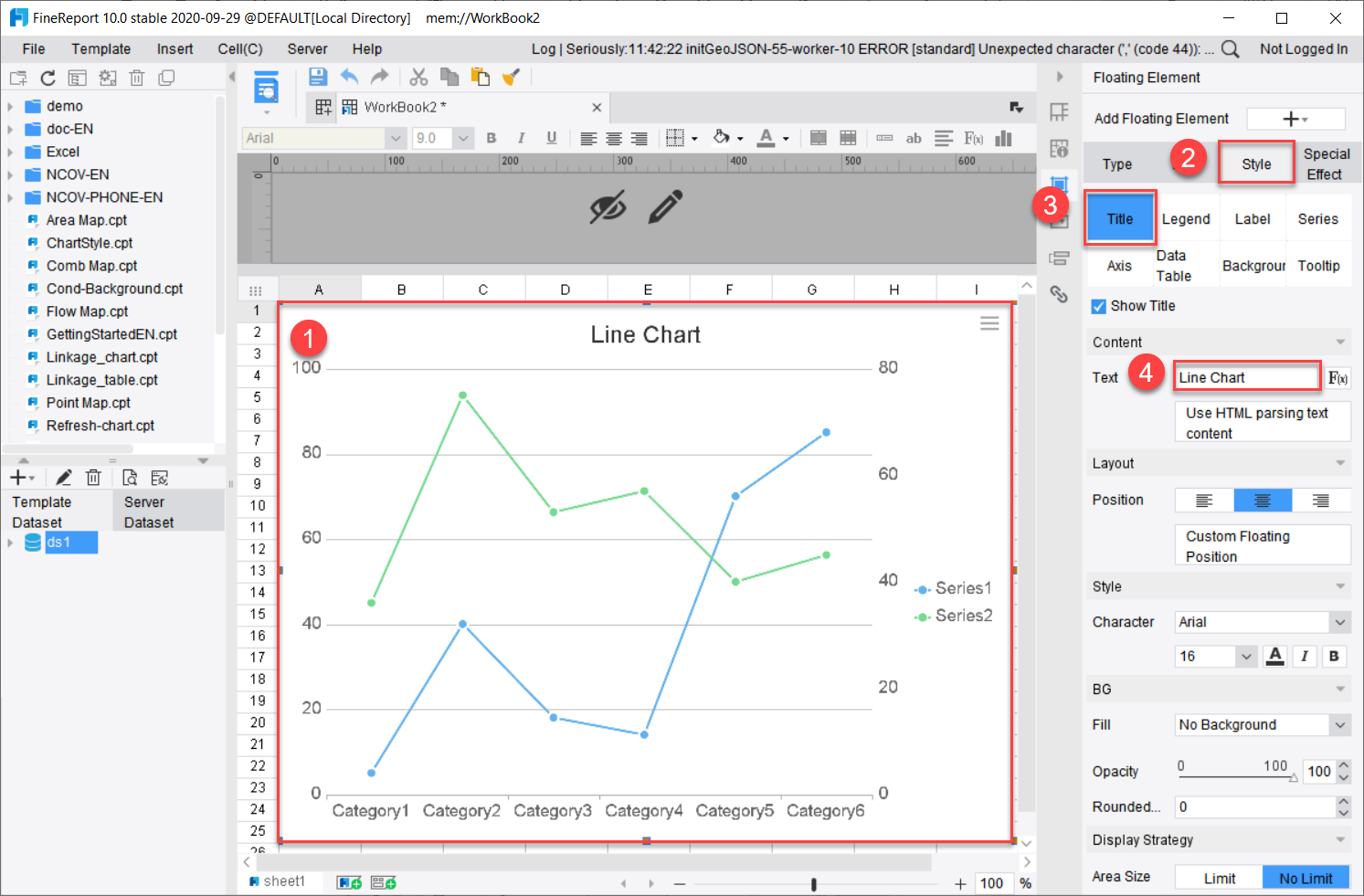
Select the chart and click on [Style]. There are various types of charts, but most of the style settings are common, which can be set by referring to Chapter 图表样式. Here we make the following settings:
Change the chart title:
Click [Title]
Change [Text] of the title to Line Chart.
2. Special style
Some settings in the [Style] of the line chart are different from the basic style, which will be introduced separately:
Label: Click [Label] to enter the label setting and find the related options of [Layout]
Location: Add the [Auto] option. When Auto is selected, the position of individual labels will change according to the optimal situation.
Overlap adjustment: When multiple labels overlap, this function can be turned on, and the system will automatically stagger the label positions.
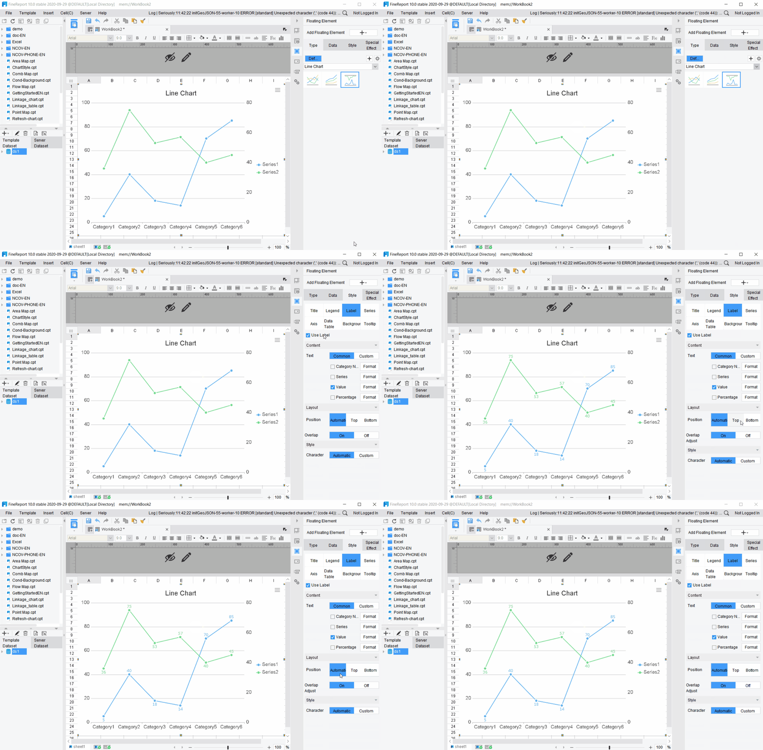
Custom axis: For custom line charts, under [Style] > [Axis], additional X and Y axes can be added, and the attributes of new coordinates can be set. For example, there are two Y axes, Y Axis and Y Axis2.

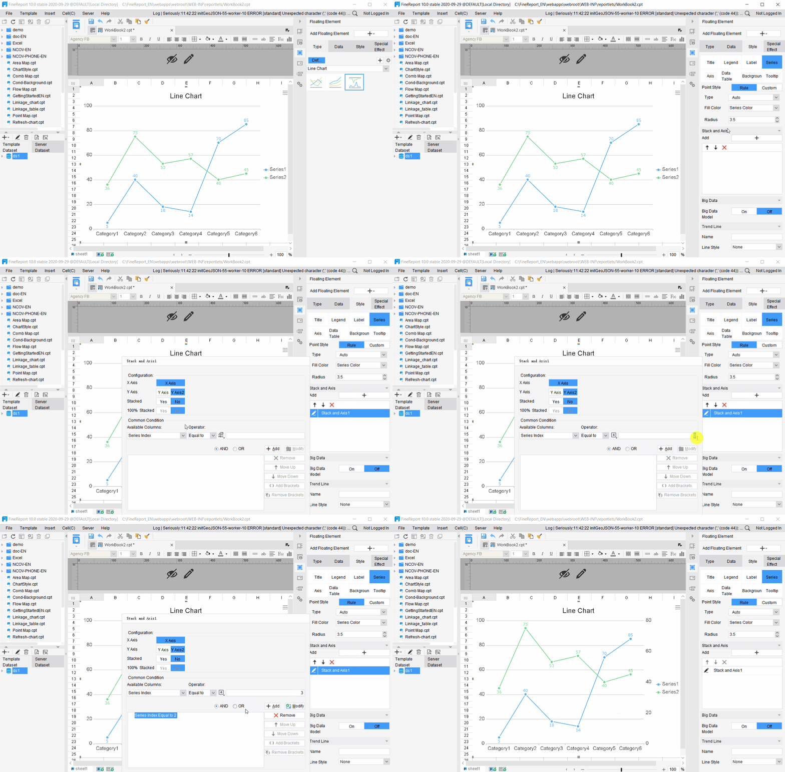
Series-axis stacking: For custom line charts, the newly added axes need to correspond to different series. You can find the settings of [Stacking and Axes] under [Style] > [Series], and customize the stacking attributes of axes and correspondence of series. For example, here make the second and third series (i.e. Order_quantity and Re_order_quantity) correspond to Y Axis2, and do not select stacking or percentage stacking.
5. Set special effects
See Setting of General Special Effects in Chapter 图表特效 for detailed introduction of special effects settings.
6. Preview
1. Save and preview.
2. It can be seen that the first series Inventory_quantity corresponds to the Y Axis on the left, and order_quantity and re_order_quantity correspond to the Y Axis 2 on the right.


