Catalog:
I. Overview编辑
1) Scatter Plot, also known as scatter distribution plot, shows how the dependent variable changes roughly with the independent variable. The Scatter Plot can also be used to demonstrate the relationship between the values in several data series, determine whether there is a certain correlation between two variables in Cartesian coordinates, or discover the distribution or aggregation of data.
2) The Scatter Plot boasts an advantage that it demonstrates the overall relationship trend between the influencing factors and the predictors in an intuitive manner. However, the disadvantage lies in that it can display nothing but the correlation, distribution and aggregation, so only with sufficient correlated data points can good results be presented.
3) Suggested Reading: 图表数据, 图表样式, 图表特效
| You will learn |
|---|
|
II. Steps编辑
1. Data preparation
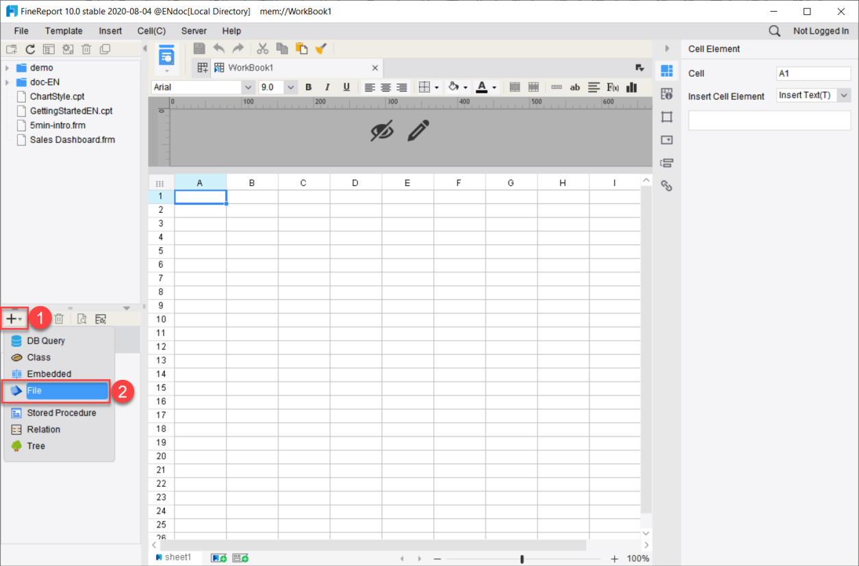
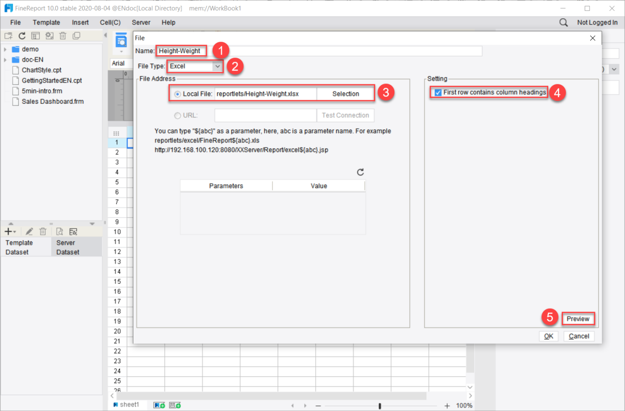
1) Create a new file dataset Height-Weight, and select the Excel file, as shown in the following diagram:
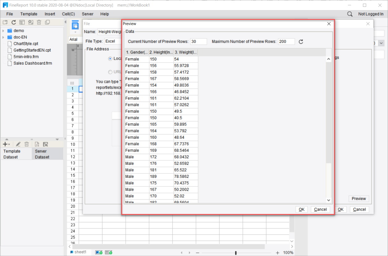
2) Data preview:
2. Select and insert a chart
1) Take the floating chart as an example. Please refer to 插入悬浮图表.
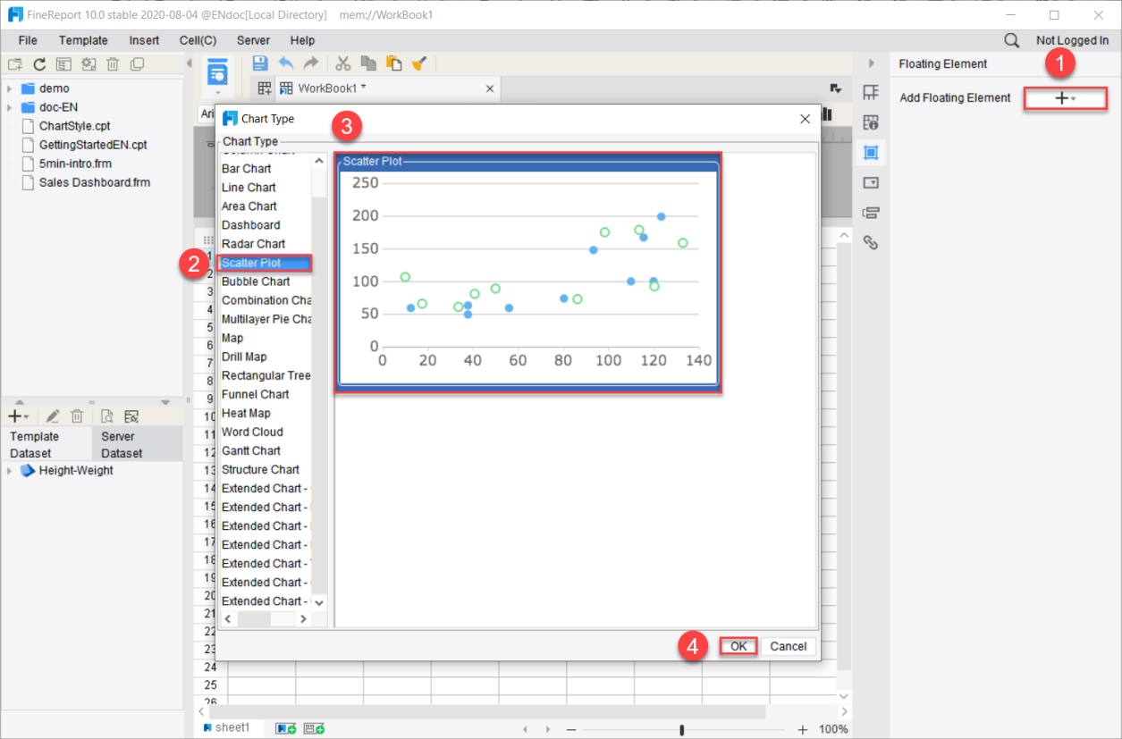
2) Select [Floating Element] on the right, click on  following the [Add Floating Element], and select [Insert Chart(C)].
3) Select [Scatter Plot] in the pop-up [Chart Type] panel.
3. Data Binding
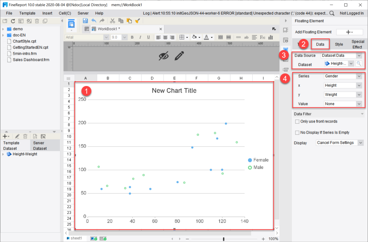
The data binding method of the scatter plot is shown below:
1) Double-click on the scatter plot.
2) Click on the [Data] tab.
3) Click on [Data Source] and select [Dataset Data].
4) Select the new file dataset Height-Weight for [Dataset].
5) Select [Gender] for [Series], and set the x-axis to Height and the y-axis to Weight.
4. Style
1) General style
Select the chart and click on [Style]. Despite the variety of types of charts, most of their style settings are common. Please refer to the chapter on 图表样式 for settings.
2) Special style
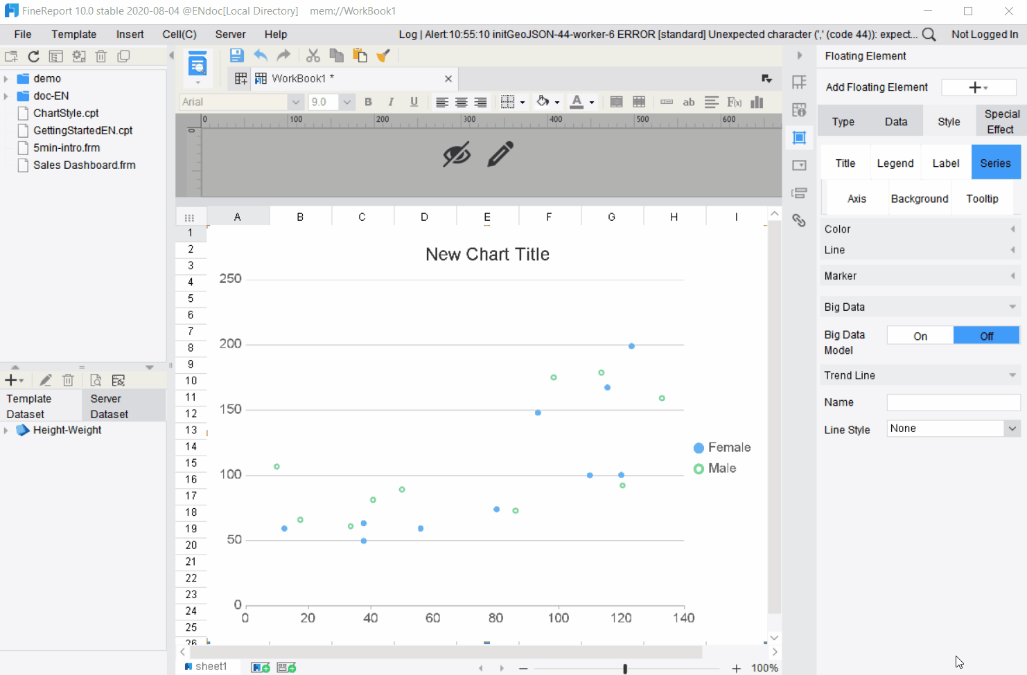
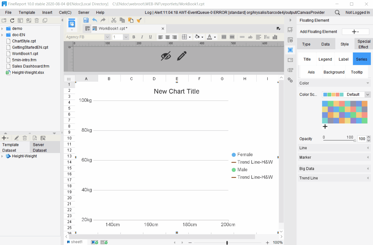
The setup options of [Style]>[Series] of the scatter plot are different from the basic style, which will be elaborated later. The setting effects can be previewed in real time in the special effect diagram on the left:
Large data volume mode: You can choose to enable/disable it. This mode can be enabled for large data volume to improve display efficiency.
Trend line
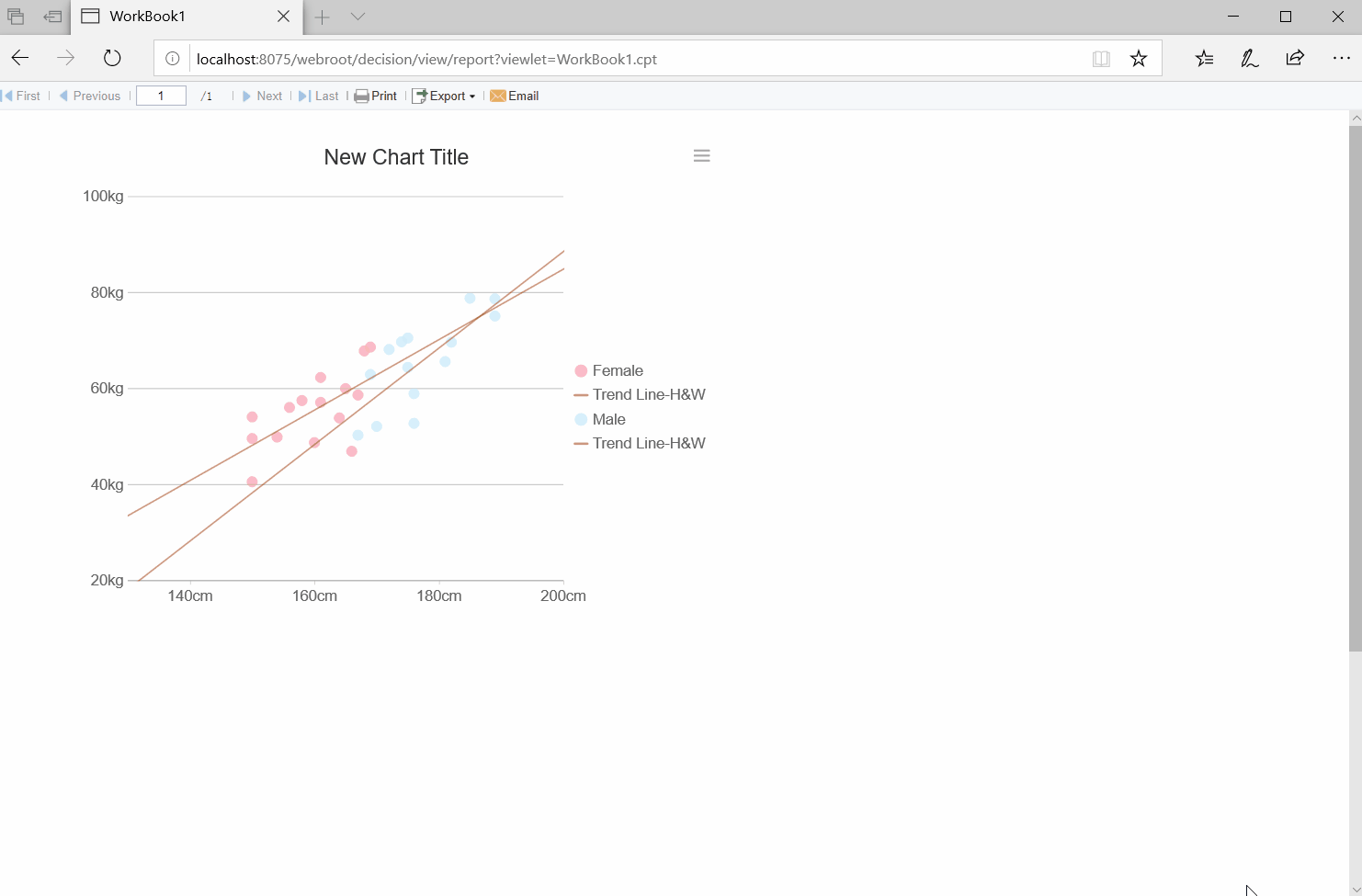
Name: Set the name of the Scatter Plot trend line. For example, it is set to [Trend Line-H&W]
Line Style: Select the type of trend line. When the line style is [None], the following options will not be displayed.
Line width: Set the thickness of the trend line. For example, set to 1.5.
Color: Set the color of the trend line.
Type: There are four types of trend lines: exponential fitting, linear fitting, logarithmic fitting and polynomial fitting. For example, select linear fitting.
Forecast: Set the cycle of the trend line forward and backward. For example, set both cycles to 2.
3) Examples in this section
Axis Value Definition
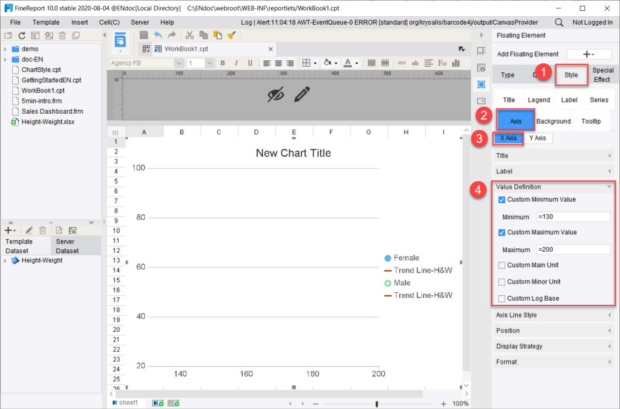
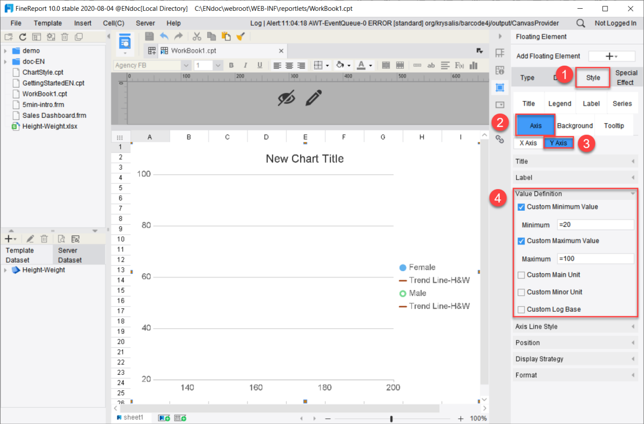
Select the chart, click on [Chart Properties]-[Style]-[Axis]-[X Axis]-[Value Definition] and set the minimum value to be 130 and the maximum 200.
Select the chart, click on [Chart Properties]-[Style]-[Axis]-[Y Axis]-[Value Definition] and set the minimum value to be 20 and the maximum to be 100. The settings of axis value definition are shown in the following diagram:
Axis format
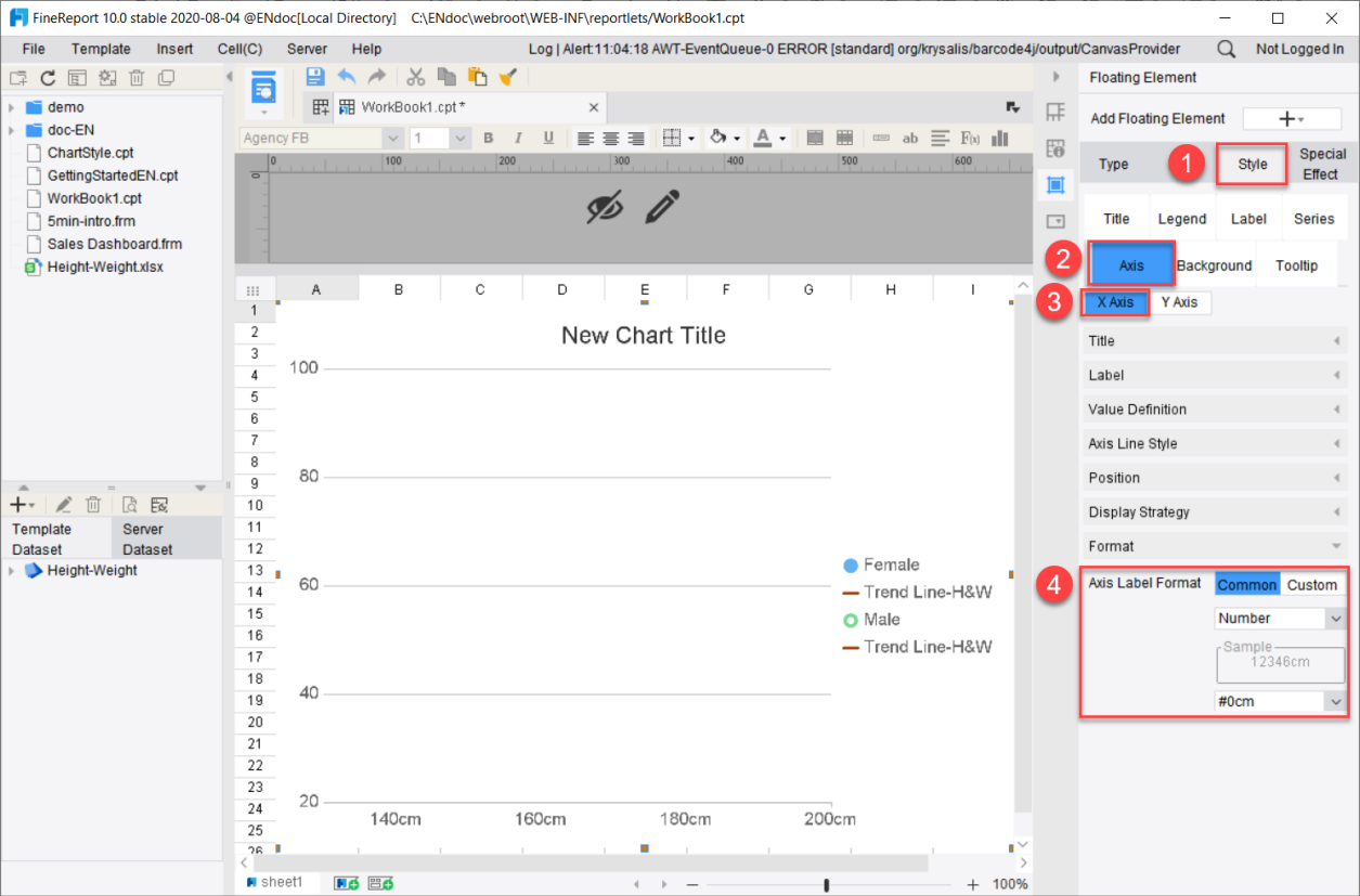
Click on [Chart Properties]-[Style]-[Axis]-[X Axis]-[Format], then click on the [General] tab, select [Number], and add the unit “cm” at the end of the number. In this way, the format of X-axis is set as #0cm.
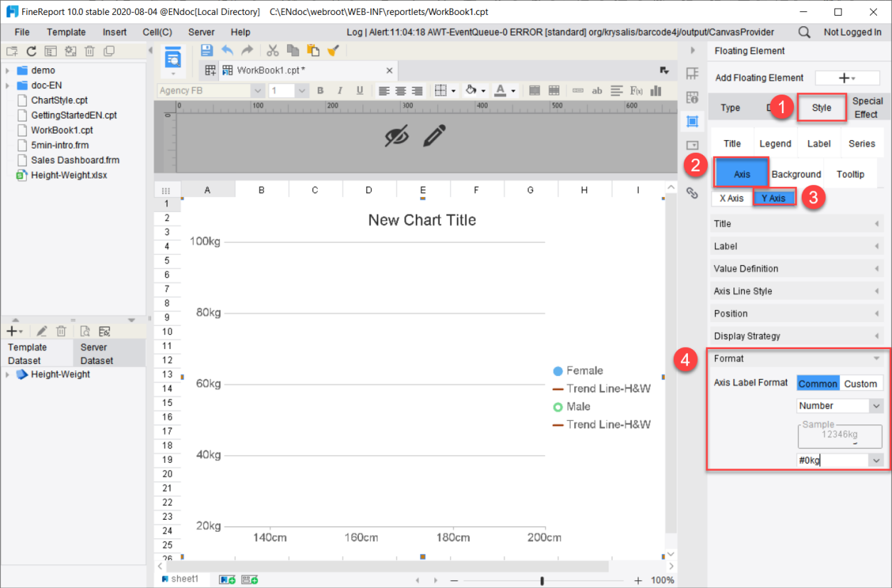
Click on [Chart Properties]-[Style]-[Axis]-[X Axis]-[Format], then click on the [General] tab, select [Number] and add the unit “kg” at the end the number. In this way, the format of X-axis is set as #0kg. The axis format setting is shown in the following diagram:
Marker setting
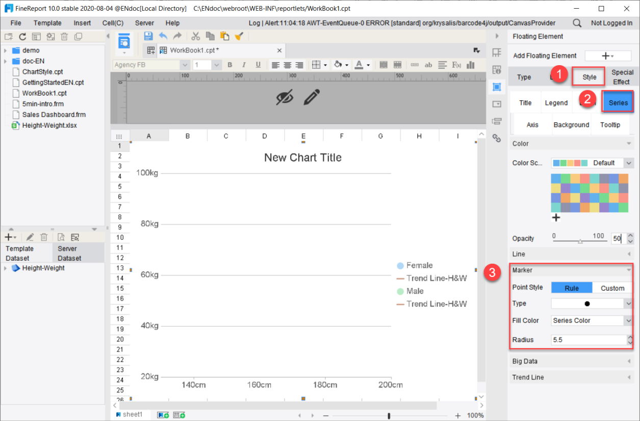
Click on [Chart Attributes]-[Style]-[Series]-[Marker]-[Type], select [Solid Circle] and set the radius as 5.5.
Note: When the marker type of the scatter plot is [None], eight different markers are used in the sequence of the series.
Color Settings
Select the chart and click [Chart Properties]-[Style]-[Color].
Select [Custom Combination Color] from the drop-down box to select the first color. Click on [More Colors] to show the [Select Color] panel, and click on the [Custom] tab.
Enter the color code f97893 for pink and click on OK.
Similarly, set the second color to blue. The color code is ade1f9.
Set the opacity to 50%.
5. Special effects settings
For detailed description of special effects of scatter plots, please refer to the chapter on 图表特效 for general settings.
6. Preview
Save the report and click on the [Form Preview]. The set scatter plot can be shown below:
